Transform Your Space With These Cozy Minimalist Living Rooms
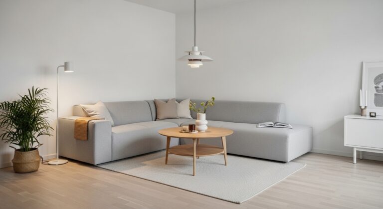
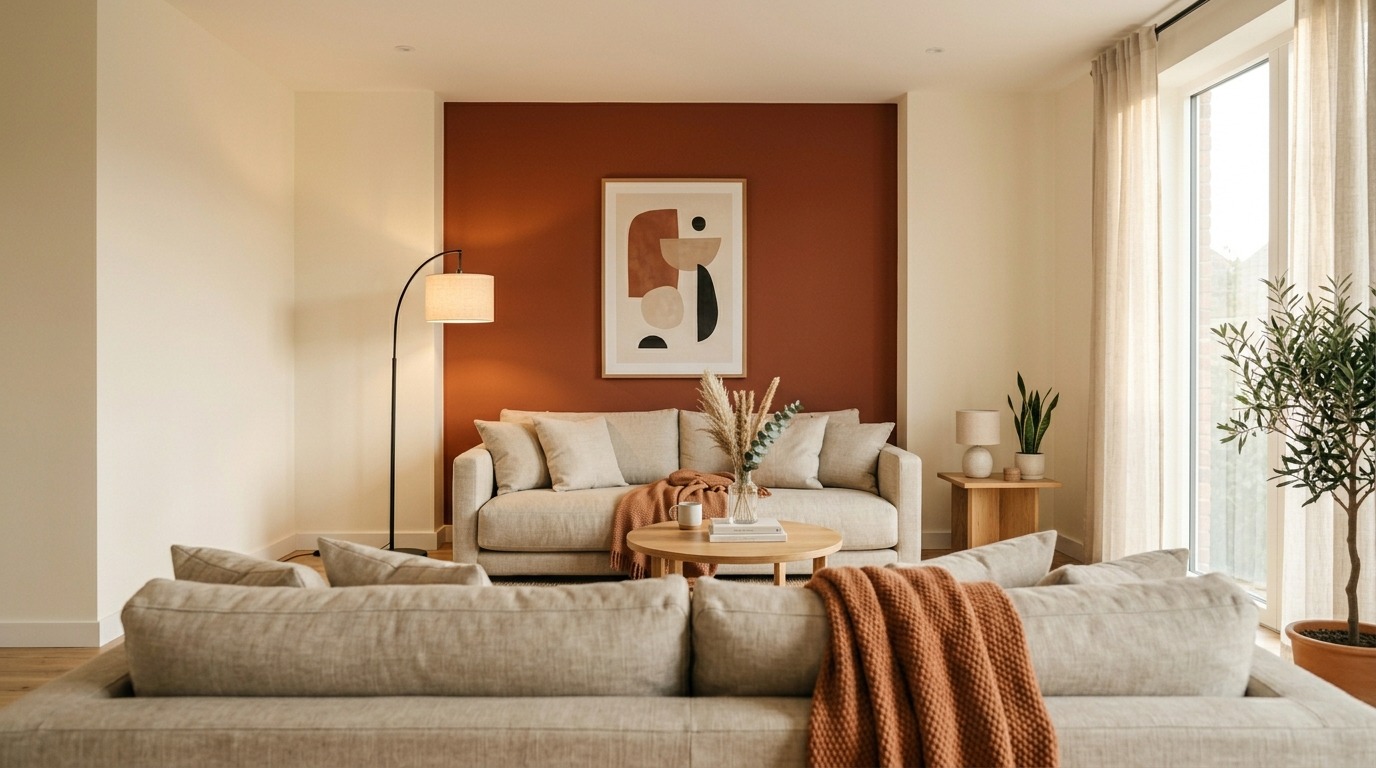
Have you ever walked into someone’s living room and felt your whole body exhale? Not because it was fancy or perfectly staged — but because it felt calm, warm, and real? That’s the exact feeling we’re chasing with cozy minimalism. It’s not about owning less. It’s about choosing better — and arranging those choices so your room feels like a full, deep breath every single time you walk in.
The good news? You don’t need a renovation budget or an interior designer on speed dial. These 16 ideas are practical, fresh, and honest. No recycled advice. No obvious tips you’ve seen on every Pinterest board. Let’s build the kind of room you’ll actually live in — not just photograph.
What Cozy Minimalism Actually Means (And What It Doesn’t)
Before we dive in, let’s clear something up. Cozy minimalism is not bare white walls and a single cactus. It’s also not stuffing every corner with throw blankets and pretending that counts as decor. The sweet spot lives between intentional restraint and genuine warmth. You keep only what you love. You display only what earns its place. And you let the room breathe without feeling empty.
Think of it like curating a playlist — not every song you’ve ever liked, just the ones that belong together and feel right in sequence.
The “One Warm Wall” Anchor Strategy
Most people paint all four walls the same color and wonder why the room feels flat. Here’s a smarter move: pick one wall — typically the one your sofa faces — and treat it as your anchor.
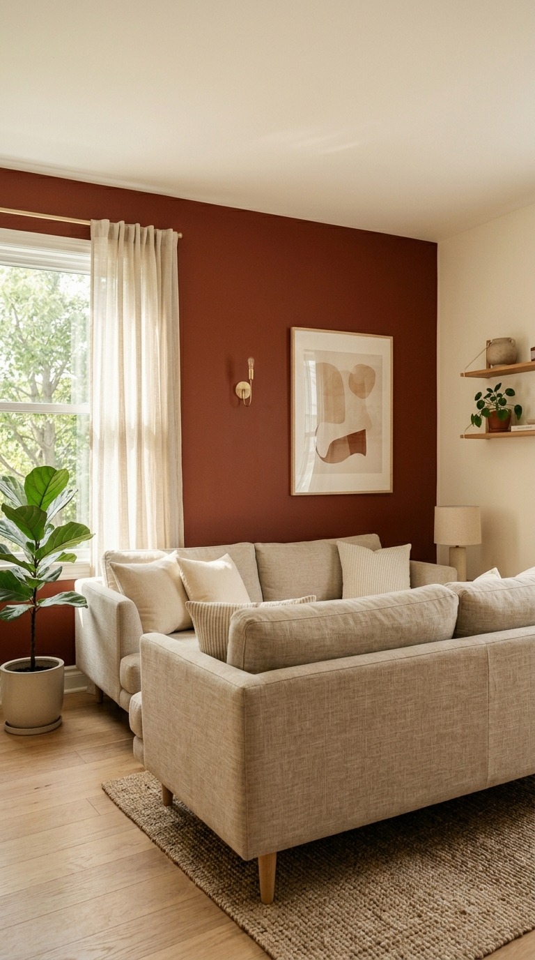
Apply a warm, saturated tone like raw umber, deep clay, or aged terracotta only to that wall. Leave the other three walls a soft cream or warm white. What happens is surprisingly powerful. The room instantly gets depth and direction. Your eye knows exactly where to settle. Furniture feels intentionally placed rather than randomly dropped.
This works especially well in smaller living rooms because the contrast creates a visual illusion of width. And the best part? One wall means one can of paint. Budget-friendly, high-impact, and genuinely cozy.
Floating Furniture — Pull Everything Away from the Walls
This one trips people up every single time. We instinctively push sofas and chairs against the walls to “open up space.” But designers do the opposite. They float the furniture — pulling pieces toward the center of the room.
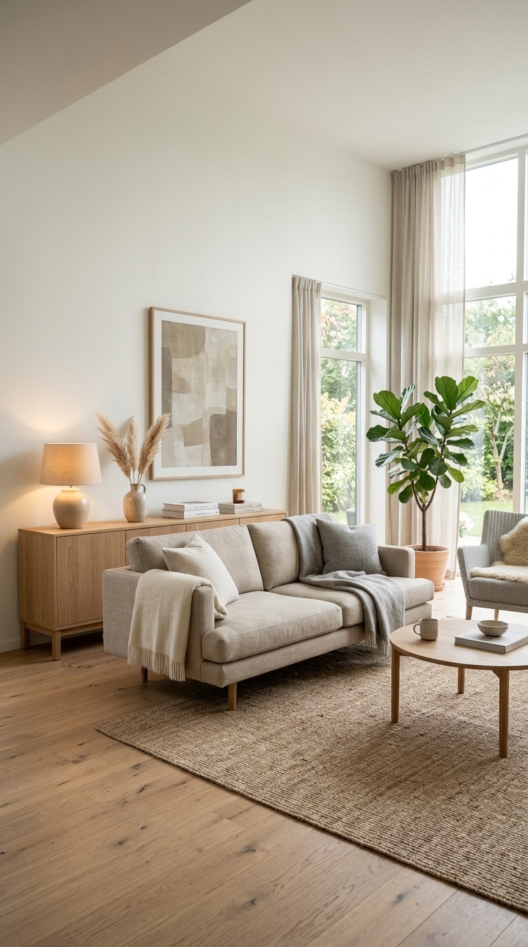
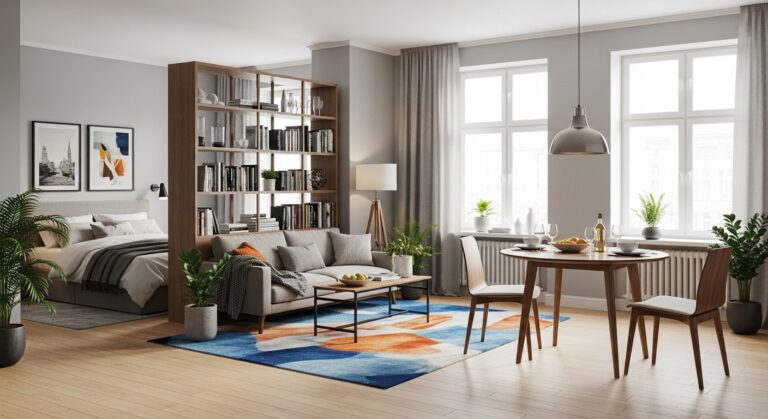
When your sofa sits a foot or two away from the wall, something clicks into place. Suddenly the room has zones instead of one big box. Conversations feel more intimate. The space behind the sofa creates a natural walkway, which makes the room feel larger even though your footprint hasn’t changed.
Add a low console table behind the sofa with a single lamp, and you’ve created a layered, editorial look that photographs and lives beautifully. This one move costs you nothing and transforms the whole room.
The Scent Layer — Your Room’s Invisible Design Element
We spend so much energy on what a room looks like and almost zero energy on what it smells like. But scent is your most powerful mood tool. Walk into a room that smells like cedar, warm amber, or soft sandalwood, and your nervous system registers it as safe and comfortable before your eyes even register the decor.
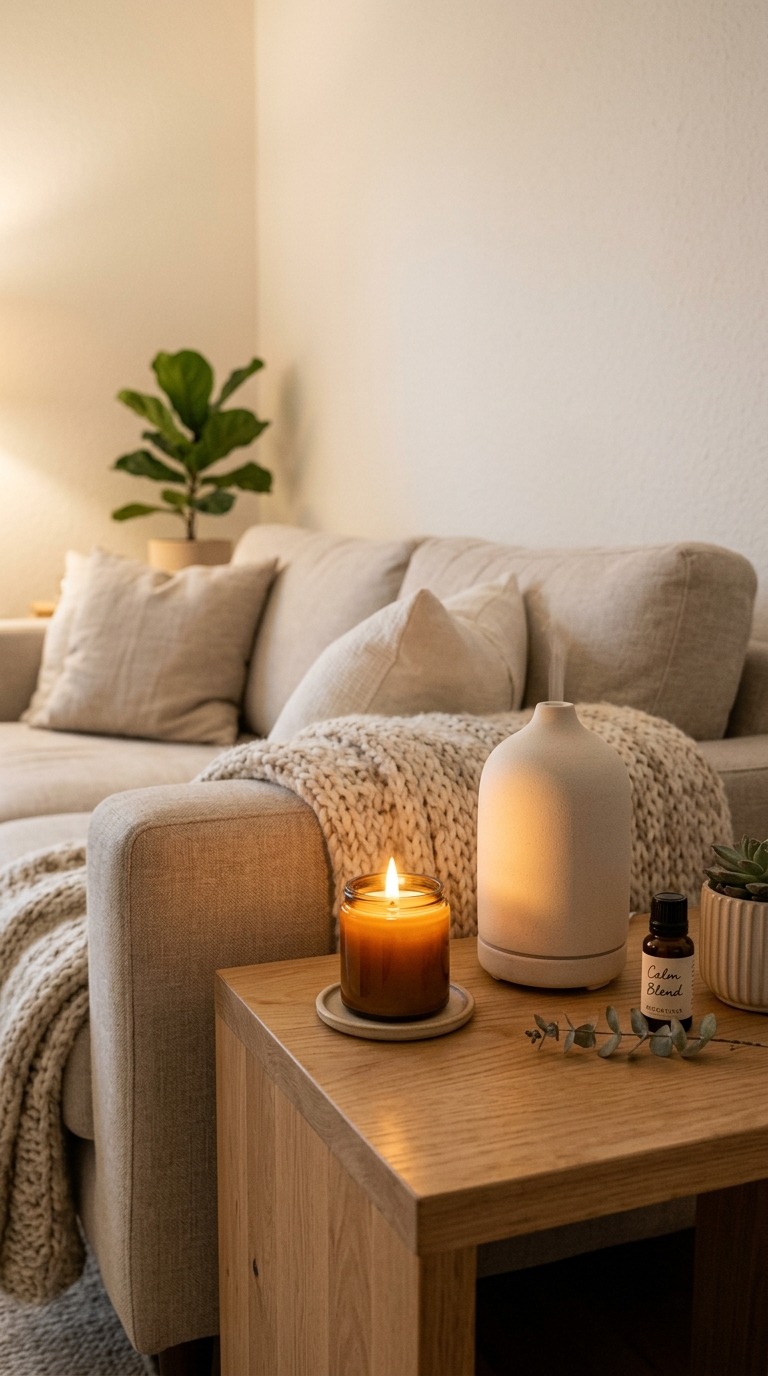
In a cozy minimalist room, scent becomes a design layer. Keep it simple — one consistent signature scent, not a mix of competing candles and sprays. A ceramic diffuser in a neutral tone blends visually while delivering warmth through scent. Beeswax candles burn cleaner than paraffin and add a soft, honeyed glow. A eucalyptus bundle tucked behind a cushion releases scent naturally without looking like a spa cliché.
Your guests won’t know why they feel so at home. But you will.
Arched Architectural Details Without Major Renovation
Arches are everywhere in design right now — and for good reason. A curved doorframe or arched alcove softens the harsh right angles that make minimalist rooms feel sterile. The arch introduces a sense of history, warmth, and deliberate craftsmanship.
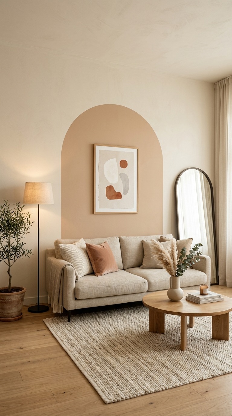
The surprise is that you don’t need to knock out walls. You can add a freestanding arched room screen between the living area and hallway. You can paint a trompe-l’oeil arch directly on the wall behind your sofa — a flat, decorative arch in a tone slightly darker than the wall, framing your artwork like a built-in alcove. Arch-shaped mirrors do the same thing: introduce the silhouette without the construction.
This approach gives your room a boutique hotel quality that no amount of throw pillows can replicate.
The “Negative Space Gallery” — Art That Uses Emptiness
Every cozy minimalist living room needs art. But the way you hang it matters more than what it is. Most people cluster multiple small frames together. Instead, try the negative space gallery — one single piece, hung slightly lower than typical convention suggests, with a lot of breathing room around it.
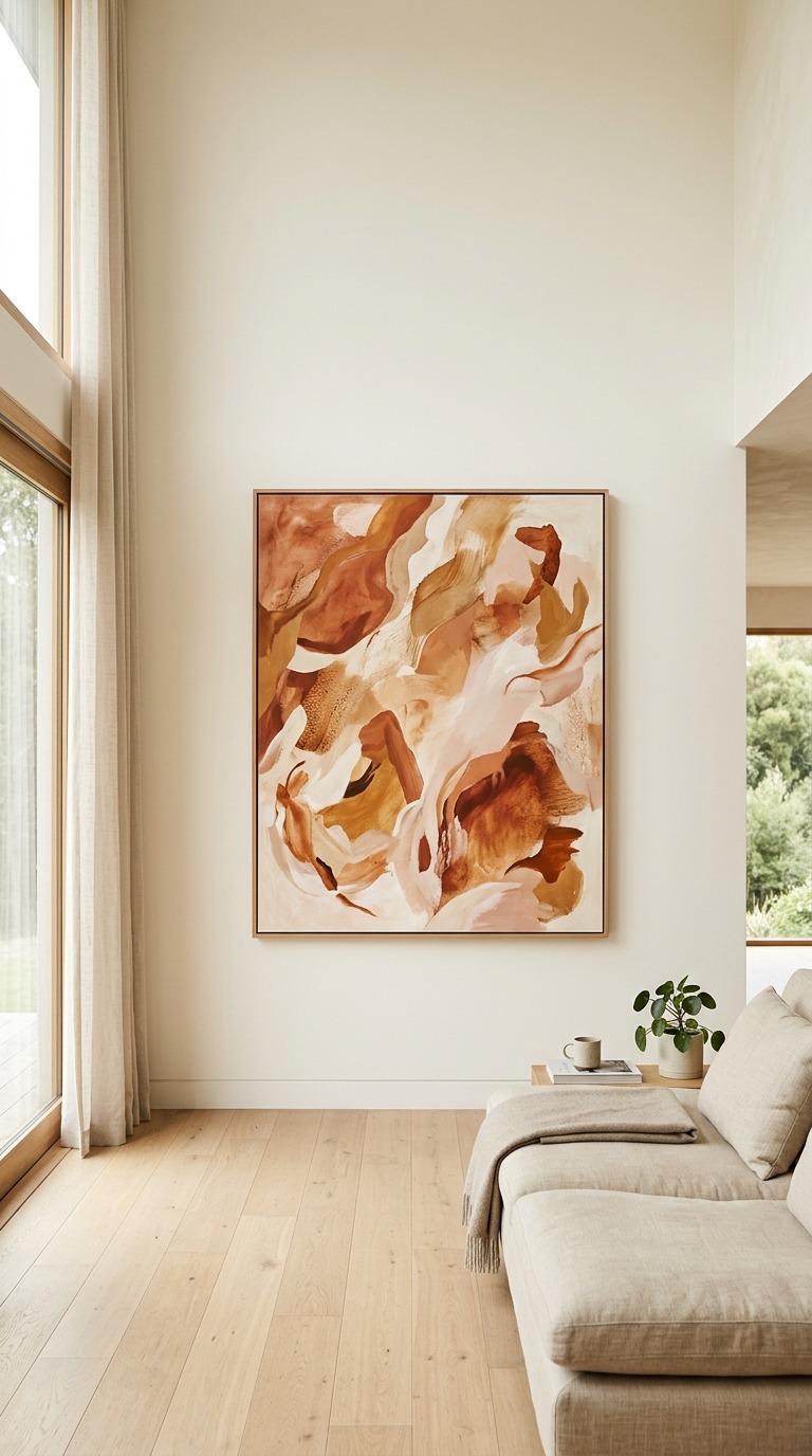
Choose art with a warm background — cream, sand, blush, or aged paper tones. The frame should feel quiet: natural wood, raw clay-toned plaster, or thin brushed brass. The emptiness around it is not wasted wall. It’s the frame. The silence around the art is what makes it feel intentional and elevated.
This approach works especially well above a fireplace mantle or behind a floating console table. And it’s the kind of detail that makes visitors slow down and look — which is exactly what great design should do.
The Layered Rug Technique — Two Rugs, One Cohesive Look
A single flat rug on a hardwood floor can feel a little predictable. The layered rug technique takes the same square footage and makes it feel considered, rich, and warm.
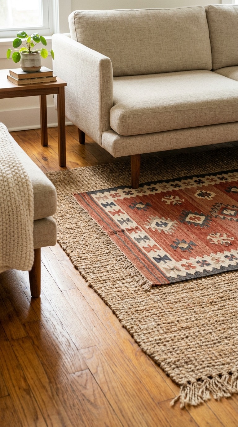
Start with a large, flat-woven natural fiber rug as your base — jute or sisal in a natural tan works perfectly. Layer a second, smaller rug on top — something with a little pile and a slightly warmer tone, like a faded terracotta kilim or a soft boucle runner. The layering creates visual depth and textural interest without adding any furniture or accessories.
The key is contrast in texture, not in color. Keep both rugs in the same tonal family. The result looks like you’ve been slowly collecting beautiful things over time rather than ordering everything from one catalog in one afternoon.
Warm-Glow Lighting Below Eye Level
Most homes use overhead lighting as the default. It fills the room with light, yes — but it also flattens every surface, eliminates shadow, and makes the space feel like a grocery store at 9 PM. Cozy minimalism depends on low, warm light sources.
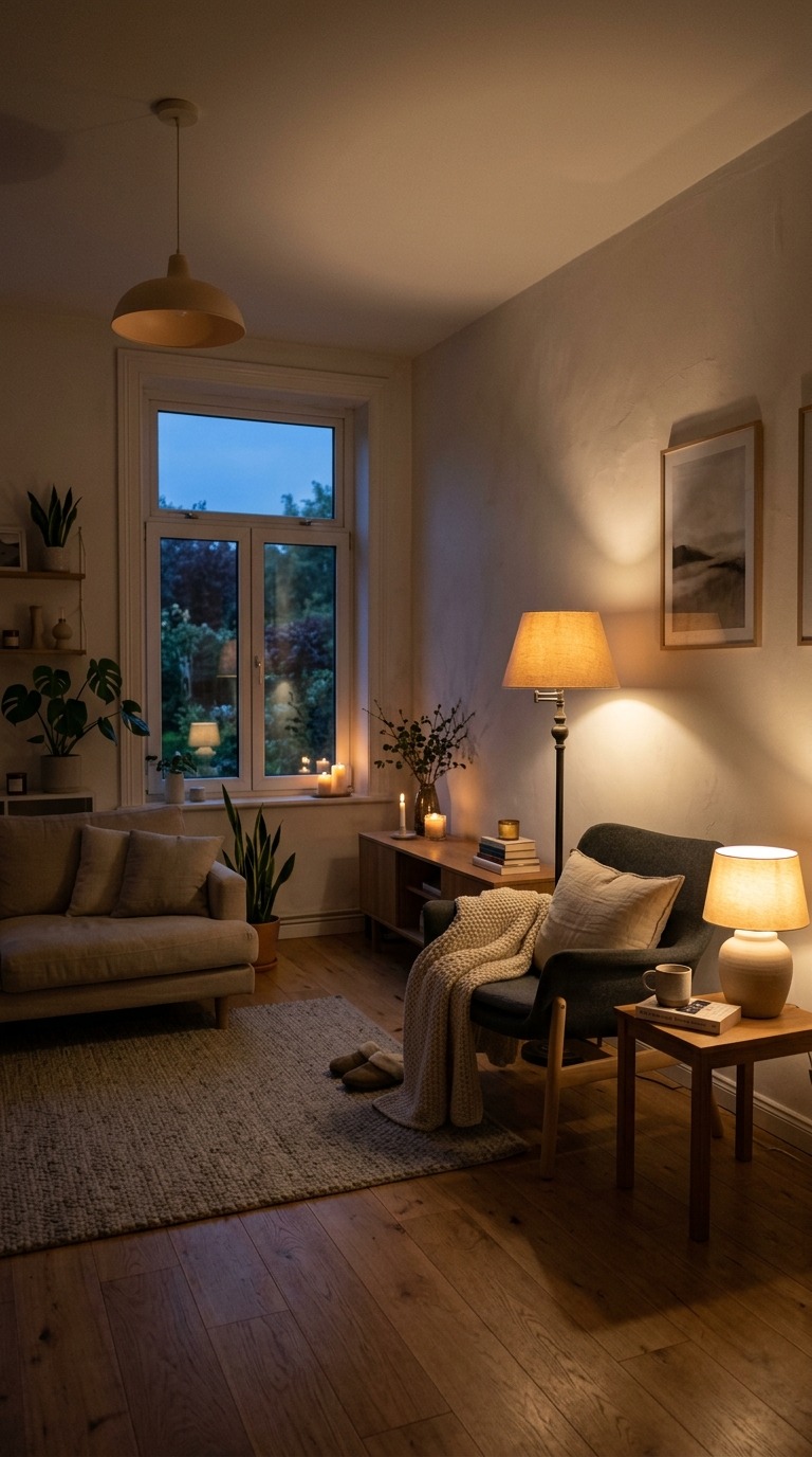
The rule is simple: place at least 70% of your evening lighting below eye level. Table lamps on side tables, a low-profile floor lamp beside the reading chair, LED candles tucked on lower shelves. This creates pools of warm light throughout the room instead of one harsh ceiling wash.
Use bulbs with a color temperature of 2700K or lower — that amber warmth that feels like candlelight rather than fluorescence. Pair this with a dimmer switch on your overhead, so you can drop it to 20% as a fill light in the background. The room transforms from “functional space” to “the place everyone wants to linger.”
The Dedicated “Calm Corner” — One Chair, One Lamp, One Intention
This is one of the most underused ideas in real homes, and it’s devastatingly effective. Pick one corner of your living room — any corner — and dedicate it exclusively to stillness. Not multitasking. Not scrolling. Just one intentional activity, whether that’s reading, journaling, or drinking coffee in silence.
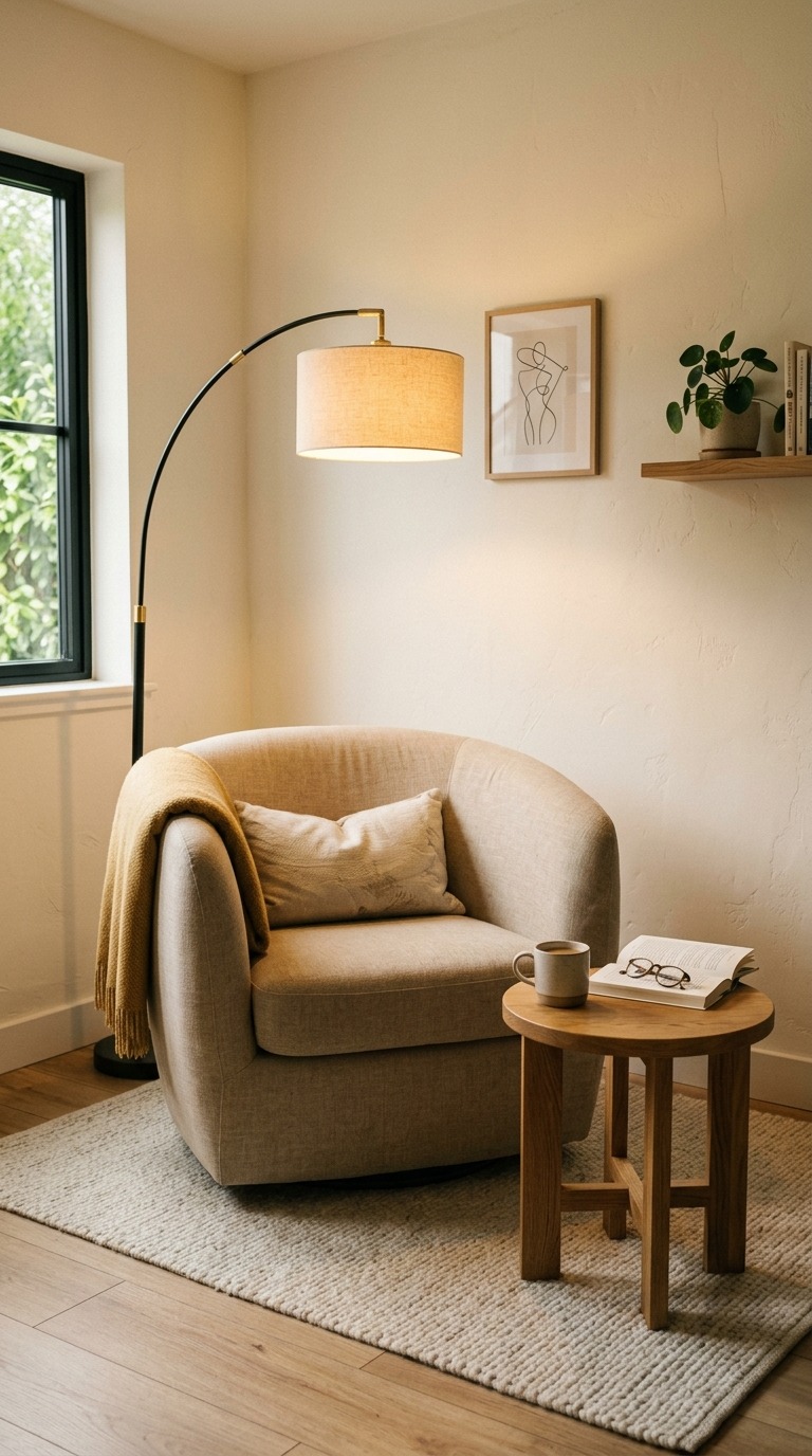
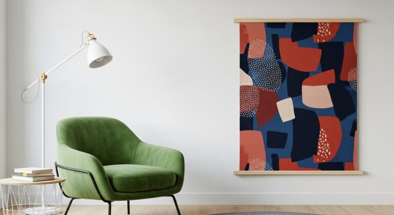
Furnish it with precision: one comfortable armchair with a curved back, one side table low enough to hold a drink and a book, one warm lamp positioned slightly behind and above the chair. Nothing else. No shelf crammed with stuff. No side table covered in remotes and coasters.
The magic of the calm corner is psychological. When you see it, your brain knows exactly what it’s for. It becomes the most magnetic spot in the house — and it takes up only 4 square feet of floor space.
Exposed Shelving With the “Rule of Three Objects”
Open shelving in a minimalist room can go wrong fast. Either it looks too empty and unfinished, or you pile it with things and it becomes visual noise. The rule of three objects solves this elegantly.
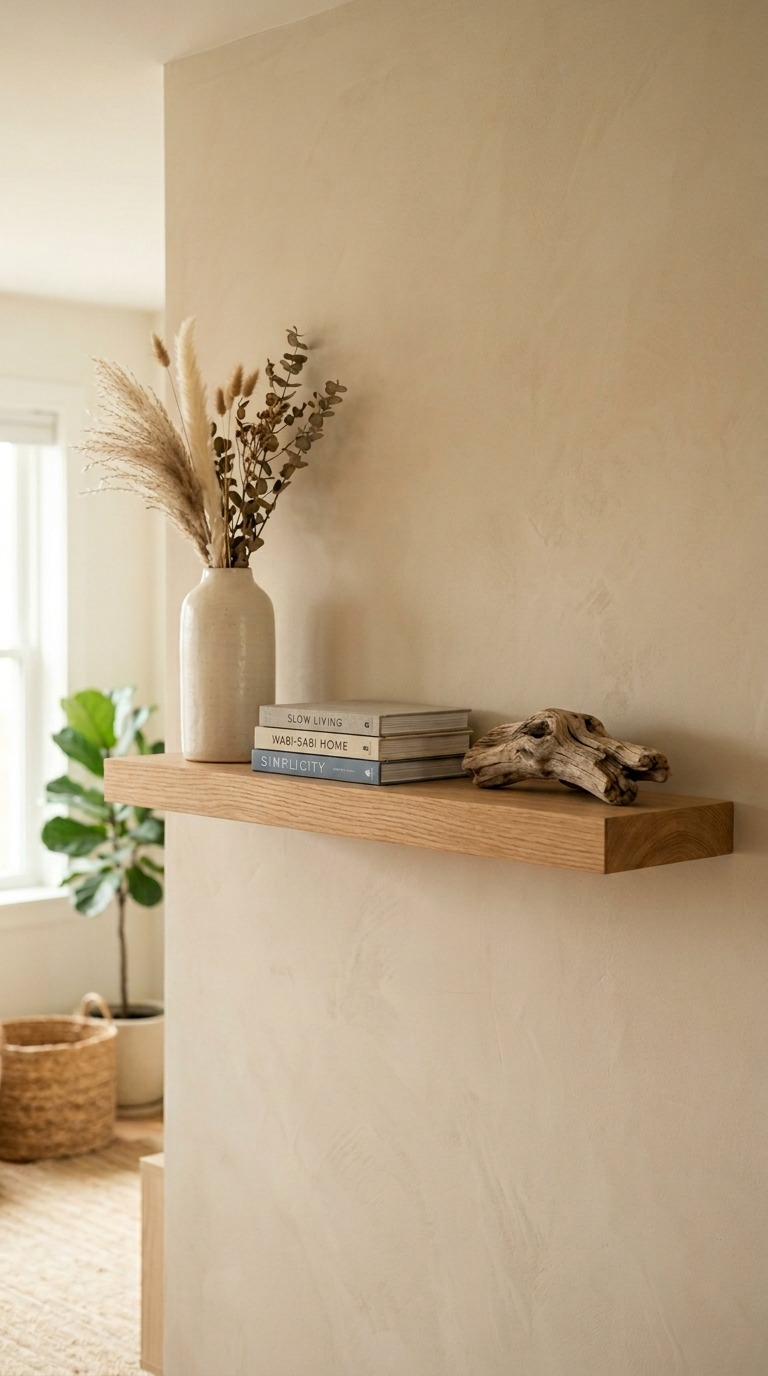
On any given shelf, place only three objects. The grouping works best when those three items contrast in height, material, and shape. A tall ceramic vase (vertical), a small stack of books (horizontal), and one organic object like a smooth stone, a piece of driftwood, or a dried stem (natural). Three things. That’s it. Resist the urge to add a fourth.
When you walk through your space and every shelf follows this rhythm, the room reads as thoughtful and curated — which is the highest compliment cozy minimalism can receive.
Limewash Paint for Textured Walls Without Wallpaper
Flat paint is the default. Wallpaper is the commitment. Limewash sits perfectly in between — and it’s having a genuine moment right now in American interior design.
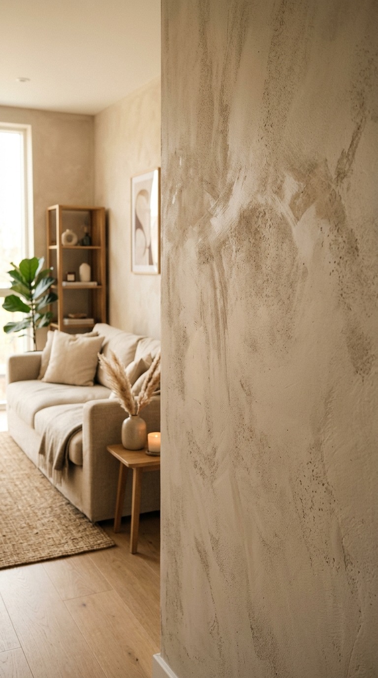
Limewash paint creates a natural, aged, mottled texture on your wall. It looks like the sun has been touching it for decades. The texture catches light differently at different times of day, so your room literally changes mood from morning to evening without you doing anything. In a cozy minimalist room, limewash gives the walls their own quiet personality — so you need even less furniture and decor to make the room feel rich.
You can apply it yourself over a weekend. It’s a thicker wash than regular paint, applied with a broad brush in overlapping strokes. The imperfection is the point. Colors to try: pale mushroom, warm white with a clay undertone, or muted sage green.
The Hidden Media Console — Make Technology Disappear
The television is the design challenge every minimalist eventually faces. A big black screen on the wall competes with every warm, intentional decision you’ve made in the room. Here’s the honest solution: hide it.
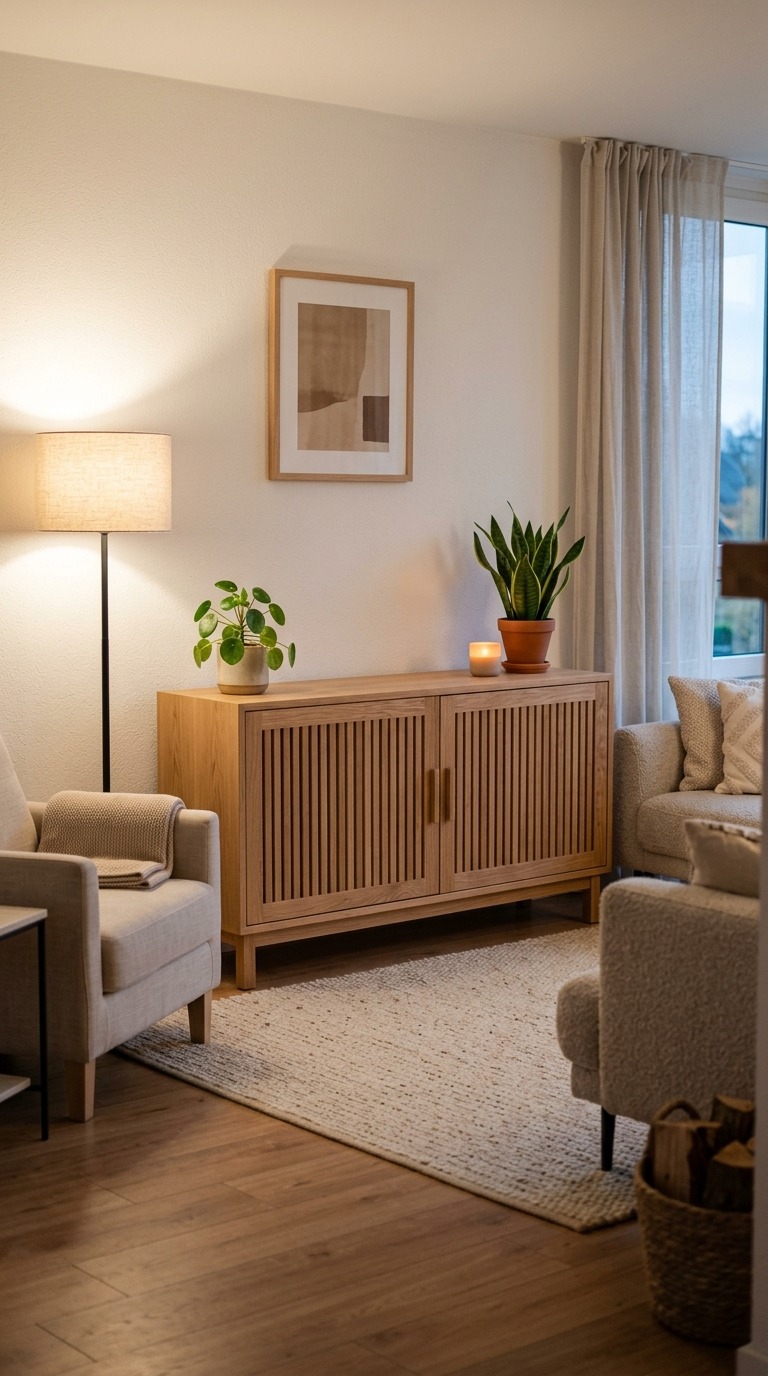
A closed media console with panel doors in a wood finish lets you close everything away when you’re not watching. The room reverts to calm immediately. For smaller budgets, a simple linen TV cover — a panel of linen or muslin on a ceiling-mounted curtain rod — does the same thing and adds softness.
If you’re committed to a wall-mounted TV, flank it with two slim floating shelves at the same height. Style those shelves simply, and the TV reads as one element in a composed grouping rather than the dominant object in the room. The eye distributes its attention rather than locking onto the screen.
The “Borrowed Nature” Window Composition
If your living room has a window with any kind of outdoor view — even a small yard, a tree, or just sky — you can turn that window into a living art piece. Interior designers call this borrowed nature: intentionally framing the outdoors as part of your room’s composition.
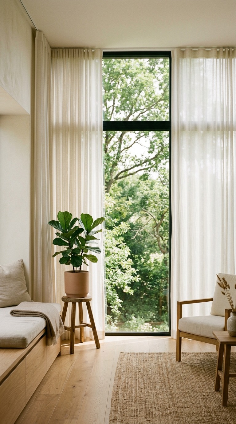
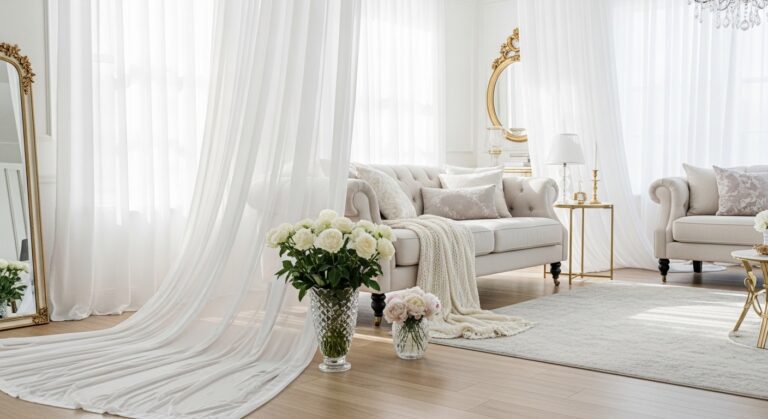
Remove heavy drapes entirely. Swap them for sheer linen panels in warm white or ecru that filter light without blocking the view. Then place one piece of furniture — a low daybed, a window seat cushion, or even just a side table with a single plant — in the foreground. The window becomes the backdrop, the plant becomes the foreground, and your room suddenly has depth and life that no wall art can replicate.
This idea costs almost nothing if you already have the window. And it changes every season naturally without you lifting a finger.
Intentional Empty Floor Space — The Floor as a Feature
Here’s something almost no competitor blog will tell you: in a cozy minimalist room, the floor is a design element, not just a surface. The empty floor space you deliberately leave open is doing real work.
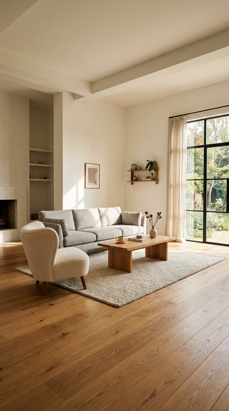
When you clear a generous patch of floor — especially in front of the sofa or beside the reading chair — you give the room room to breathe. Your furniture looks deliberate rather than stuffed in. The rug anchors the seating area while the uncovered floor around it creates margin and calm.
This is counterintuitive because we’re trained to fill spaces. But try it once. Remove one piece of furniture from your living room — the side table that’s always cluttered, the extra pouffe nobody sits on — and live with the empty space for a week. I’d bet you’ll never put it back.
The Tonal Bookshelf — Organize by Color, Not Category
If you have books and you love them, they belong in your living room. But a shelf full of colorful, mismatched spines turns into visual noise that fights every calm decision you’ve made. The solution is tonal organization — arranging your books not by author or genre but by color.
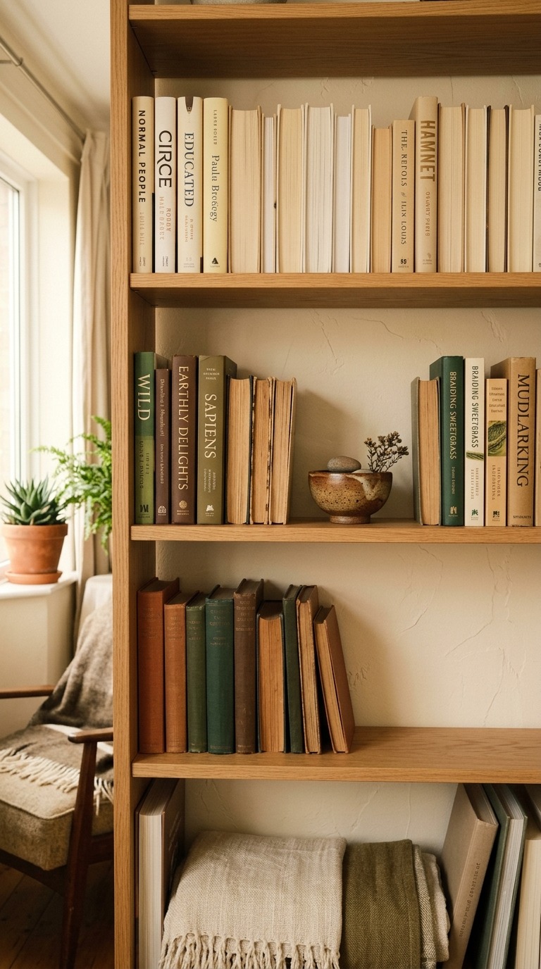
Group all your warm-toned spines together: creams, tans, whites, and pale yellows on one shelf. Dedicate another section to deeper naturals: brown, rust, olive, and forest green. This transforms your bookshelf from a utility storage unit into a piece of quiet visual art. Intersperse a few objects using the rule of three from Idea 9, and the whole shelf becomes a cohesive composition.
Turn some books backward — spine facing the wall, pages facing out — for an instant creamy, uniform texture section. It looks incredibly chic and costs nothing.
The “Morning Light Ritual” Layout
Most people arrange their living room around the television or the most convenient path through the space. But what if you arranged it around the morning light instead? This is a genuinely underrated idea that changes how the room feels to live in every single day.
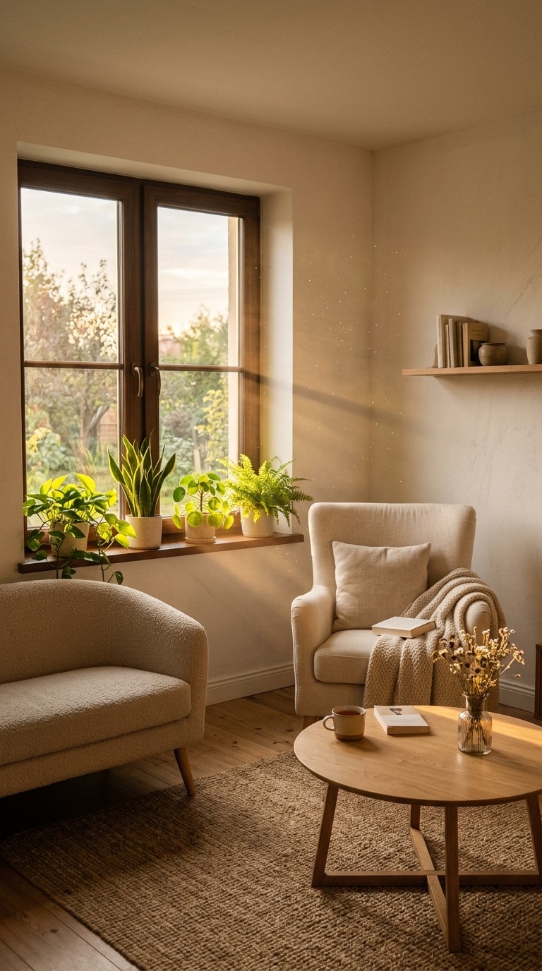
Notice where natural light enters your room in the morning — usually through east or south-facing windows. Then position your primary seating to face or sit within that light. Put your coffee table between the light and the sofa. Place your reading chair directly in the path of the morning sun.
When you arrange the room around the light rather than the screen, your daily routines shift. You naturally gravitate toward the sunlit corner in the morning. You read instead of scroll. You sit quietly instead of turning on the TV. The room does the designing for your lifestyle — not just your wall art.
The Curated “One-Shelf Memory Display”
Cozy minimalism gets accused of being cold and impersonal. This final idea fixes that permanently. Instead of spreading personal objects, photos, and meaningful things throughout the entire room — which creates visual clutter — you dedicate exactly one shelf or one small surface to everything personal.
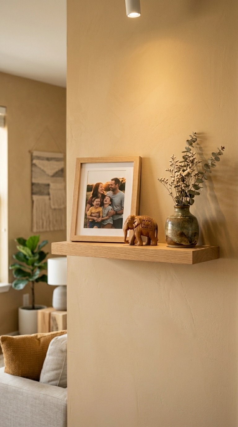
This is your memory shelf. On it: one framed photo that genuinely matters to you, one object you brought back from a trip, one small heirloom or handmade piece. That’s the limit. Three to five things maximum.
When you contain the personal to one spot, it doesn’t compete with the calm of the room. Instead, it anchors it. Anyone who visits sees that shelf and understands instantly that this room is loved and lived in, not just designed. It’s the warmest possible punctuation mark in a space built around restraint.
Final Thoughts
The best cozy minimalist living room isn’t the one that looks most like a design magazine. It’s the one that makes you genuinely slow down when you walk into it. Every idea on this list points toward the same goal: intention over accumulation, warmth over appearance, and living well over decorating well.
Start with one idea that genuinely excites you. Live with it. Then add another. The transformation happens slowly — and that’s exactly how it should feel.