12 Bathroom Shower Tile Ideas That Will Transform Your Space
Have you ever stood in someone’s bathroom and thought, “How did they make such a small space feel this luxurious?” Nine times out of ten, the answer is the tile work in the shower. It’s not the vanity. It’s not the lighting. It’s the tile — and the specific way it was chosen, cut, and placed.
Most people pick shower tiles from a catalog and call it a day. But if you want a bathroom that genuinely looks like a magazine spread, you need ideas that go a little deeper. That’s exactly what this guide gives you — twelve specific, beautiful, and practical shower tile ideas that most renovation articles completely overlook.
Let’s get into it.
The Limewash Effect With Textured Plaster Tiles
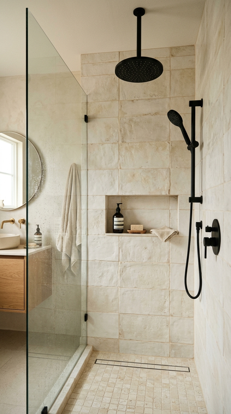
You’ve seen the limewash trend explode in living rooms and bedrooms. But almost nobody brings it into the shower — and that’s exactly why it looks so fresh when you do.
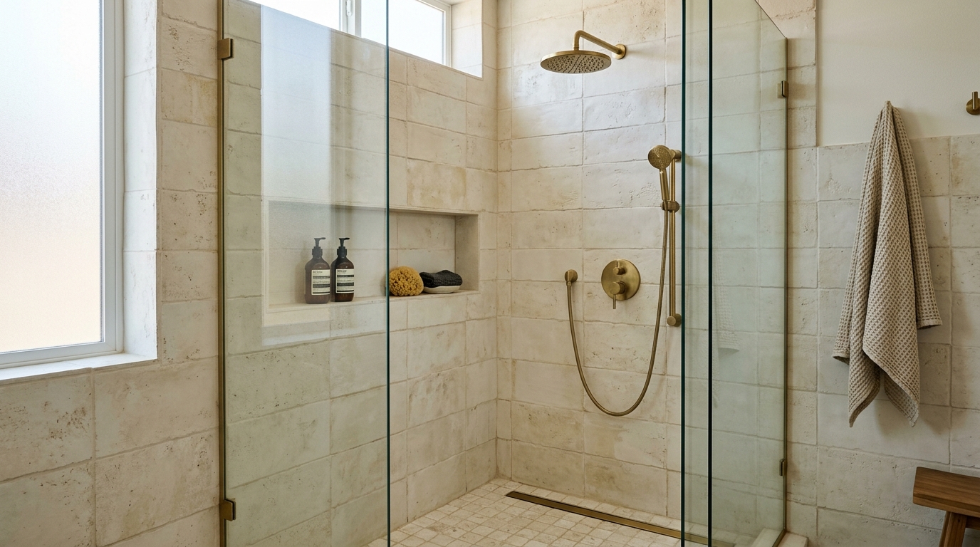
These are plaster-effect ceramic or porcelain tiles with a matte, slightly uneven surface that mimics the aged, handmade quality of Italian limewash walls. They don’t look perfectly smooth. That’s the point.
The beauty of this idea is in the imperfection. Each tile has slight tonal variation — some patches a little darker, some lighter — so the whole shower wall breathes and shifts in the light throughout the day.
- Best colors: Warm white, dusty bone, antique linen, or aged terracotta
- Best grout pairing: Match the grout closely to the tile color — you want the seams to disappear
- Ideal for: Bathrooms with natural wood accents, brushed brass fixtures, or warm pendant lighting
The tile format matters here too. Large format (60×120 cm or bigger) gives you the most dramatic plaster-wall effect. Smaller tiles break up the visual continuity and lose the impact.
Zellige Tiles — But Only on One Wall
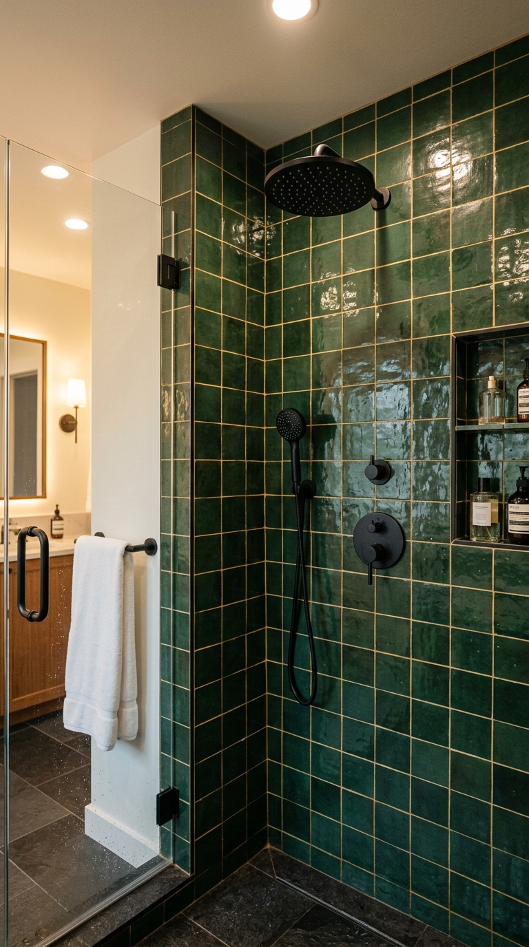
Zellige tiles are handmade, hand-glazed Moroccan tiles with wonderfully irregular surfaces that catch and scatter light in a way no machine-made tile can replicate. They’re genuinely one of the most beautiful materials in the world of tile — but here’s the mistake most people make: they use them on every wall.
Don’t do that. Pick one wall — the back wall of the shower, directly opposite the showerhead — and go full zellige on just that surface. Let the rest of the shower walls stay in a simple, neutral complementary tile.
This creates a natural focal point. When you step into the shower, that one shimmering, jewel-toned wall is the first thing you see. It feels intentional, curated, and incredibly high-end.
- Best colors: Cobalt blue, olive green, warm terracotta, or inky black
- Grout tip: Use a warm gold or dark charcoal grout to enhance the handmade feel
- Watch out for: Zellige tiles are thicker and more irregular than standard tiles — your tiler needs experience with them to get the installation right
Vertical Subway Tiles With a Colored Grout Twist
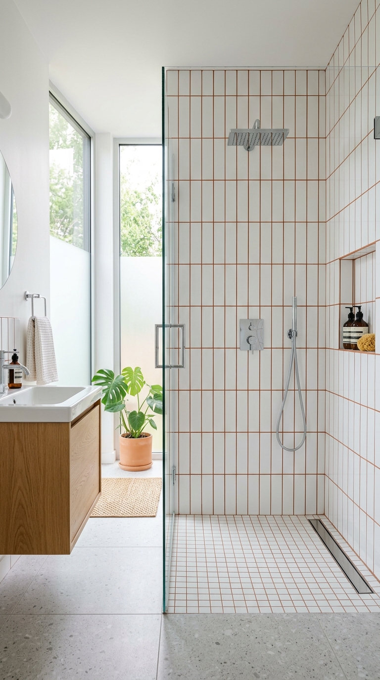
Subway tiles aren’t going anywhere — and they shouldn’t. They’re classic, versatile, and budget-friendly. But the way most people install them (horizontal, white grout) is the most boring version of a genuinely great tile.
Here’s a simple upgrade: lay them vertically, and choose a colored grout.
Vertical installation immediately makes the ceiling feel taller. It’s one of those visual tricks that works on your brain without you even realizing it. And colored grout — even a subtle one like warm sand, sage green, or terracotta — turns the grout lines themselves into a design feature.
- Best tile size for vertical install: Classic 3×6 inch or the slightly larger 4×8 inch
- Grout colors that work brilliantly: Deep navy (with white tile), sage green, warm brick red, or slate gray
- Finish recommendation: Glossy tiles amplify the effect because they reflect more light vertically
This is one of the most cost-effective upgrades on this list — you’re not changing the tile, just the orientation and the grout color.
Raw Concrete-Look Porcelain in a Walk-In Shower
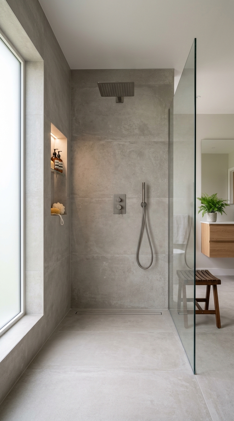
If you have a walk-in shower — or you’re building one — raw concrete-look porcelain tiles are one of the most architecturally stunning choices you can make.
The key word here is porcelain. Real concrete in a wet shower environment is a maintenance nightmare. But high-quality porcelain that looks and feels like concrete gives you all the visual drama with none of the sealing, staining, or cracking problems.
Use the same tile from floor to ceiling, including the shower floor (choose a slightly textured version for slip resistance). This seamless, monolithic approach makes the shower feel like a single sculpted object rather than a collection of surfaces.
- Best size: Large format, 60×120 cm or bigger
- Grout strategy: Use a grout color that exactly matches the tile — minimal grout lines preserve the seamless concrete illusion
- Fixture pairing: Matte black or brushed gunmetal fixtures look exceptional against warm gray concrete tones
Terrazzo Tile Revival — The Retro Look That Feels Modern
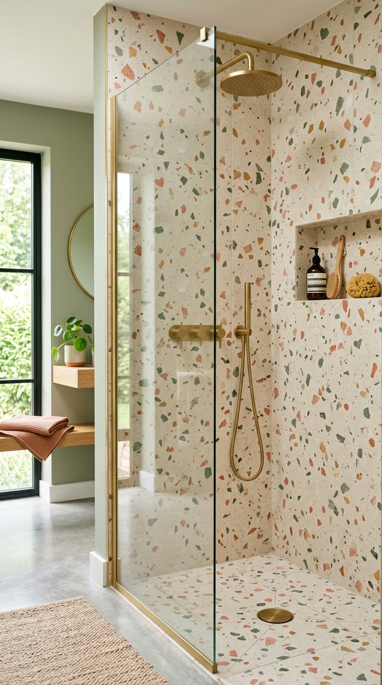
Terrazzo has been around since the 15th century — Venetian workers used marble chips and cement to create floors in palaces. Today, it’s having a full cultural comeback, and it works beautifully in showers.
Modern terrazzo tiles come in porcelain format with printed or inlaid chip patterns. The charm is in the randomness — every tile has a slightly different chip arrangement, so the overall wall has a lively, organic feel that solid-color tiles can never match.
- Best color combinations: Coral and cream, sage and white, black and gold, dusty blue and warm gray
- Tile format: Medium format tiles (30×30 or 40×40 cm) work best — too large and the pattern gets lost
- Where to use it: Particularly beautiful as a floor tile with simpler complementary walls above
Terrazzo also photographs exceptionally well — if that matters to you when you eventually sell your home, this is a tile that shows up beautifully in listing photos.
Arched Niche With Contrasting Mosaic Tile Lining
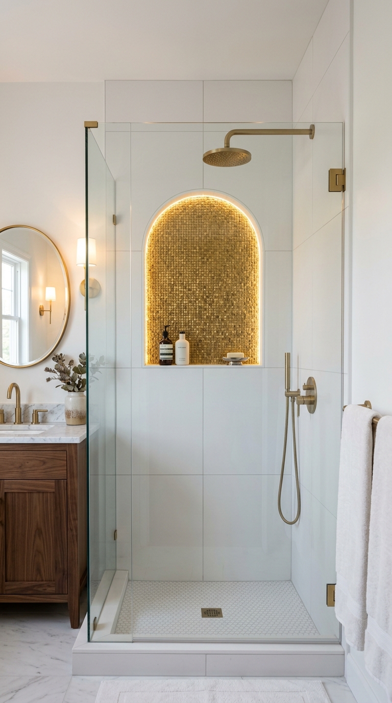
This idea isn’t just about the tile — it’s about creating a moment inside the shower. An arched shower niche (a recessed shelf built into the wall) lined with a completely different, contrasting tile creates a jewel-box effect that makes the whole shower feel curated.
The arch shape alone elevates it above the typical rectangular niche. And when you line the interior with a small mosaic — metallic gold, iridescent mother-of-pearl, or a deep jewel-tone glass mosaic — it catches the shower light in a way that feels genuinely luxurious.
- Best contrasting materials: Glass mosaic, metallic ceramic mosaic, or handmade glazed tile chips
- Niche depth recommendation: 10–12 cm is the sweet spot — deep enough for shampoo bottles, shallow enough to tile cleanly
- Grout for the mosaic interior: Epoxy grout in a complementary metallic or dark shade resists soap scum far better than standard grout
Even in a budget renovation, this single detail can make the entire shower feel expensive.
Black Hex Tiles on the Floor With White Walls
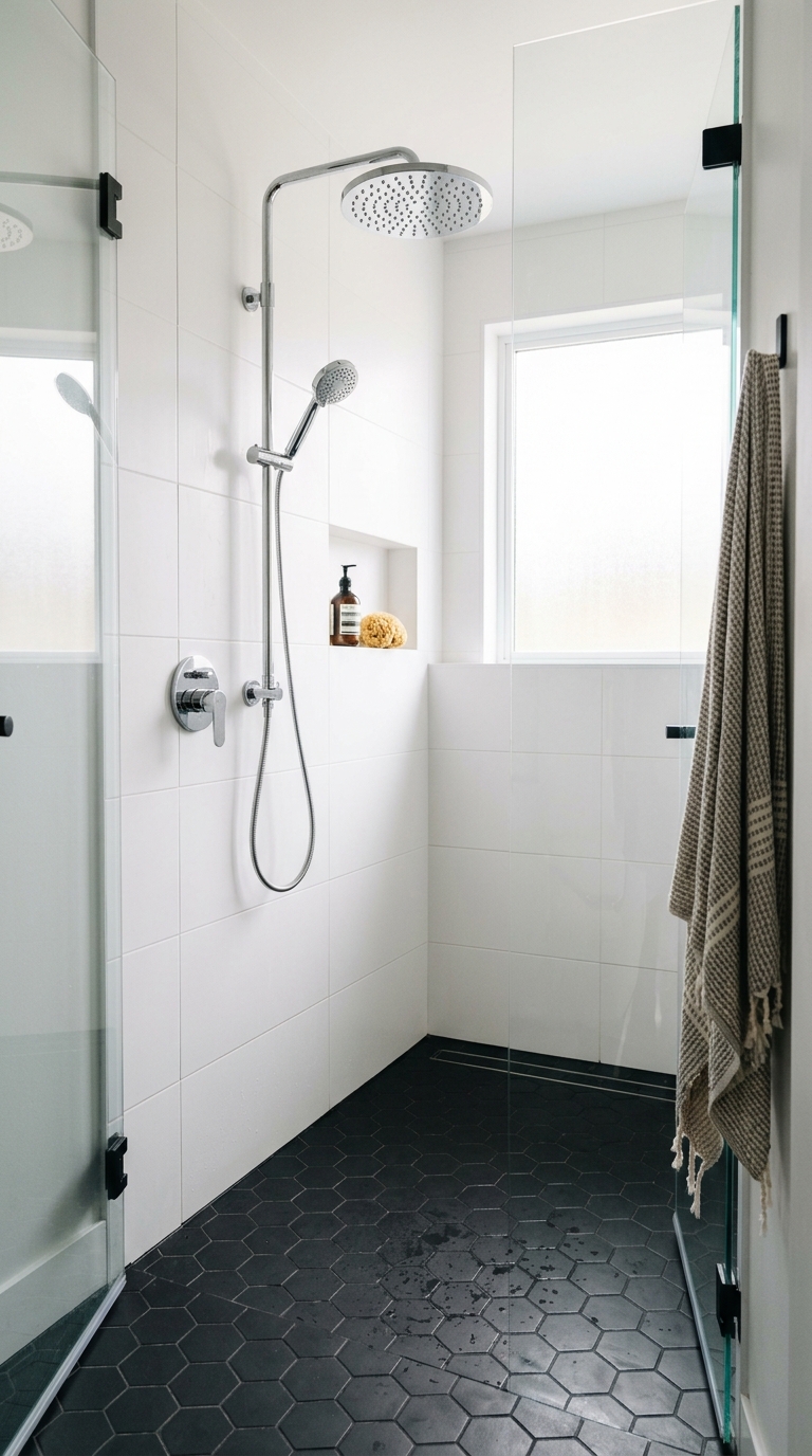
The black-and-white contrast will never go out of style — but the specific combination of black hex floor tiles with clean white walls feels especially fresh right now. It’s a bathroom equivalent of a tuxedo: timeless, sharp, and inherently elegant.
Hexagonal tiles on the floor serve a practical purpose too — all those grout lines mean excellent slip resistance without needing a rough surface texture. And the geometric pattern adds visual interest right at the point where most shower floors are completely boring.
- Best hex size: Small format (2.5 cm or 5 cm) for maximum pattern impact and best slip resistance
- White wall tile pairing: Large format matte white or bright glossy white both work — they just create different moods
- Grout color for black hex: Dark charcoal grout keeps the bold graphic quality; white grout softens it toward something more playful
This combination also photographs beautifully and appeals to an extremely wide range of buyers if resale is on your mind.
Handmade Ceramic Tiles With Visible Thumb Prints and Organic Edges
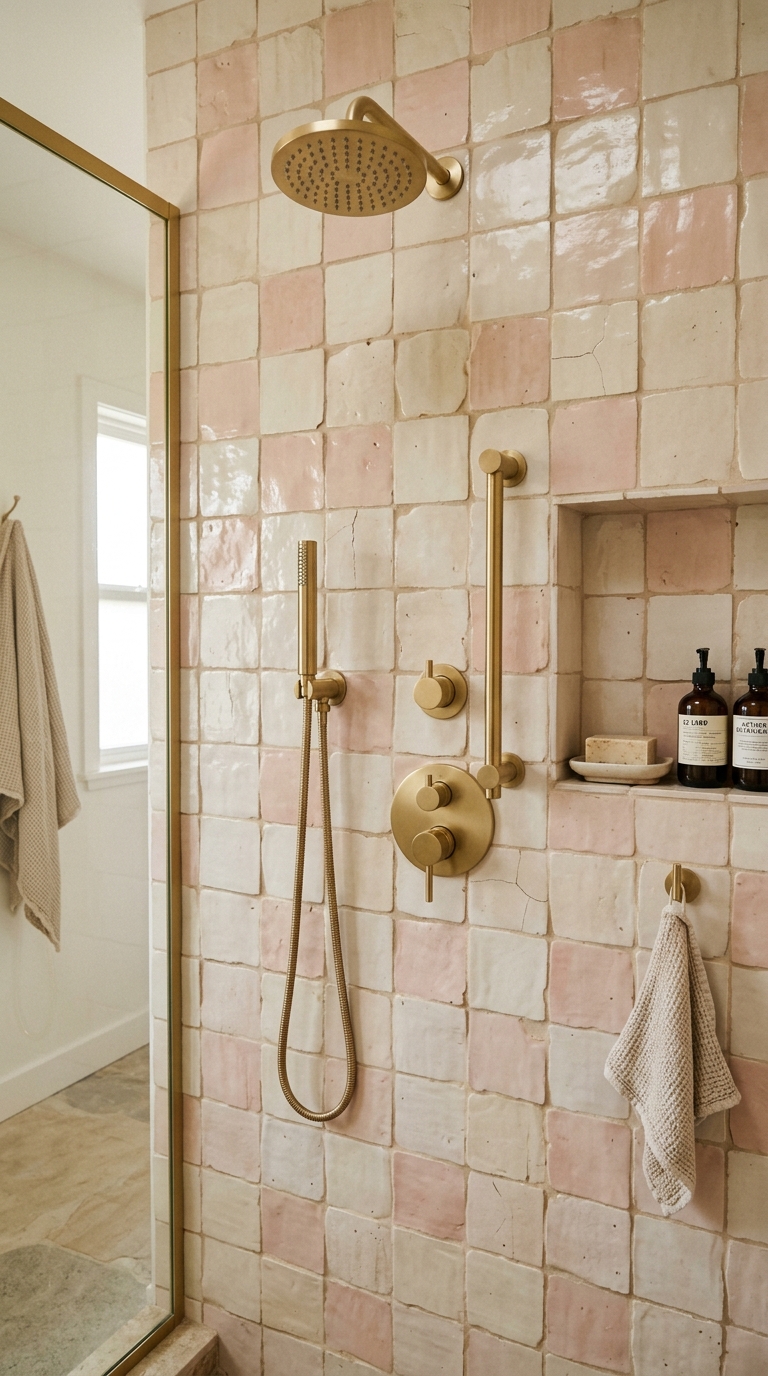
There’s a growing movement in interior design toward celebrating human imperfection — and nowhere does it show up more beautifully than in handmade ceramic tiles.
These tiles are literally shaped and glazed by hand. You can see the slight irregularity in the edges, the variation in the glaze thickness, the fingerprints pressed into the surface before firing. Every single tile is different. And that’s what makes them extraordinary.
In a shower, these tiles create a wall that feels alive. The glaze variation means the surface shifts from matte to slightly glossy depending on how light hits it. No two showers tiled this way will ever look identical.
- Where to source: Look for small-batch ceramic studios, Portuguese or Spanish makers, or boutique tile importers
- Best colors: Soft blush, warm ivory, sage green, dusty sky blue, earthy terracotta
- Important installation note: Handmade tiles need an experienced tiler who understands how to work with size variation — standard installation techniques don’t apply
Fluted (Ribbed) Tiles — A Texture That Changes Everything
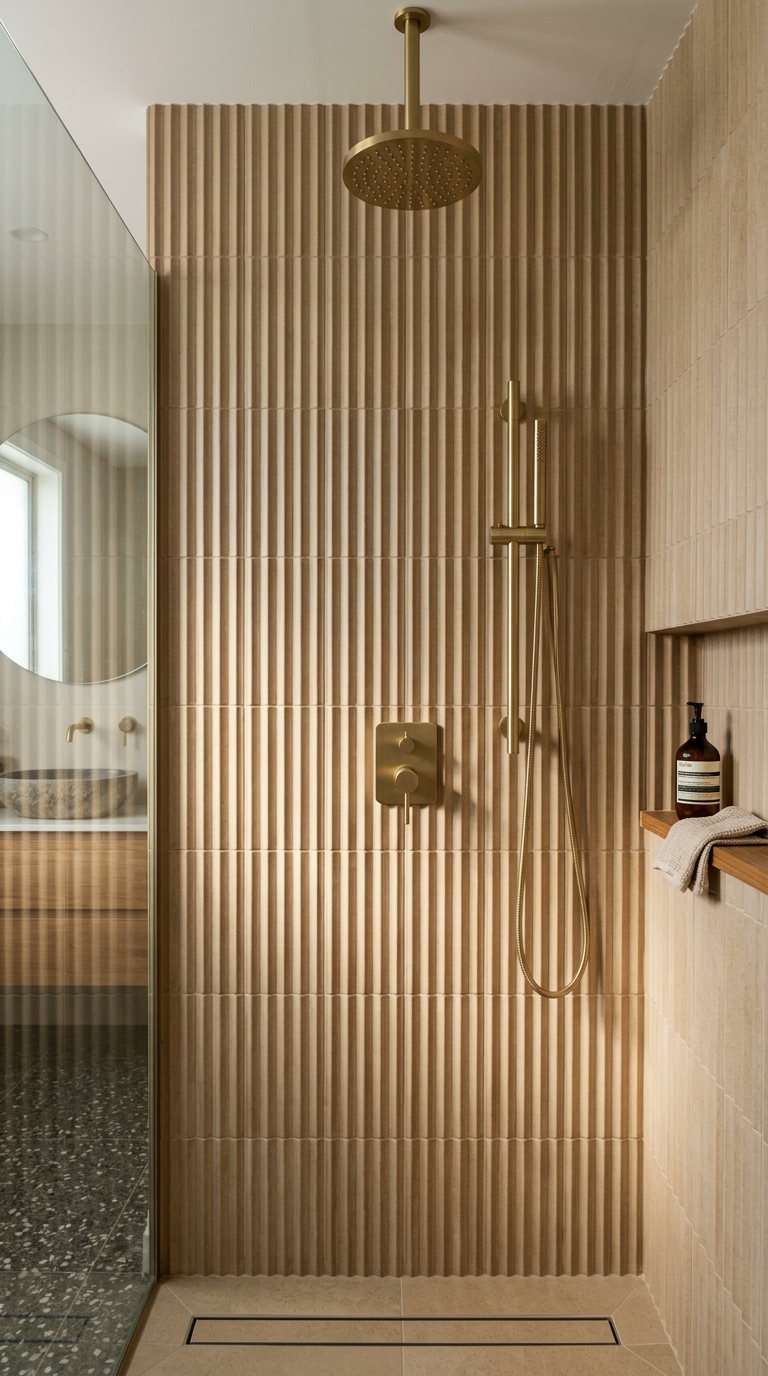
Fluted tiles have vertical ridges running across the face of the tile, creating a dimensional, sculptural texture that transforms flat bathroom walls into something that feels three-dimensional.
The magic of fluted tiles is in the light. As natural or artificial light moves across them throughout the day, the ridges cast shifting shadows that make the wall look alive. In the morning, the shadows are long and dramatic. Under even vanity lighting, they’re subtle and sophisticated.
- Best orientation: Vertical ridges running top-to-bottom feel most natural and make walls feel taller
- Best finish: Matte is more architectural; glossy creates more reflective light play
- Where they work best: Full back wall of a walk-in shower, or as a half-height feature band running around the shower perimeter
Fluted tiles work especially well in bathrooms with warm lighting — the ridges amplify the warm tones and create an almost spa-like atmosphere.
Color Blocking — Two Tile Colors, One Clean Line
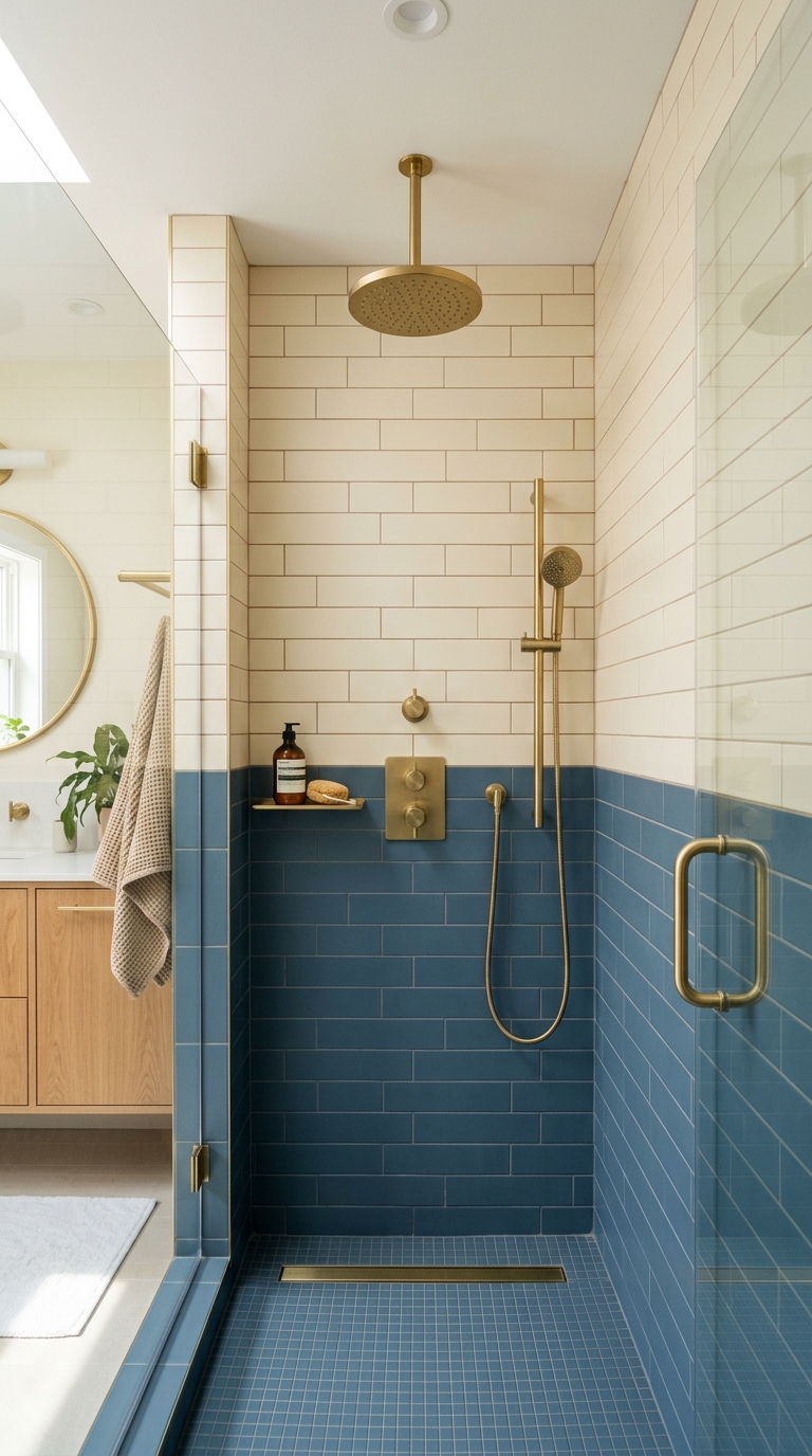
Color blocking in interior design means using two or more clearly defined, contrasting colors with a sharp, intentional boundary between them. In a shower, it’s one of the most sophisticated and under-used techniques available.
The simplest version: use one tile color for the bottom two-thirds of the shower walls, and a different, complementary tile color for the upper third. A single clean horizontal line divides them. That’s it. The result looks incredibly considered and architectural.
- Best color pairings: Deep navy + warm white, sage green + soft pink, charcoal + sand, terracotta + ivory
- The dividing line: Use a slim metal trim strip (brass or chrome) at the transition point — it gives the color change a crisp, professional finish
- Proportion tip: A 60/40 split (dark below, light above) feels more grounded than a 50/50 split
You can use the same tile format on both sections, or choose two different textures that share a color family — for example, a matte terracotta below and a slightly glossy complementary tone above.
Large Format Stone-Look Tiles With Bookmatched Veining
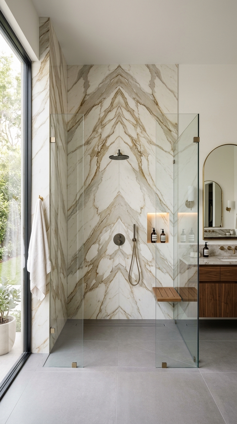
Bookmatching is a technique borrowed from natural stone fabrication: you take two adjacent slabs cut from the same block of stone and open them like a book, so the veining mirrors itself perfectly across the center line. The result looks like butterfly wings made of marble.
You can now get porcelain tiles that digitally replicate this effect. When you install them correctly — aligning the veining pattern so it flows continuously from one tile to the next — the shower wall looks like it was carved from a single enormous slab of stone.
- Why porcelain over real marble: Real marble stains easily in showers, needs regular sealing, and etches from acidic products. Porcelain gives you the look with none of the maintenance
- Critical installation step: Lay the tiles out dry on the floor before installation to plan the vein continuity — this is a non-negotiable step for bookmatched designs
- Best fixture pairing: Warm brushed brass or polished nickel both work beautifully with veined stone tones
This is the tile choice that makes people gasp when they walk into your bathroom.
Mixed Material Accent Band — Combining Two Tile Types in One Shower
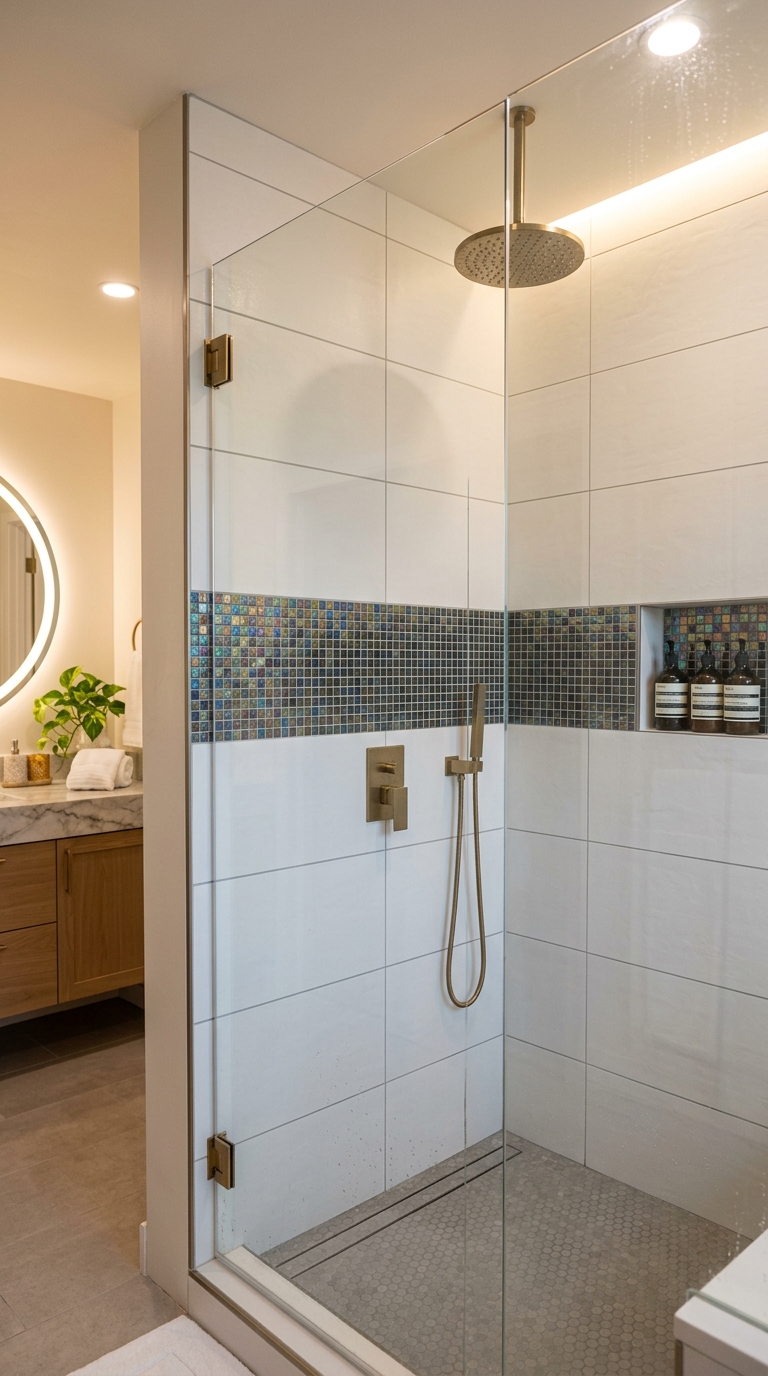
The final idea is about intentional contrast within a single shower. Instead of choosing one tile and using it everywhere, you use a primary tile for the majority of the wall, and introduce a completely different tile material as a single horizontal band running around the shower at eye level.
This accent band can be a glass mosaic, a metallic strip, a row of handmade ceramic, or even a band of natural stone. The key is that it runs continuously around the perimeter of the shower — wrapping all four walls — creating a visual belt that grounds the whole design.
- Best accent band height: Eye level (about 150–160 cm from the floor) works best — it’s the first thing you see at natural standing height
- Width of the band: 15–20 cm is ideal — wide enough to make a statement, narrow enough to feel deliberate rather than chaotic
- Best combinations: Matte white large format + iridescent glass mosaic accent; concrete gray + metallic bronze mosaic; cream stone look + handmade terracotta band
This approach is also wonderfully forgiving from a budget perspective — you can use a more affordable primary tile for the bulk of the wall and spend more on the accent band where it matters most visually.
Bringing It All Together
The best shower tile decisions come from one simple principle: choose one idea and commit to it fully. The showers that look stunning aren’t the ones with the most tile types — they’re the ones where a single, well-executed concept runs consistently from floor to ceiling.
Whether you’re working with a tight budget and going with vertical subway tiles and colored grout (Idea 3), or planning a dream renovation with bookmatched stone-look porcelain (Idea 11), the approach is the same: be intentional, trust the concept, and don’t hedge.
Your shower is one of the few spaces in your home where you’re completely surrounded by a single design environment every single day. Make it count.