15 Minimalist Living Room Ideas for Small Spaces That Actually Work in Real Life
Have you ever walked into a tiny living room and thought, “This feels so open — how did they do that?” It’s not magic, and it’s definitely not about buying expensive furniture. It’s about a set of smart, intentional choices that most people never think about until someone shows them. That’s exactly what this guide is here for.
Small spaces don’t have to feel tight, cluttered, or compromised. With the right minimalist approach, your little living room can feel calm, stylish, and surprisingly generous. These 15 ideas go beyond the basics you’ve already seen a hundred times — no generic “paint it white” advice here. We’re going deeper, getting more specific, and giving you things you can actually use today.
Why Minimalism Works So Well in Small Living Rooms
Here’s the honest truth: minimalism isn’t about owning nothing. It’s about owning the right things and placing them intentionally. In a small space, every design choice either opens the room up or closes it down. There’s no neutral ground. That pressure is actually a gift — it forces you to be creative in ways that people with large rooms never have to be.
When you nail minimalism in a small living room, you end up with something most large rooms can’t achieve: a feeling of complete purpose. Nothing is there by accident. Everything earns its place. That’s a powerful thing to live inside every single day.
Use a Single Curved Sofa to Define the Whole Room
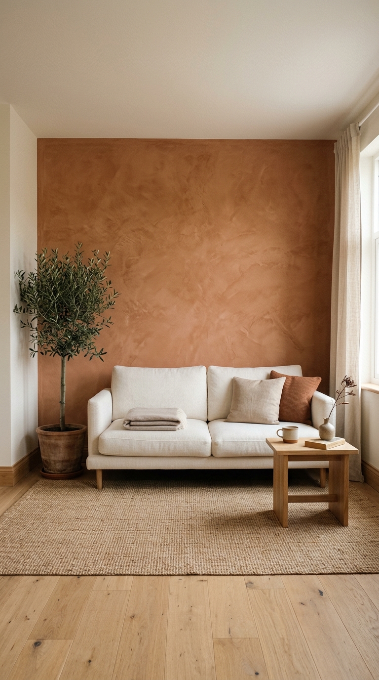
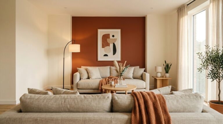
Most people in small spaces reach for the smallest sofa they can find, which often results in a room that looks underfurnished and awkward. Here’s a counterintuitive move that actually works better: one statement curved sofa that defines the entire space.
A curved sofa does something straight sofas can’t — it breaks the boxy feeling of a small room. The organic shape softens the visual noise of sharp corners and walls, and it creates an instant focal point without needing anything else around it. You walk in and your eye lands on it, then rests. That’s exactly what a minimalist room should do.
- Choose a curved sofa in a single solid tone — terracotta, oat, or dusty rose work beautifully
- Keep it away from the wall by just six inches — this trick alone makes the room feel larger
- Skip the coffee table completely and use a single round side table instead
- Let the sofa be the statement; resist the urge to add more seating
Real talk: I’ve seen studio apartments where a well-placed curved sofa made a 200-square-foot space look like it belonged in an architectural magazine. The curve is doing more visual work than you realize.
Try a “One Material Ceiling-to-Floor” Accent Wall
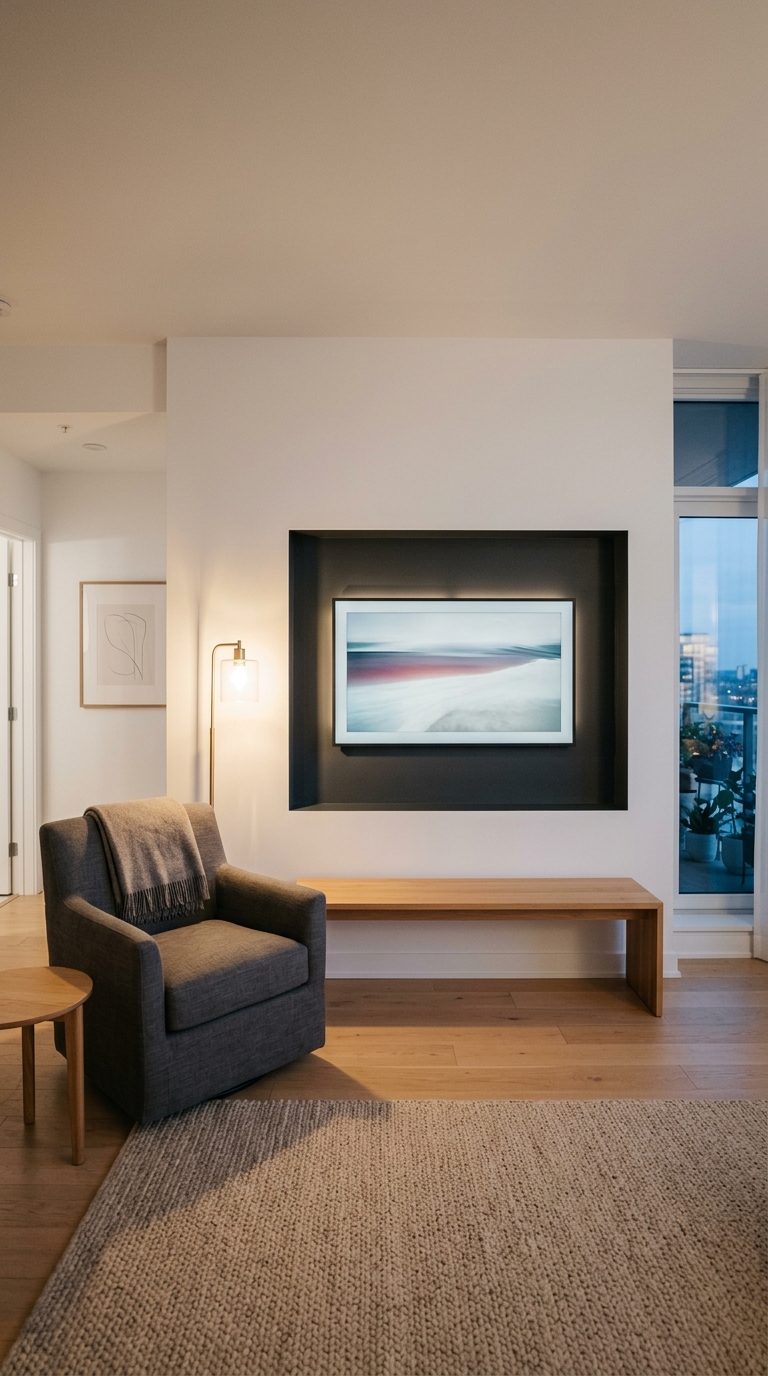
Everybody talks about accent walls with paint. We’re going further. Pick one wall and commit to a single material — limewash plaster, thin wood slats, or large-format stone-look tile from floor to ceiling. One material, one wall, zero distractions.
This approach works so well in small spaces because it creates depth through texture instead of pattern. Your eye reads the surface as interesting without being overwhelmed, and the room feels more curated than a simple paint job ever could. It’s the kind of detail that makes people walk in and immediately think “whoever lives here has taste.”
- Limewash plaster is the most affordable option and you can DIY it in a weekend
- Thin vertical wood slats make the ceiling feel higher — a game changer in rooms under 9 feet
- Avoid wallpaper with patterns; texture yes, pattern no in a small minimalist space
- Keep everything else on the other three walls completely bare
This works because the eye has one dramatic thing to look at, processes it, and then relaxes. Visual chaos is the enemy of small spaces. This gives you visual interest without the chaos.
Replace Your TV Stand With a Recessed Wall Niche
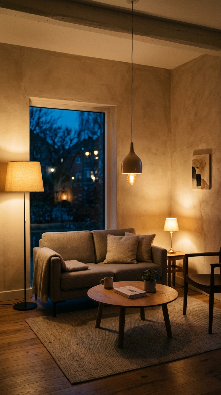
The TV stand is one of the biggest space eaters in small living rooms, and almost everyone just accepts it as a given. You don’t have to. A recessed wall niche — essentially a shallow cut-out in the wall — eliminates the stand completely and makes your TV feel like it belongs to the architecture of the room rather than sitting on top of it like an afterthought.
If you’re renting, this isn’t an option. But if you own, this single renovation will change how your entire living room functions. Paint the inside of the niche a contrasting darker tone so the TV blends in when off and the niche becomes a shadow box — beautiful even when you’re not watching anything.
- The niche only needs to be about 4 to 6 inches deep — no major structural work required
- Run all cables inside the wall during construction for a completely clean look
- Add a thin LED strip inside the niche for ambient backlight that reduces eye strain
- Use the niche for the TV only — no shelves, no decor, just the screen
The psychological effect here is significant. When your TV has a home inside the wall rather than sitting on furniture, the room immediately feels more intentional. It’s a small detail that signals “this space was designed, not just assembled.”
Layer Your Lighting in Three Zones, Not One
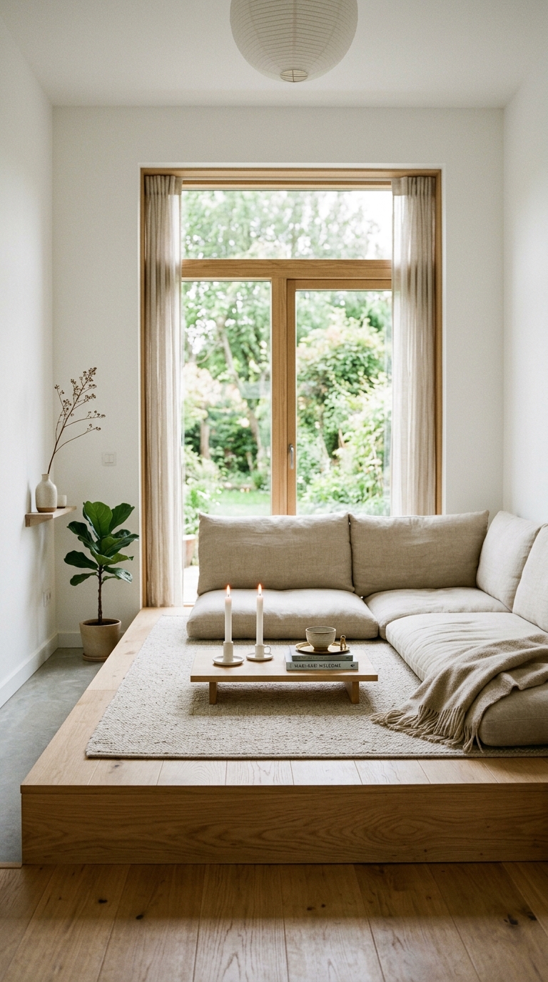
Most small living rooms rely on one overhead fixture, and that single source of light is silently making the room feel smaller and flatter than it needs to. Lighting layers are not just about aesthetics — they’re a spatial tool. When you create multiple pools of warm light at different heights, your brain reads the room as larger and more complex.
The three-zone approach is simple: high light (a pendant or sconce), mid light (a floor lamp or tall lamp behind furniture), and low light (a small table lamp at sitting height). Each zone serves a different time of day and a different mood. Together, they give your small room depth you can literally feel.
- Use only warm bulbs — 2700K to 3000K color temperature — in a small minimalist space
- Keep the overhead ceiling light on a dimmer or skip it entirely during evenings
- A floor lamp tucked behind your sofa creates a halo effect that looks expensive
- All three sources together should give you the same brightness as one harsh overhead — just distributed more beautifully
This is one of those ideas that sounds almost too simple until you try it one evening. The first time you sit in your small living room with three warm light sources glowing instead of one bright overhead, you’ll wonder why you ever lived any other way.
Go Completely Legless With a Platform Seating Setup
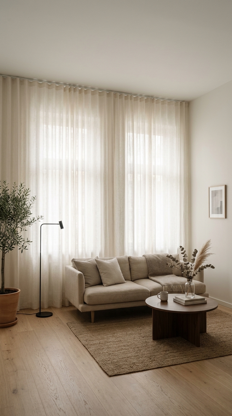
Platform seating — where your seating sits directly on a raised wooden platform at floor level — is one of the most underutilized ideas in Western minimalist design. It comes from Japanese living culture, and it works spectacularly well in small spaces because it eliminates the visual noise of furniture legs entirely.
When you remove legs from the visual equation, the floor reads as one continuous surface. That continuity makes the room feel longer, wider, and calmer. Add custom cushions in a single linen tone and you’ve created a seating setup that looks like it was designed by a professional for a fraction of the cost.
- Build the platform from plywood with a thin oak veneer — simple and affordable
- Keep the platform height at 8 to 10 inches maximum for comfort
- Use the space underneath the platform for hidden storage — cut-out drawers work perfectly
- Pair with floor cushions that can stack against the wall when not in use
This approach works especially well in apartments where the living room doubles as a guest sleeping space. The platform becomes a low bed with cushions pulled out — zero extra furniture required.
Use a Floor-to-Ceiling Curtain to Hide Storage, Not a Wall
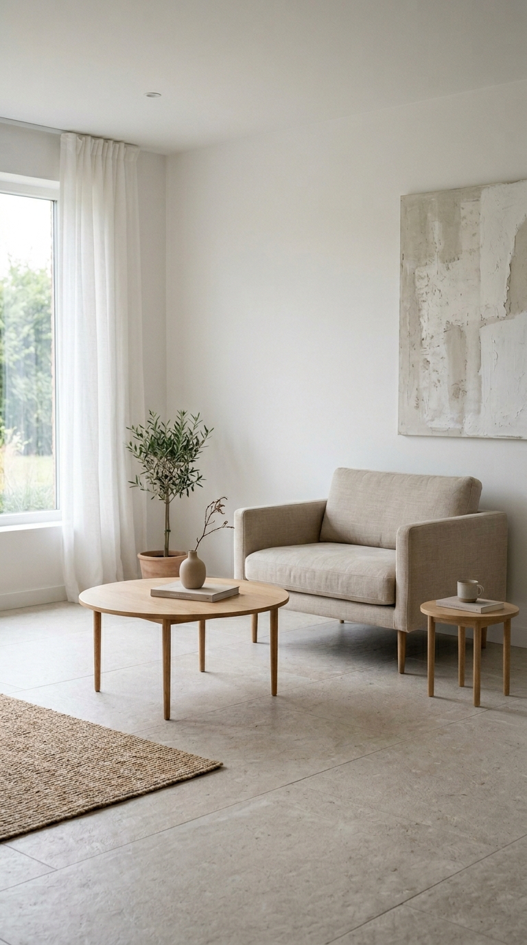
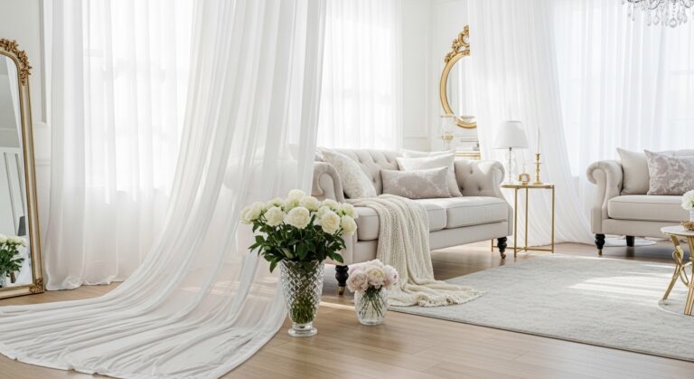
Here’s one that almost nobody does but should: instead of showing your storage wall — shelves, cabinets, closets — hide the entire thing behind a single floor-to-ceiling curtain rod with linen panels. The curtain covers everything and transforms what would be a cluttered wall into a seamless, soft surface.
The visual trick here is powerful. A continuous panel of fabric hanging from ceiling to floor makes the wall look taller than it is and gives the room a softness that neither paint nor wallpaper can match. Behind the curtain, you can store whatever you need — no judgment, no visual clutter.
- Mount the rod as close to the ceiling as possible — this is crucial for making ceilings feel higher
- Use linen or cotton voile in a tone that’s slightly lighter than your wall color
- The curtain should be 20 to 30% wider than the wall it covers so it hangs in gentle folds
- If you have a window on the same wall, use sheer panels so light still comes through
I’ve seen this idea used in a 280-square-foot New York studio where the owner hid an entire IKEA shelving wall, a mini fridge, and a clothing rack behind linen curtains. Visitors never suspected. The room looked like a curated boutique hotel room.
Choose Furniture With Matching Leg Heights
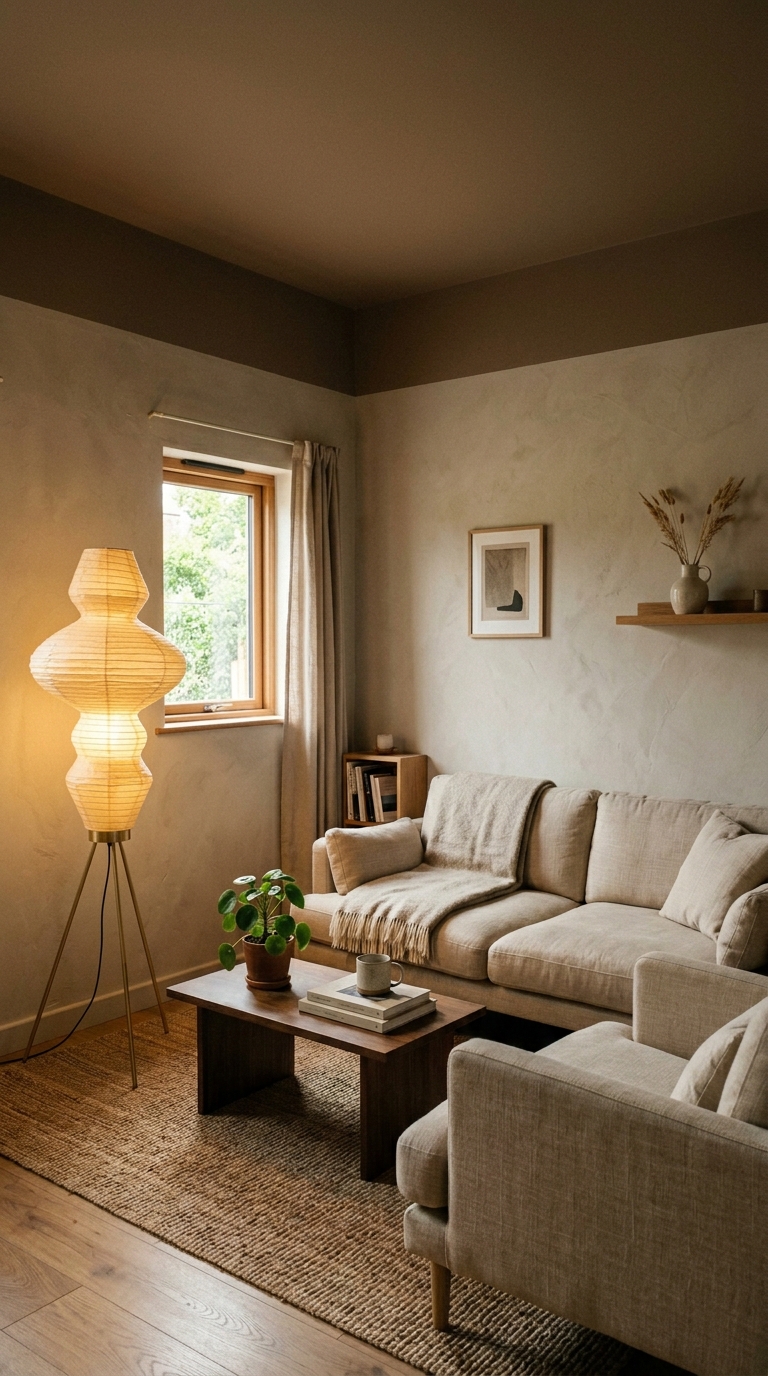
This is one of the most overlooked details in interior design, and it makes an enormous difference in small spaces. When the legs of your sofa, coffee table, and any side tables all sit at the same height, the room creates a visual horizon line that the eye follows across the entire space. The result is a room that reads as unified, expanded, and intentionally designed.
Mismatched leg heights — even by just an inch or two — create micro-conflicts that your brain processes as visual noise. You don’t consciously notice it, but you feel it as tension. Eliminating that tension is free. It just requires that you shop with this one rule in mind.
- The sweet spot for this unified leg line in a minimalist room is 7 to 9 inches off the floor
- Hairpin legs in a thin matte black or natural brass finish work best for this look
- You can swap the legs on IKEA or Amazon furniture pieces for under $30 — a great budget hack
- Keep leg tones within the same family: all black, all natural wood, or all brass
This idea is one I wish someone had told me years earlier. Once you see it in a well-executed minimalist room, you cannot unsee it — and you’ll never arrange furniture randomly again.
Paint Your Ceiling Two Shades Darker Than Your Walls
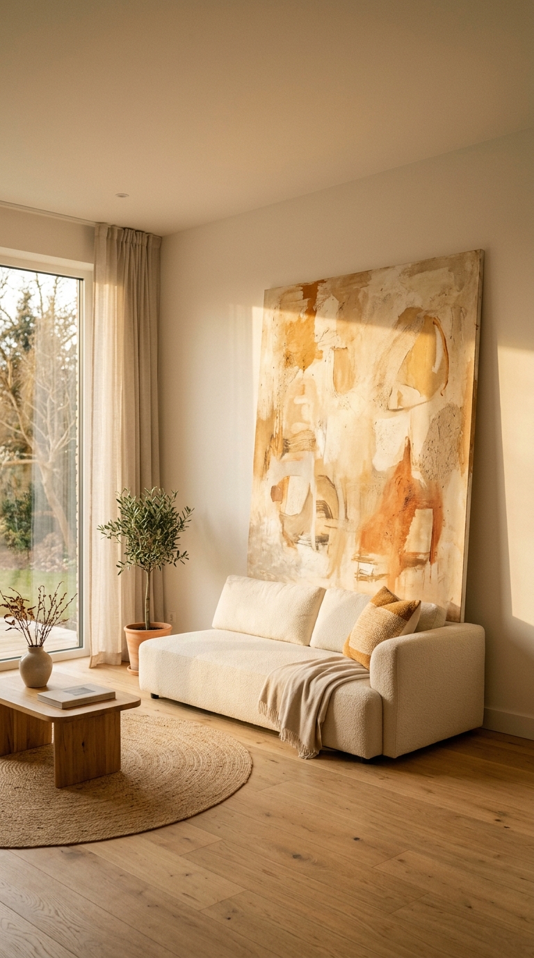
Everyone tells you to paint the ceiling white to make a room feel taller. That advice works in large rooms. In small living rooms, it often makes the ceiling feel disconnected and cold. A bolder and more effective approach is to paint the ceiling slightly darker than your walls — creating what designers call a “tent” effect that wraps the room in warmth and makes it feel purposeful rather than cramped.
When your walls are warm greige and your ceiling is two shades deeper in the same tone family, the room becomes a cocoon. It feels intimate in a good way — like being held rather than boxed in. This works especially well in rooms with lower ceilings where you want to lean into the coziness rather than fight it.
- This technique works best with warm earth tones, not cool grays or blues
- Use the same paint finish on both ceiling and walls — flat or eggshell — for continuity
- Avoid white trim when doing this; use a slightly lighter version of the wall color instead
- The color difference between wall and ceiling should be subtle, not dramatic — two shades maximum
This is one of those ideas that costs almost nothing and transforms the entire feeling of a space. Dozens of small apartment owners who’ve tried this say their living room finally feels like a room that was designed rather than a room they’re just living in temporarily.
Use One Oversized Piece of Art Instead of a Gallery Wall
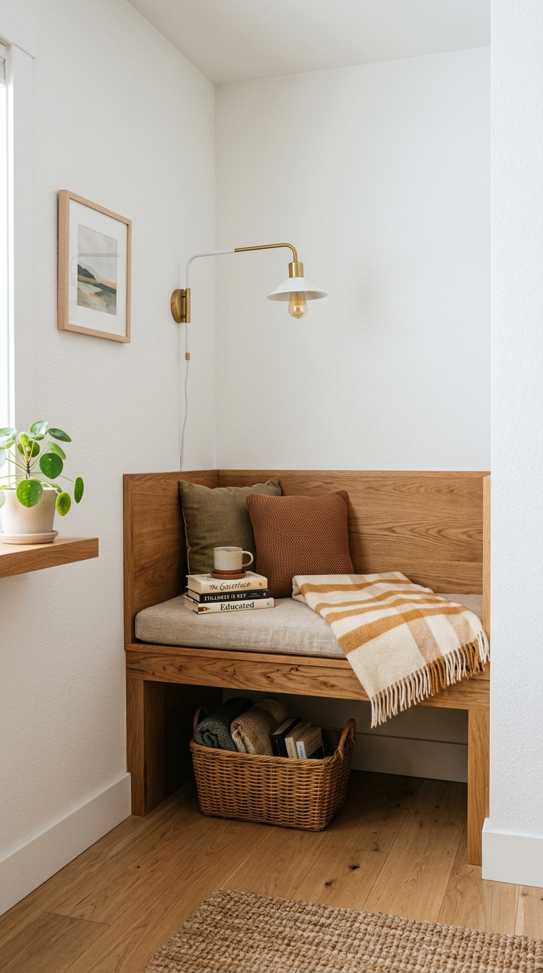
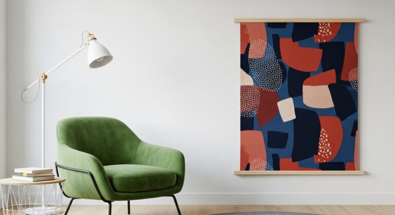
Gallery walls are everywhere. They’re also one of the fastest ways to make a small living room feel chaotic. The minimalist alternative — one single oversized piece of art — does exactly the opposite. It gives you all the personality and style of wall decor with none of the visual noise.
The size is important here. We’re talking about a piece that’s at least 40 by 50 inches, ideally larger. In a small room, a painting of that scale becomes an architectural element rather than just decor. It gives your eye somewhere to rest and something to appreciate without fragmenting your attention in twelve directions.
- Lean the art on the floor against the wall rather than hanging it — this looks more relaxed and modern
- Choose abstract work with three colors maximum that pick up tones already in your room
- Local art markets and antique stores often have oversized pieces for under $100
- Resist the urge to add anything else to the wall where the art lives
One of the most memorable small living rooms I’ve encountered had a single enormous canvas in warm terracotta and cream — bought from a local artist for $80 — leaning against the wall. Every single visitor asked if it was from a gallery. It wasn’t. It was the scale that made it feel significant.
Design a “Dead Corner” Into Your Most Functional Spot
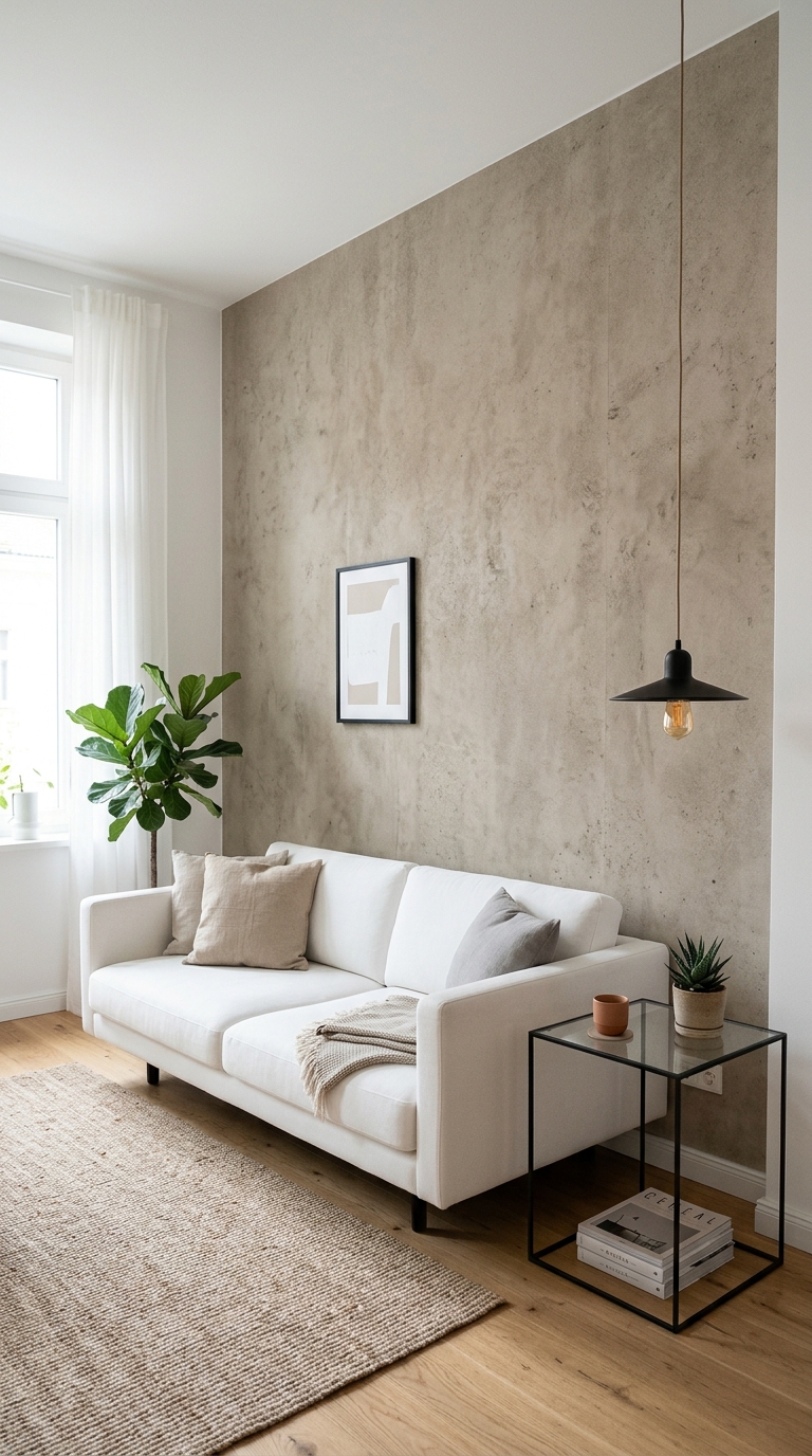
Every small living room has at least one dead corner — that awkward space where two walls meet and nothing quite fits. Most people either shove a plant there or leave it empty. Both are missed opportunities. That corner is actually your most valuable real estate for creating a functional minimalist nook.
A simple built-in bench — even one you build from a single piece of plywood — turns that corner into a reading seat, extra storage, and a design moment all at once. Keep it clean: one thin cushion, one wall-mounted lamp, and a small basket underneath. That’s it. Three elements, total transformation.
- The bench seat should be at standard seat height: 17 to 18 inches
- Paint the bench in the exact same color as the wall — this makes it feel architectural, not like added furniture
- Use the interior of the bench for hidden storage — hinged top lid works perfectly
- One small wall sconce mounted 16 inches above the seat height is all the lighting you need
This corner nook approach is particularly powerful in urban apartments where the living room often serves as the only quiet place to sit and read. Creating a defined space for that activity — even in just 24 square inches — gives you a psychological separation between “Netflix couch” and “this is where I actually think.”
Use Architectural Film to Fake Expensive Wall Materials
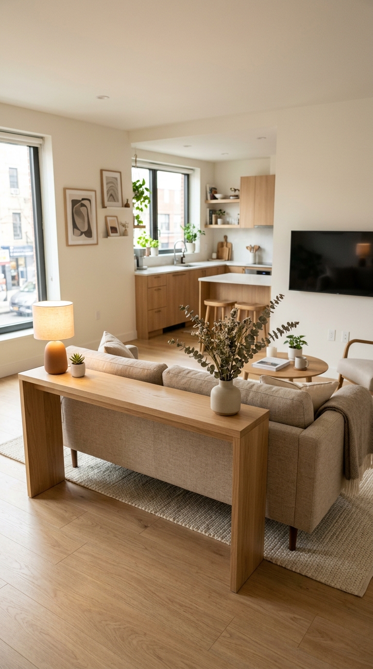
Architectural film — sometimes called adhesive wall wrap — is one of the best-kept secrets in small space design. It mimics marble, concrete, wood grain, and stone with surprising accuracy, and it comes off without damaging walls. For renters especially, this is a complete game changer.
One accent wall in a concrete or warm stone look gives your small living room a material richness that paint simply can’t match, without any demolition or renovation. The tactile realism of good architectural film reads as actual texture in photographs and in person at conversational distance.
- Source from Korean brands like Hyundai L&C or 3M’s DI-NOC line — these are the quality standards
- Apply to just one wall — the one your sofa faces — for maximum impact with minimum commitment
- Clean the wall thoroughly before application; bubbles happen when surface prep is skipped
- A good installer can do a single wall in under three hours
This idea works particularly well in rented apartments where you’re limited in what you can do structurally. The transformation from flat painted drywall to something that looks like polished concrete or warm stone is genuinely startling — in the best way.
Install a Slim Console Table Behind Your Sofa as a Spatial Divider
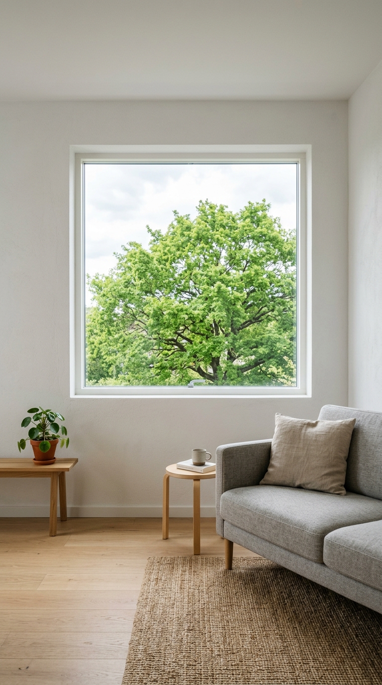
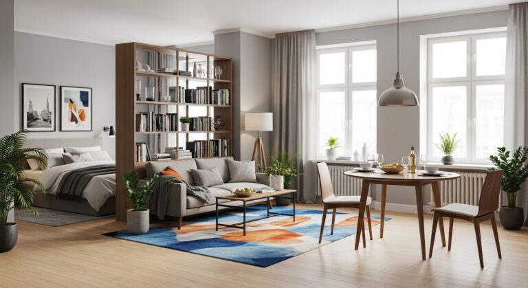
In open-plan small spaces — where your living area bleeds into a kitchen or hallway — the sofa often floats awkwardly in the middle of the room with nothing anchoring it. A slim console table placed directly behind the sofa solves this problem elegantly. It defines the back edge of your seating zone, creates a surface for soft lighting, and doubles as a visual divider without adding any bulk.
The console should be no deeper than 12 inches and sit at exactly the height of your sofa back — typically 28 to 30 inches. It disappears into the back of the sofa visually while completely transforming how organized and intentional the space feels.
- Keep the console surface minimal: one lamp, one small object, nothing more
- Matching the console color to your floor tone makes it almost invisible — the lamp becomes the feature
- This also gives you a perfect place to tuck power strips and charging cables out of sight
- Works especially well in apartments where the front door opens directly into the living area
This is one of those ideas that professional interior designers use constantly in small spaces, yet it rarely makes it into the DIY advice you see online. Once you understand the logic — anchoring floating furniture with a slim surface — you start seeing it everywhere in beautifully designed apartments.
Use Your Window as Your Primary Art Piece
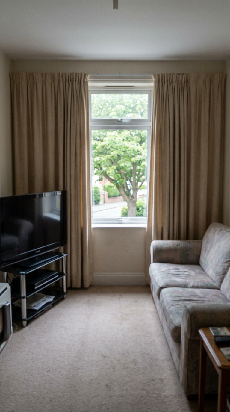
Remove heavy curtains entirely. Orient your sofa to face the window rather than the TV. Let the view — even a simple urban one — become the “art” your room is built around. This approach is common in Scandinavian interior design and it makes small rooms feel connected to the world outside, creating an expanded sense of space that no paint color or furniture arrangement can replicate.
- If privacy is a concern, use frosted window film on the lower half and leave the upper half clear
- Trim the window frame in a slightly deeper tone than your walls — this frames the view like a painting
- Hang a single thin branch or piece of driftwood horizontally from the ceiling in front of the window for a nature element without blocking light
- Remove anything from the windowsill — keep it completely clear
The psychology behind this idea is real and well-documented. Rooms with a clear view to nature — even a sliver of sky — feel 20 to 30 percent more spacious than identical rooms without one. You’re not just decorating when you prioritize your window. You’re hacking your brain’s perception of space.
Choose a Rug That’s Larger Than You Think You Need
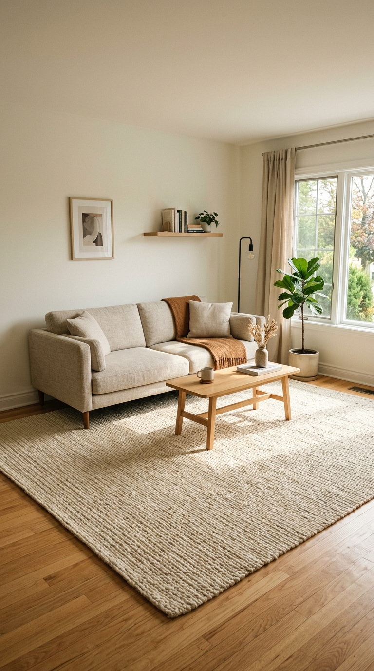
The single most common rug mistake in small living rooms is going too small. A tiny rug floating in the middle of your room visually chops the space into fragments, making it feel smaller and more chaotic. The counterintuitive minimalist move — especially in small spaces — is to go significantly larger than feels logical.
A rug that extends at least 18 inches beyond the front legs of your sofa in every direction works like a visual floor plan. It defines the living zone as a complete, intentional space rather than a collection of furniture pieces scattered on bare floor. The larger the rug relative to the room, the calmer and more spacious the room feels.
- In a small room, aim for a rug that’s at least 8 by 10 feet — larger if you can
- All four legs of every piece of furniture should ideally sit on the rug
- Stick to one tone and one texture — a jute or flatweave in a warm neutral reads beautifully in minimalist spaces
- Avoid patterned rugs in small rooms; they add visual energy that competes with the architecture
This is one of those things where the budget question comes up. Yes, a large quality rug costs more than a small one. But if you shop at IKEA, Ruggable, or even Facebook Marketplace, a large neutral rug is genuinely achievable without overspending. The transformation it creates is worth every penny.
Build a “Negative Space” Zone That You Deliberately Leave Empty
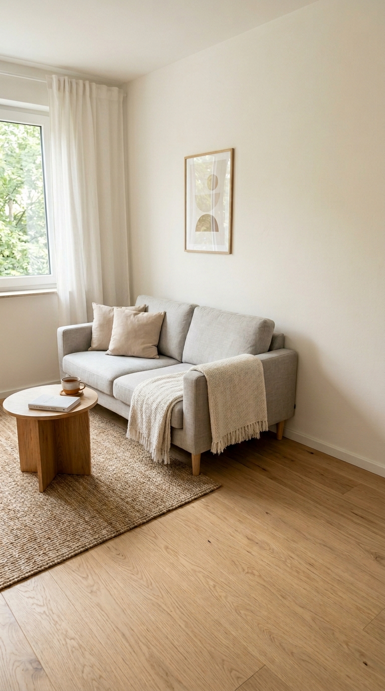
This last idea is the most radical and the most powerful: deliberately designate a section of your small living room as empty space. No furniture, no plant, no rug, nothing. Just floor. This is a principle directly borrowed from Japanese ma — the concept of meaningful negative space — and it works with a kind of quiet force that fills a room in spite of containing nothing.
Most people with small spaces feel compelled to fill every inch. The psychology is understandable: if space is limited, use it all. But the opposite is true in minimalist design. When you deliberately leave a section empty, it becomes a breathing space for the eye and for your nervous system. The room feels larger, calmer, and more intentional than any furniture arrangement could achieve.
- This empty zone works best in a corner or along the wall opposite your main seating
- The floor in this zone should be clean and beautiful — a reason to show it off, not cover it
- Resist every impulse to fill this space over time — its power comes from being held empty
- In small studios, this empty zone often works well near the entry as a visual decompression space
I know this sounds almost too simple to be an actual design idea. But walk into any deeply minimalist room — the kind that makes you exhale involuntarily when you enter — and you’ll find this empty zone, held deliberately and respected consistently. That exhale you feel? That’s the negative space doing its job.
The Bigger Picture: Small Spaces Are a Creative Advantage
Here’s something worth sitting with: the people who figure out how to live beautifully in small spaces almost always end up with more intentional, more personal, and more visually satisfying homes than people with large ones. The constraint forces the creativity. Every decision matters. Nothing hides.
These 15 ideas are not a checklist to work through all at once. Pick two or three that speak to where you are right now. Start with lighting — it costs the least and changes the most. Then try the rug. Then look at that dead corner you’ve been ignoring. You’ll be surprised how quickly your small living room starts to feel like something you designed rather than something you just moved into.
Minimalism in a small space isn’t about sacrifice. It’s about precision — and when you get it right, it feels like freedom.