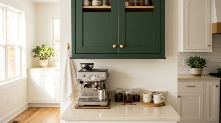
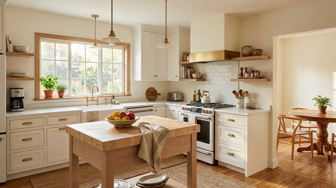
Kitchen and Dining Room Ideas That Instantly Refresh Your Home
There is a specific kind of morning that changes everything. You walk downstairs still half-asleep, reach for your coffee mug, and then you stop — because the kitchen actually feels good. The light is hitting the backsplash just right, the colors feel calm and warm, and the whole room wraps around you like it was designed specifically for your life. That feeling is not an accident. It is the result of small, intentional choices that slowly transform a purely functional space into the most genuinely beloved room in your house. Most people underestimate how deeply their kitchen and dining room affect their daily mood, their energy, and even how often they invite people over to share a meal.
I have spent years tweaking, painting, rearranging, and rethinking every corner of my own kitchen and dining room, and I want to be honest with you — the biggest shifts never came from expensive renovations. They came from understanding color, texture, light, and how people actually move through a space when it feels welcoming. This article gives you twelve real, tested, genuinely beautiful ideas that I have either used in my own home or watched transform a friend’s space entirely. Some are bold, some are subtle, but every single one of them has the power to make your kitchen and dining room feel like a room you are genuinely proud of every single day.
Warm White Walls With Creamy Undertones
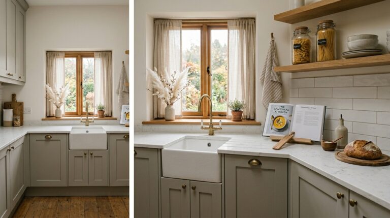
Warm white is the color that designers quietly use when they want a kitchen to feel effortlessly expensive and genuinely livable at the same time. Unlike stark bright white, a creamy warm white catches the light differently at every hour of the day — golden and soft in the morning, rich and honeyed in the evening under pendant lights, and deeply calm on grey rainy afternoons when the whole room seems to exhale. It makes natural wood tones glow, it makes brass fixtures look intentional rather than trendy, and it makes even a modest-sized kitchen feel open and generous. When you walk in, you do not notice the color specifically — you just feel instantly comfortable, which is exactly what a great neutral is supposed to do in a hardworking family space.
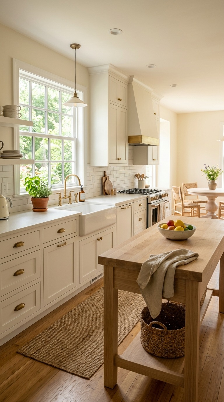
For this look, I always come back to Sherwin-Williams Alabaster, which is one of the most versatile warm whites ever made for interior walls. It carries a very soft yellow-cream undertone that reads as white in most lighting but never feels cold or clinical. Pair it with natural linen window panels, pale oak or butcher block counters, and simple white or cream ceramic dishes displayed openly on shelves. Avoid pairing it with anything cool-toned — grey cabinets or blue-tinted marble will fight it. I painted my own kitchen in Alabaster three years ago and I have never once considered changing it. It makes every single thing I place against it look better, and that kind of quiet versatility is genuinely rare in a paint color.
Deep Navy Cabinets With Natural Wood Open Shelving
Deep navy in a kitchen is one of those choices that feels intimidating in the paint chip stage and then absolutely spectacular on the actual cabinets. The color creates a striking visual anchor — it grounds the whole room, makes the ceiling feel higher by contrast, and gives even a small kitchen a sense of architecture and intention that white or grey cabinets rarely achieve. Navy reads differently depending on its companions. Paired with warm walnut wood, it feels Scandinavian and collected. Paired with brass and white marble, it leans classic and refined. Paired with matte black hardware and concrete counters, it turns quietly industrial and modern. The beauty of a true deep navy is that it is sophisticated enough to feel designed but approachable enough to still feel like home rather than a showroom.
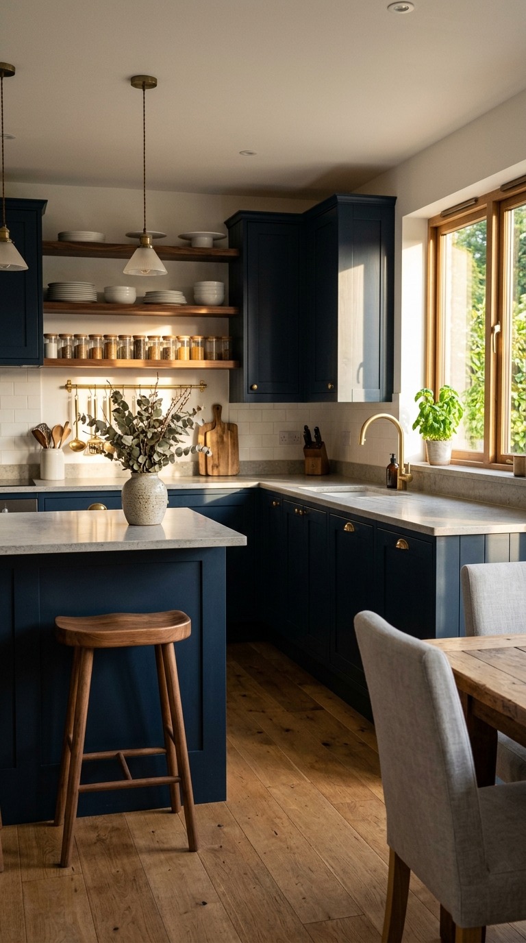
Benjamin Moore Hale Navy is the shade I recommend most often when someone tells me they want to try this look but they are nervous about going too dark. It carries just enough warmth in its undertone to avoid reading cold or corporate, and it plays beautifully with natural textures. Keep your upper walls and ceiling light — crisp white or warm cream works perfectly — so the room breathes and does not feel like a cave. Add open walnut shelving above the counter if you can, because the contrast of warm wood grain against that deep navy is genuinely one of the most beautiful combinations in a modern kitchen. I will be honest — the first time I saw this pairing in a friend’s renovated kitchen, I went straight home and started measuring my own cabinet doors.
A Statement Dining Room Ceiling Color
Painting your dining room ceiling a rich unexpected color is one of the most transformative — and most underused — design moves in a home. When you sit at the dining table, the ceiling is directly in your line of sight in a way it almost never is in other rooms, which means color up there actually shapes the entire emotional atmosphere of the meal. A deep terracotta ceiling wraps the room in warmth. A moody sage green makes the space feel like a secret garden. A dusty blush makes candlelit dinners feel genuinely romantic without any other changes at all. The walls can stay simple and light, the furniture can stay neutral, but a colored ceiling changes the entire feeling of being in that room — especially in the evening when you have guests around the table and the light softens everything beautifully.
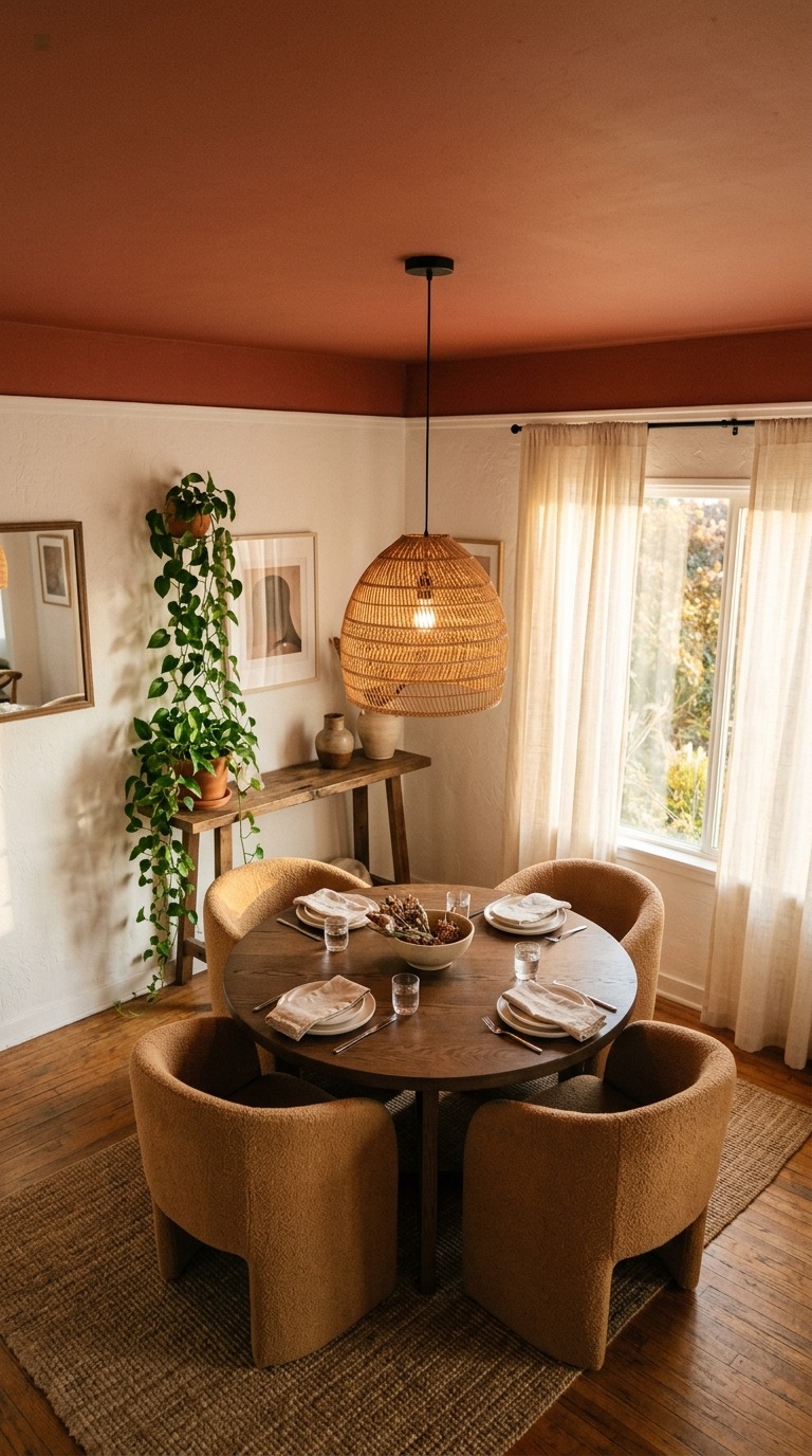
Farrow & Ball Templeton Pink is a shade I have been obsessed with for dining room ceilings for years — it is a dusty, muted terracotta-rose that shifts from blush to clay depending on the light and looks absolutely magical by candlelight. If you want something deeper and moodier, try their Preference Red, which is a rich faded brick tone that makes every dinner feel slightly cinematic. Keep your walls in a clean white like Farrow & Ball All White or Pointing so the ceiling reads as the intentional star of the room. Use a rattan or woven pendant to add natural texture that softens the boldness. This is a weekend project that costs one tin of paint and completely changes how the room feels — I genuinely believe more people need to look up.
Open Shelving With Curated Everyday Objects
Open shelving terrifies people because they think it requires a perfectly curated, permanently tidy display that looks like a magazine shoot. The truth is that the most beautiful open shelving I have ever seen in real homes is actually functional — it holds the dishes and glasses and objects that people genuinely use every single day, just arranged with a little intention. The key is editing. You do not need to display every item you own. Choose a limited color palette for your dishes — all white, all cream, or a mix of natural clay tones — and then layer in one or two genuinely personal objects like a handmade ceramic piece from a market, a small trailing plant, or a stack of well-loved cookbooks with beautiful spines. The result feels lived-in and warm in a way that closed cabinets never quite achieve.
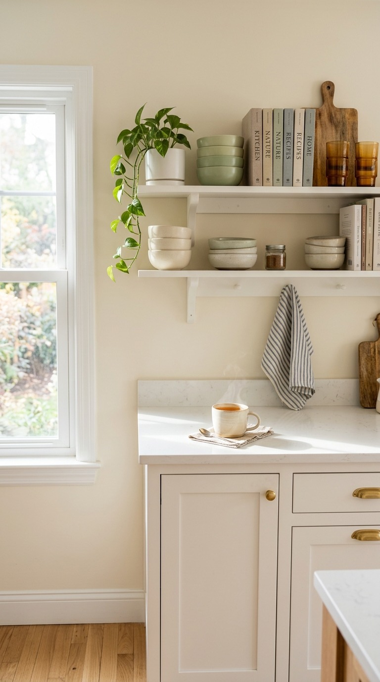
The practical side matters just as much as the aesthetic. Mount your shelves at a height where the items you reach for daily sit right at eye level — this makes open shelving genuinely functional rather than purely decorative. Use the same floating shelf bracket style throughout so the whole wall reads as intentional. I painted my own open kitchen shelves in Sherwin-Williams Pure White, which is slightly warmer than a true bright white and makes ceramic dishes glow softly. If you have mismatched dishes you love, consider bringing them together with a shared material — all stoneware, all glazed ceramic, all natural wood — rather than matching color. Shared material creates cohesion even when colors vary, and that is honestly the secret behind every open shelf that looks naturally beautiful rather than forced.
A Warm Terracotta Accent Wall in the Dining Room
A terracotta accent wall in a dining room does something that almost no other color achieves — it makes the room feel simultaneously earthy and elegant, grounded and warm, without trying too hard in either direction. Terracotta is a color with genuine history and presence. It references Mediterranean plaster, Moroccan riads, Tuscan farmhouses, and handmade pottery all at once, which means it carries a kind of cultural warmth that a purely trendy color never quite manages. In a dining room, it creates an immediate sense of welcome. Guests walk in and feel relaxed before they even sit down, which is exactly the atmosphere you want around a table where people share food and conversation. Paired with natural wood and woven textures, it builds a room that feels like it has been collected slowly and loved deeply rather than decorated all at once.
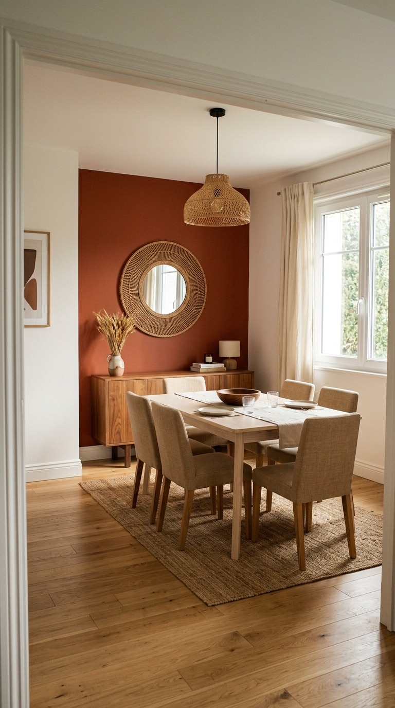
Benjamin Moore Moroccan Spice is one of my favorite terracotta options because it leans slightly orange-warm without tipping into pumpkin, which keeps it feeling sophisticated rather than seasonal. Paint just the wall behind your dining sideboard or buffet — this gives the color maximum visual impact without overwhelming the room. Pair it with pale ash or natural oak furniture, which lets the warmth of the wall breathe rather than compete. Add a large woven mirror above the sideboard to reflect light and soften the boldness of the color. Keep your textiles in warm sand, cream, or undyed linen so the palette stays cohesive. I tried a version of this in my own dining room and what surprised me most was how much it changed the feeling of dinner — even a casual Tuesday meal suddenly felt a little more intentional and special.
Black Hardware as the Unifying Design Element
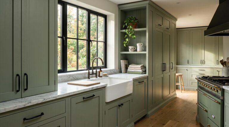
Matte black hardware is one of those additions that looks completely simple in description and then lands in a kitchen with a kind of visual authority that is almost difficult to explain. It is not the hardware itself — it is what it does to everything around it. Black pulls a room together. It creates definition, adds contrast, and gives the eye a resting point so the whole space reads as more intentional and designed. In a white kitchen, matte black hardware makes the cabinets look custom. In a navy kitchen, it adds a modern edge that keeps the space from feeling too nautical. In a warm wood kitchen, it grounds all that natural warmth with just enough visual sharpness. It is the design equivalent of a great pair of shoes that somehow makes every outfit work — the right hardware changes how you perceive every other decision you made in the room.
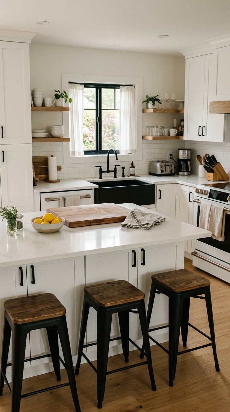
The key to getting this right is committing to it consistently. If you go matte black on cabinet pulls, go matte black on the faucet, the light fixture, and the curtain rod too. Mixing matte black with brushed nickel or chrome in the same room creates visual noise that undermines the whole clean effect you are trying to achieve. Source your hardware from the same finish family even if the pieces come from different manufacturers. Schoolhouse Electric makes beautiful matte black cabinet hardware that holds up beautifully over years of daily use, and their pulls come in lengths that suit both small cabinet doors and large drawers. I switched out the dated chrome hardware in my kitchen two years ago and it remains the best single afternoon project I have ever done — the transformation was instant and completely disproportionate to the effort involved.
A Dining Banquette Built Into a Corner
A corner banquette is one of those design decisions that genuinely changes how a family eats together. Something about a built-in seat tucked into a corner makes a dining area feel like a destination rather than a pass-through — like a place people actually want to linger after the meal, refill their coffee, and keep talking rather than drifting toward the sofa or their phones. Children especially love banquettes because the contained, cozy feeling makes even a regular dinner feel a little like an adventure. For smaller kitchens and dining rooms, a banquette also solves a real spatial problem — it tucks neatly into a corner and allows a round or square table to seat more people than four legs of chairs would ever manage in the same footprint, which makes it both beautiful and genuinely practical for daily life.
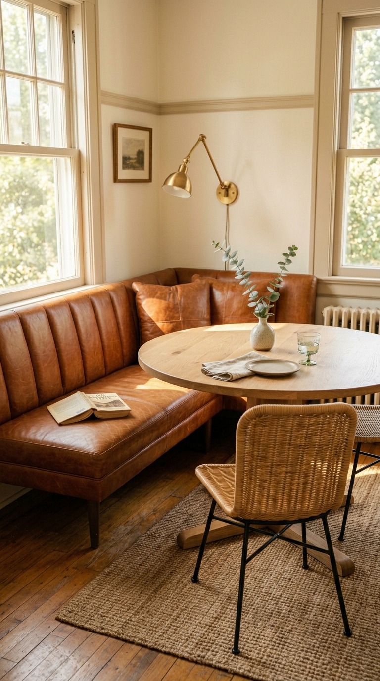
The upholstery choice matters enormously here because a banquette takes more wear than almost any other piece of furniture in the house. I always recommend performance-grade leather or a tightly woven performance fabric that can handle spills, crumbs, and daily contact without looking shabby within the first year. Cognac leather is my personal favorite — it develops a beautiful patina over time and wipes clean in seconds, which is non-negotiable if you have children or you actually cook and eat real food daily. For the back cushions, a chunky cream boucle or a natural linen provides enough softness to make long dinners comfortable. Build in storage underneath the seat if your contractor allows it — that hidden compartment for placemats, extra candles, and board games is the kind of practical detail that makes you feel genuinely brilliant every single time you open it.
Zellige Tile as a Kitchen Backsplash
Zellige tile is the backsplash material that professional kitchen designers specify when they want a kitchen to look like it has been collected over decades rather than installed in a weekend. Unlike the smooth, uniform surfaces of standard ceramic subway tile, zellige is a hand-made Moroccan clay tile with a deliberately irregular glaze — each tile catches the light at a slightly different angle, which means a wall of zellige constantly shifts and shimmers as the light changes throughout the day. The effect is genuinely breathtaking in a way that photographs cannot fully capture until you are standing in the actual kitchen watching morning light move across the surface. It brings texture, warmth, life, and a sense of genuine craft to a room that can sometimes feel purely functional, and it does it without needing to shout.
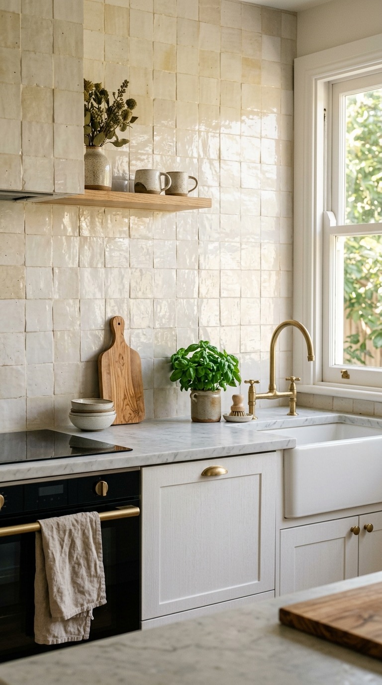
Zellige comes in an enormous range of colors — from deep forest green to warm terracotta to pale ivory to midnight teal — but my personal recommendation for a timeless kitchen is always the warm ivory or cream family. It reads as nearly neutral but the surface variation keeps it endlessly interesting. Try Zia Tile or Cle Tile, both of which source genuine Moroccan zellige with the kind of surface quality that actually delivers the light-catching shimmer rather than the flat, imitation version sold by mass-market tile companies. Install it in a simple running bond pattern and let the tile itself do all the visual work — no decorative grout lines or borders needed. I watched a friend install creamy zellige behind her range last spring and the kitchen went from pleasant to genuinely extraordinary. That single wall changed everything.
Linen Curtains in the Dining Room for Softness and Warmth
Floor-to-ceiling linen curtains are the single fastest way to make a dining room feel finished, expensive, and genuinely beautiful without spending a significant amount of money on furniture or renovation. Fabric adds something to a room that paint and hard surfaces simply cannot — it brings movement, softness, and acoustic warmth that immediately makes a space feel more intimate and intentional. Natural undyed linen in particular has a color that works with almost every palette. It is simultaneously warm and neutral, organic and refined, relaxed and elegant. When afternoon light comes through linen panels, the room fills with a warm golden diffusion that makes even the most ordinary dinner feel like something worth pausing over. Every room I have ever added floor-to-ceiling linen to immediately started feeling more like a real home and less like a house still waiting to be finished.
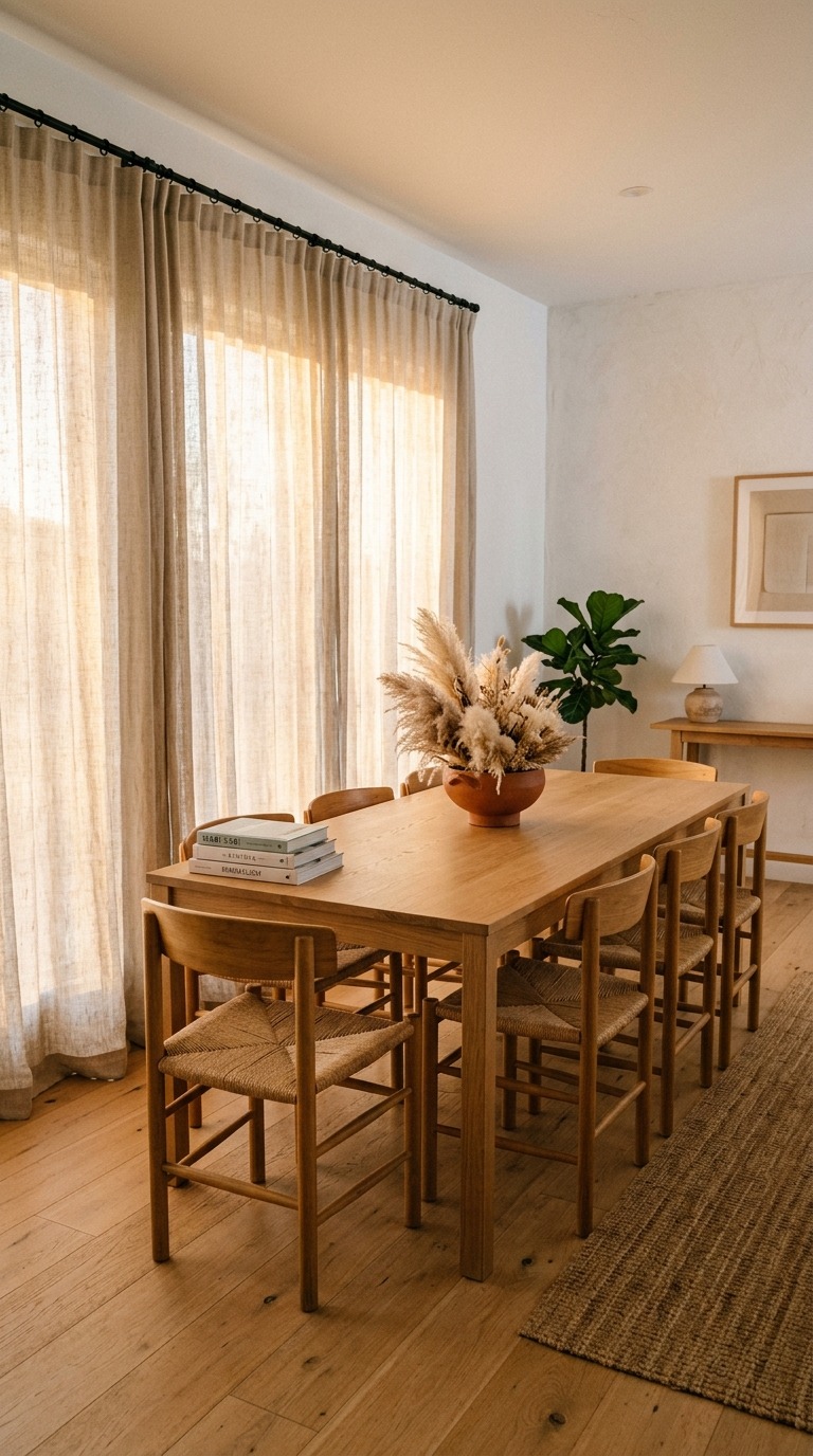
Hang your curtain rod as high as possible — ideally at ceiling height, or within two or three inches of the ceiling — and let the panels fall all the way to the floor with a slight puddle or gentle break at the base. This vertical line makes ceilings feel higher, windows feel grander, and the whole room feel more considered. Source your linen curtains from Cultiver or Parachute, both of which offer a range of natural linen tones that are pre-washed and softened for a relaxed, lived-in drape that looks beautiful from the first day. Choose a slightly oversized width — panels that are at least two to two and a half times the width of your window — so they gather generously when pushed to the side. A narrow, skimpy curtain makes even a beautiful window look mean, while generous linen panels make even a modest window feel like something genuinely lovely.
A Kitchen Island in a Contrasting Color
A contrasting kitchen island is the one design move that makes a kitchen look instantly more intentional than an all-matching cabinet scheme ever could. When everything in a kitchen matches — same color, same finish, same hardware — the room can feel like a showroom or a rental rather than someone’s actual home. But introduce a single contrasting island in a completely different color from your perimeter cabinets and the whole kitchen suddenly reads as layered, considered, and alive. The island becomes a natural focal point, the place where your eye lands and lingers. It anchors the room visually and gives you the freedom to build the rest of the space around two complementary tones rather than just one, which adds genuine depth and character to a room that spends a lot of hours looking at you every single day.
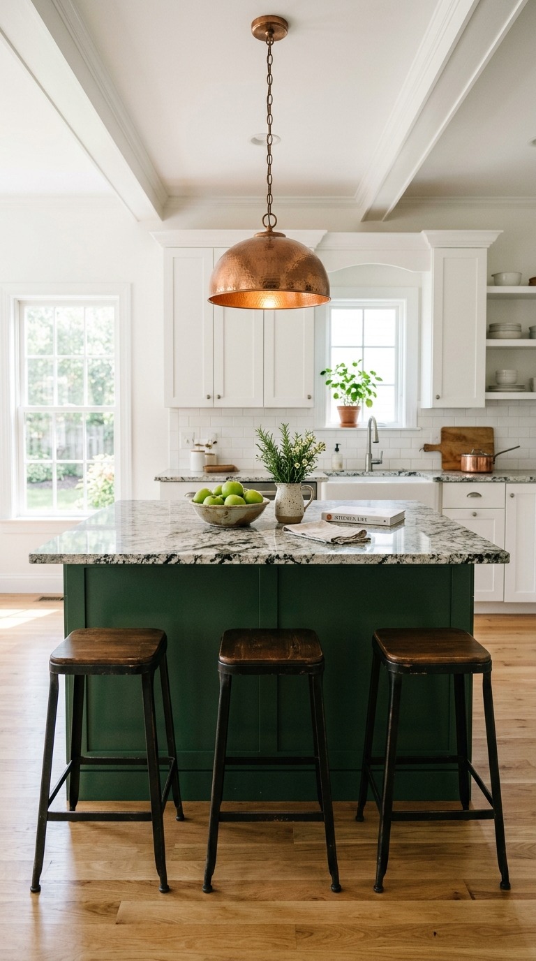
Farrow & Ball Studio Green is my current obsession for a contrasting island because it is a deep, slightly muted forest green with enough yellow in its undertone to feel warm rather than cold — it lives beautifully against white perimeter cabinets and looks extraordinary beneath a natural stone countertop. If green feels too bold, try their Mole’s Breath, which is a sophisticated warm grey that reads almost like a muted taupe in certain lights — contrasting but quieter. Pair your island color with a countertop in a natural material like honed granite, leathered quartzite, or butcher block to keep the look grounded and organic. Add pendant lights directly above the island — copper or aged brass work beautifully against darker island tones. I dream about having this island in my own kitchen on a weekly basis, and that says everything.
Candlelight and Layered Dining Room Lighting
Lighting in a dining room is not just about being able to see your food — it is about creating a feeling that makes every meal feel worth sitting down for. The difference between a harsh overhead light and a layered combination of a low pendant, soft wall sconces, and real candles on the table is the difference between a room that functions and a room that genuinely enchants. Most dining rooms in standard homes suffer from a single centered ceiling fixture that floods the room with flat, even light — technically adequate but emotionally completely neutral. Adding a pendant or chandelier hung low over the table — ideally at sixty to sixty-six inches from the floor to the bottom of the fixture — immediately transforms the intimacy of the space. The light focuses on the table, the faces around it, and the food between you in a way that flat overhead light never does.
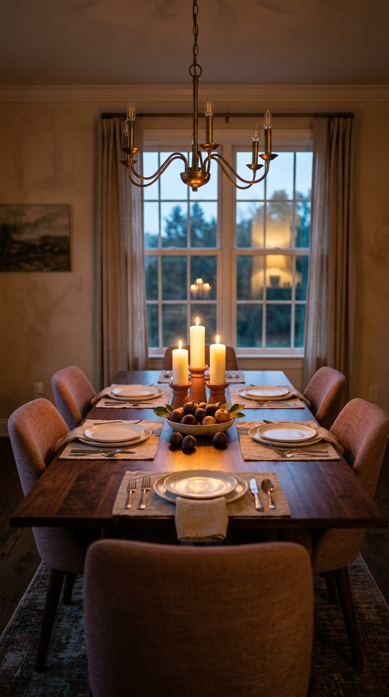
Layer your dining room lighting in at least three levels — the overhead pendant or chandelier, a secondary source like wall sconces or a sideboard lamp, and actual candles directly on the table. Real beeswax or soy candles in simple terracotta or ceramic holders are inexpensive and create a living, flickering warmth that no electrical light ever fully replicates. I started keeping three pillar candles on my dining table as permanent fixtures several years ago and lighting them even on regular weeknight dinners, and it has quietly changed how my family feels about sitting down to eat together. Something about real candlelight makes people slow down, look at each other, and stay at the table longer. It is one of the cheapest and most genuinely powerful things you can do for the atmosphere of your dining room starting tonight.
A Kitchen Herb Wall for Beauty and Function
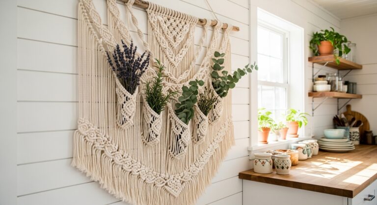
A kitchen herb wall is one of those ideas that sits at the exact intersection of beautiful and practical in a way that is genuinely rare in home design. Most decorative additions are purely visual — they look good but they do not actually make your daily life better or easier. A living herb wall does both. It brings color, texture, fragrance, and genuine natural life into a room that is largely made of hard surfaces — tile, stone, metal, glass. It makes the kitchen smell extraordinary on ordinary mornings when you brush past the rosemary reaching for the coffee. It gives you fresh herbs within arm’s reach whenever you cook, which makes even a simple weeknight dinner feel more intentional. And visually, a row of thriving green plants against a white tile backsplash or a pale painted wall is simply one of the most effortlessly lovely kitchen images I know.
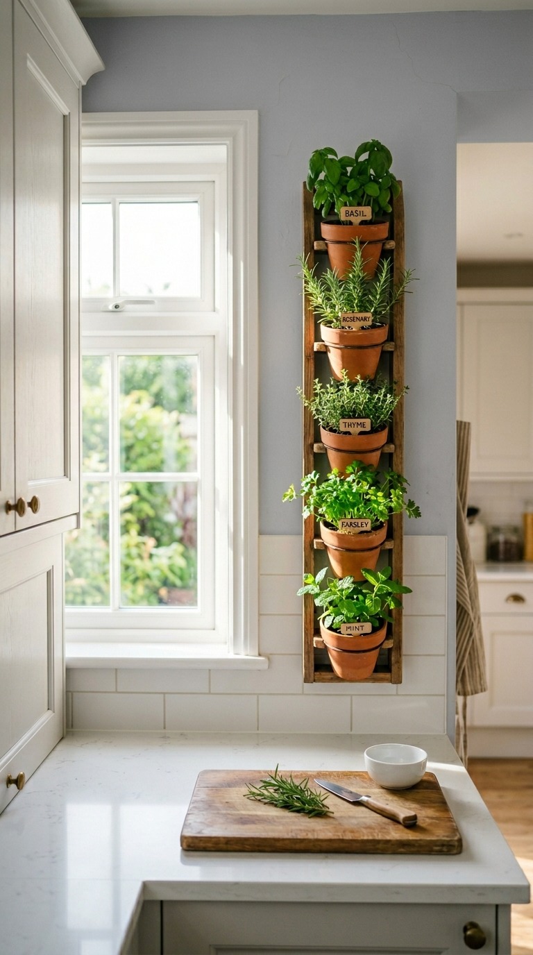
The key to keeping a kitchen herb wall alive and beautiful rather than slowly dying and sad is choosing the right herbs for your light conditions honestly. Basil, mint, and parsley do well in average kitchen light. Rosemary, thyme, and oregano need more direct sun — put these closest to the window or under a small grow light if your kitchen runs dark. Use terracotta pots rather than plastic because terracotta breathes and prevents the root rot that kills most kitchen herbs within weeks. Mount them on a simple wooden wall bracket or a clean steel rail system — both look beautiful and keep the counter clear. Water consistently but never let the pots sit in standing water. I keep a row of five herbs mounted beside my kitchen window and cutting fresh basil directly into a pasta dish on a Tuesday evening is one of those small daily pleasures that makes me feel genuinely grateful for the kitchen I have.
Your bedroom — and I mean your kitchen and dining room — is ready to become the room you have always wanted. Every single idea in this article is something you can start on this weekend, this month, or even tonight with a few candles and a set of curtain panels. You do not need a full renovation.
You do not need a designer. You need one clear decision and the willingness to follow it through with care and attention. Pick the idea that made you stop and read the paragraph twice. That reaction is your instinct telling you something true about what your home is ready for. Trust it. Start there.
One good choice leads to the next, and before long your kitchen and dining room will feel like the rooms you actually dreamed of when you first moved in and started imagining what your life here could look like.
A beautiful kitchen and dining room is not a luxury reserved for people with renovation budgets and professional help. It is available to anyone who pays attention, makes intentional choices, and understands that the small details — the hardware, the lighting, the texture on the wall, the linen pooling on the floor — are what separate a house that functions from a home that genuinely feels like yours. I hope this article gave you real practical ideas you can act on today, not just inspiration to save to a folder and forget.