Which of These 15 Bedroom Paint Colors Is Your Favorite?
What if the color on your bedroom walls could change how deeply you sleep, how calm you feel the moment you walk in, and how much you actually love spending time in your own space?
That sounds like a lot of work for a can of paint — but honestly, it isn’t. The right bedroom color does all of that quietly, without you even noticing it happening. It sets the emotional temperature of your entire room before a single piece of furniture even gets a chance to speak.
This article walks you through 15 bedroom paint colors that interior designers, real homeowners, and lifestyle enthusiasts keep coming back to — year after year — because they genuinely work. Whether you want your room to feel like a cozy mountain cabin, a breezy coastal retreat, or a sleek sophisticated sanctuary, there is something here that will make you want to grab a brush this weekend.
Soft Sage Green That Calms Every Tired Mind
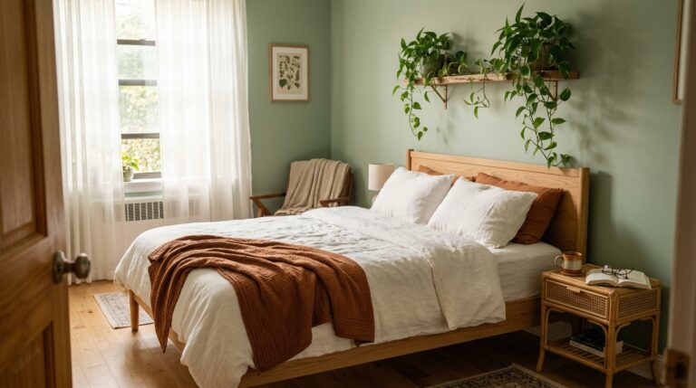
There is something almost medicinal about a sage green bedroom. The moment you paint those walls, the whole room exhales. It is the kind of green that does not shout — it whispers. It pulls in the calm of outdoor spaces, the quiet of a garden in early morning, and brings all of that peace right into the four walls where you sleep. Paired with natural wood tones, cream linens, and warm lighting, a sage green room feels like a permanent exhale.
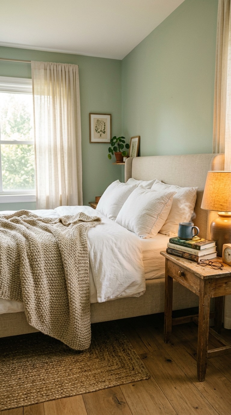
The key to making sage green work beautifully is keeping the surrounding palette soft and organic. Think undyed linen curtains, unbleached cotton bedding, and light oak or walnut furniture pieces. Avoid anything too cool-toned — no stark whites or chrome accents — because they will fight the warmth that makes sage so special. Go for off-whites, aged brass hardware, and matte ceramic accessories to let the color truly breathe and settle into its full beauty.
Warm Greige Tones That Never Go Out of Style
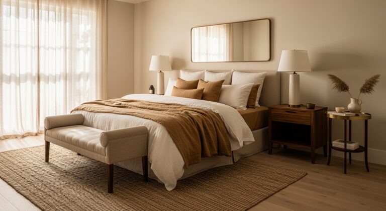
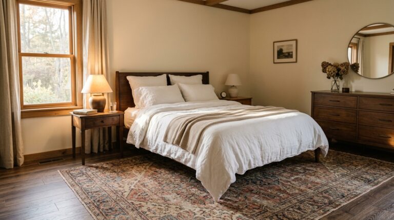
Greige — that gorgeous in-between space where gray meets beige — is one of the most livable and versatile bedroom paint colors you can ever choose. It never feels cold the way a true gray can, and it never feels dated the way a classic beige sometimes does. Instead it sits in this warm, grown-up, endlessly elegant middle ground that makes every piece of furniture you own look more intentional and considered. Rooms painted in warm greige feel like they were designed by someone who quietly knew exactly what they were doing.
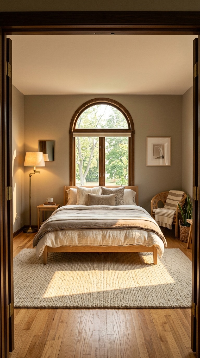
To get the most out of greige, layer your room with varying textures in similar warm tones — a nubbly wool throw here, a smooth linen pillow there, a woven bedside rug underfoot. The trick is tonal layering, which means building depth through texture rather than contrast. Warm greige loves soft lighting, so lean into table lamps with amber bulbs over overhead lights. A large mirror in a raw wood or antique gold frame will bounce light around the room and make the whole space feel twice as airy and polished.
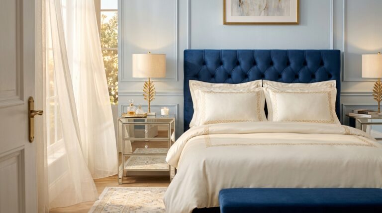
Dusty Blue Walls That Make Sleep Feel Effortless
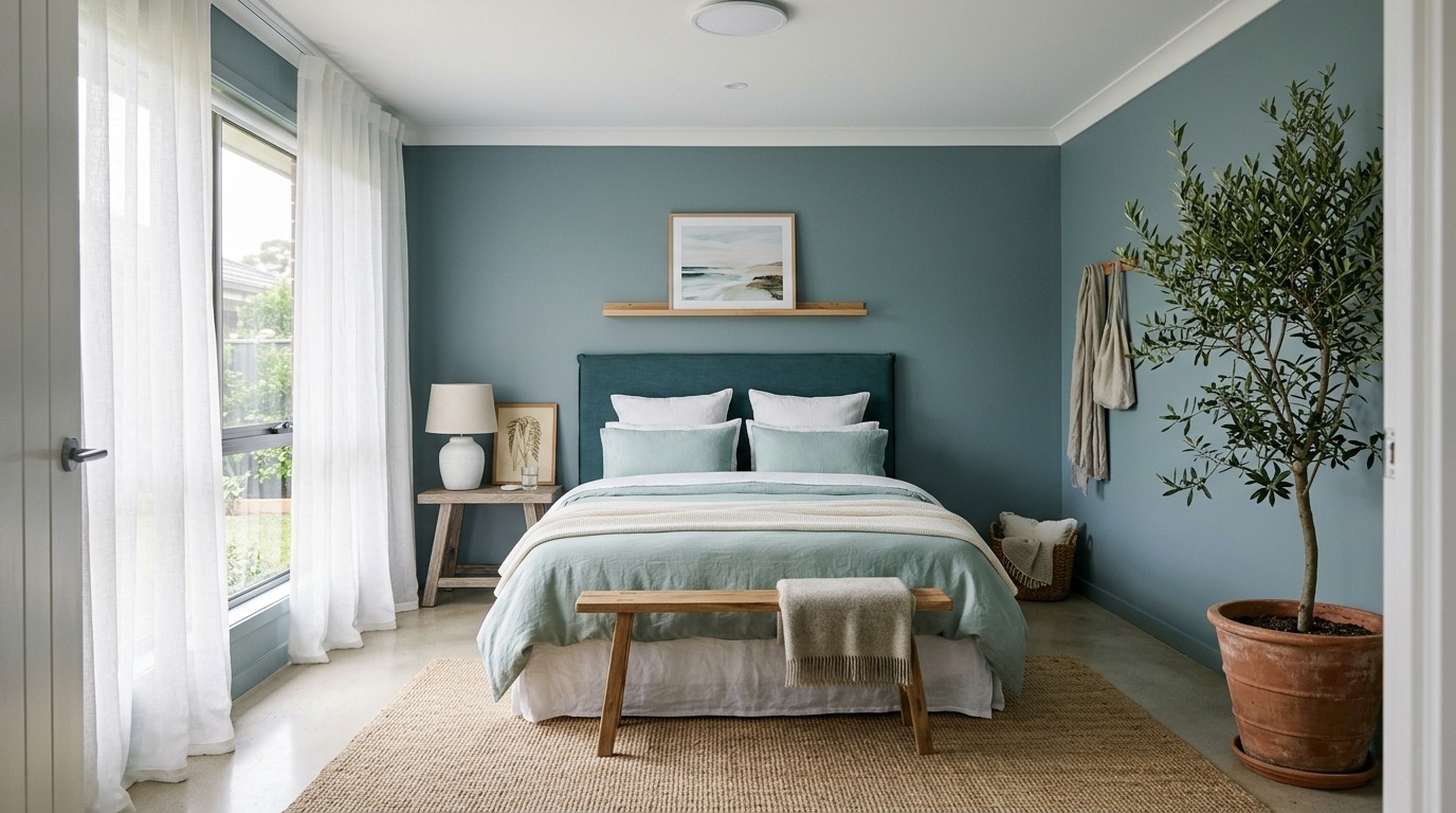
Dusty blue is the color of calm mornings, clear horizons, and the feeling you get right before you fall into a really deep, satisfying sleep. It is not the bright, bold blue of an accent wall — it is softer than that, grayer, more considered. A bedroom wrapped in dusty blue feels like it exists slightly outside of time, which is exactly what a sleep space should feel like. It pairs beautifully with white, soft gray, pale wood, and any natural fiber you love.
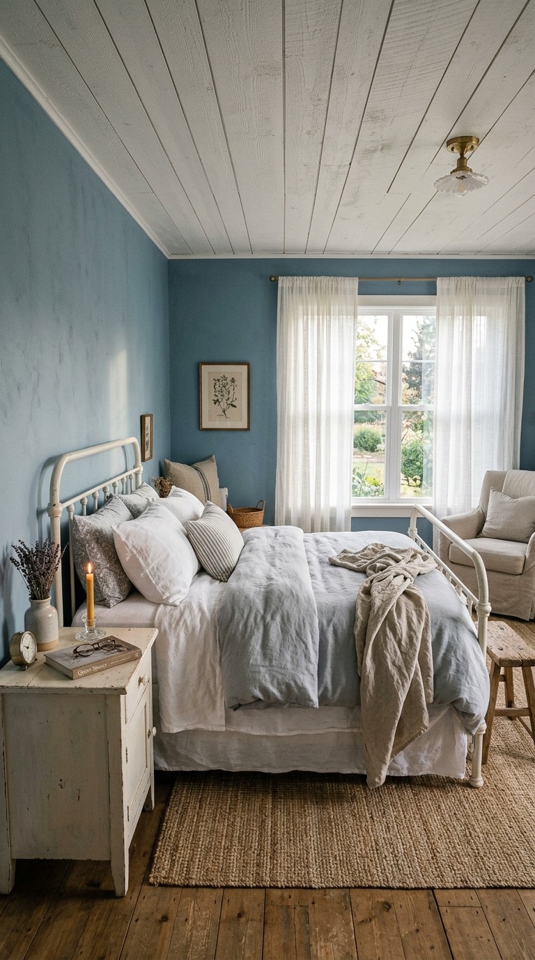
To bring this color to life in your own room, start with a white or off-white trim because the contrast defines the color without hardening it. Layered textiles in cream, oat, and soft gray keep the palette from feeling too cold or nautical. If your room gets good natural light, dusty blue will warm up beautifully through the day and shift into something almost lavender as the evening settles in. If your room is darker, balance it with plenty of warm-toned lighting and lighter furniture to keep the energy lifted.
Terracotta Paint That Warms Every Corner Instantly
If you have ever wanted your bedroom to feel like an escape — not just from your day but from your whole season — terracotta is the color that delivers that. It is warm, ancient, grounding, and surprisingly sophisticated when you use it with intention. A terracotta bedroom glows in any light. Morning sun makes it vibrant and energizing. Evening lamplight turns it into something almost cinematic. It is one of those rare colors that changes personality throughout the day while always staying beautiful.
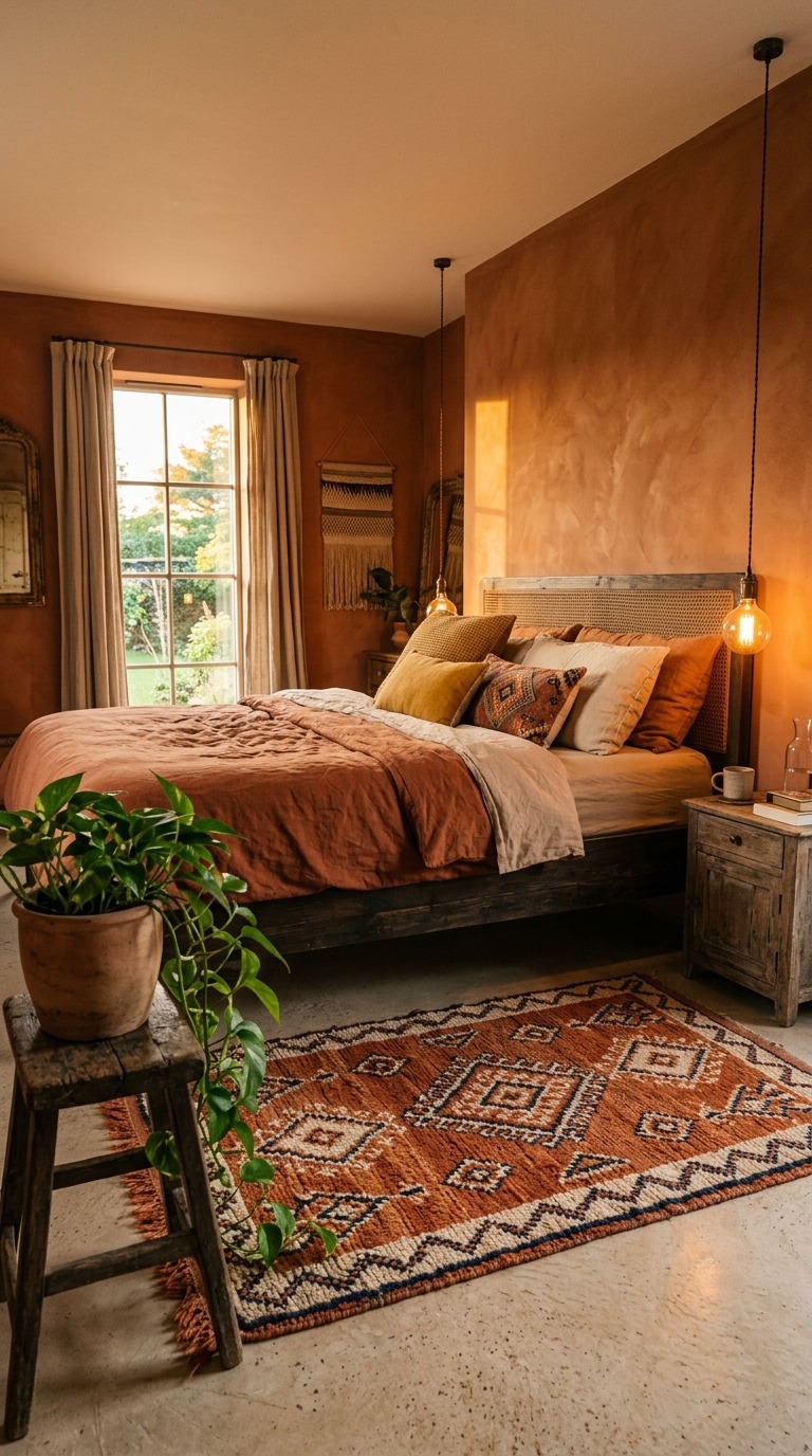
The materials you pair with terracotta matter enormously. Lean into natural textures — raw linen, chunky wool, rattan, dark-stained wood, and unglazed ceramic. Keep the bedding earthy but slightly lighter than the walls — rust, oat, warm sand — so the room breathes rather than closes in. Add one or two trailing green plants for life and contrast. Avoid anything too polished, too metallic, or too modern because terracotta wants to feel handmade, warm, and deeply connected to the natural world.
Soft Blush Color That Feels Romantic and Timeless
There is a reason soft blush keeps showing up in the most beautiful bedrooms across the design world — it makes people feel genuinely good. Not in a loud, statement-making way, but in a deeply quiet, slightly romantic, entirely welcoming way. Blush works because it is warm without being yellow, soft without being white, and feminine without being overwhelming. It gives a bedroom that elusive quality that designers spend years chasing — the feeling that the room itself is giving you a hug.
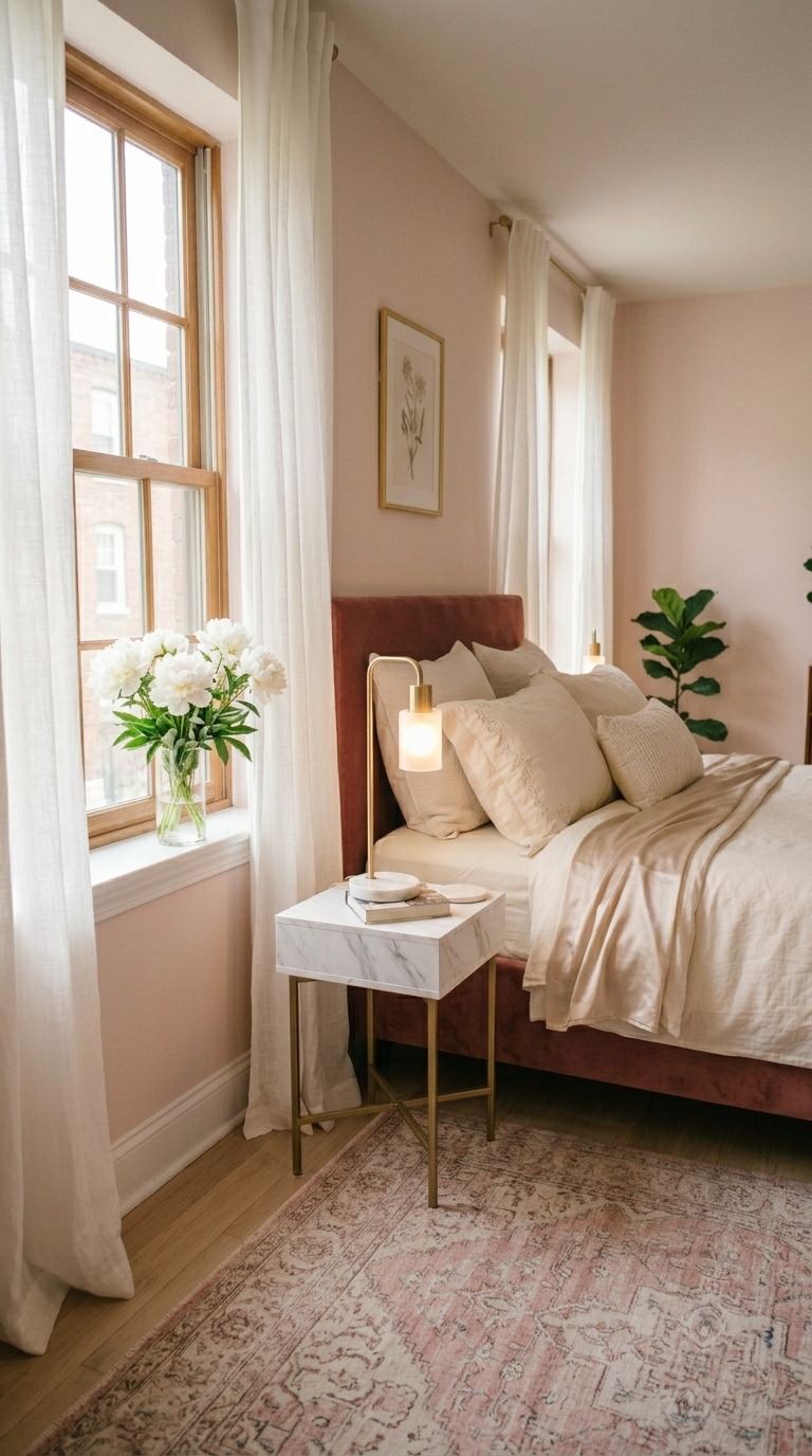
The secret to blush that feels sophisticated rather than juvenile is the depth of the tone. Choose a blush that has a slight gray or mauve undertone rather than a candy-pink base. This keeps it from reading young or trendy and instead makes it feel enduring and elegant. Pair it with warm gold, aged brass, soft ivory, and materials like velvet and silk to push it into full luxury territory. Blush also loves a deeply colored accent — a charcoal linen pillow, a dark walnut side table — which gives the room just enough contrast to keep it visually interesting.
Charcoal Gray That Creates a Cozy Luxurious Cocoon
Painting a bedroom charcoal feels brave until you do it — and then it feels like the most obvious, luxurious decision you ever made. Deep charcoal walls create a cocoon effect that is unmatched by any other color. The room feels intentional, confident, and deeply restful in a way that lighter colors simply cannot replicate. It is the bedroom equivalent of pulling on a perfectly soft, heavy blanket — everything becomes quieter and more contained in the best possible way.
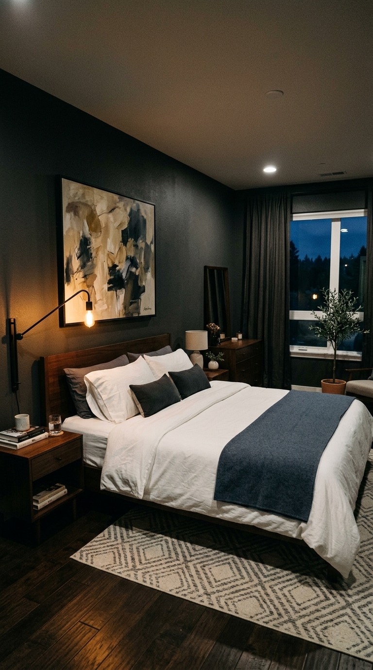
To stop charcoal from feeling cave-like, contrast is everything. Crisp white bedding against dark walls creates a striking visual that feels expensive and intentional. Introduce warm-toned metals like brushed gold or antique brass for hardware and lighting fixtures. Keep the floor light — a cream rug, pale wood, or light-toned tile — to balance the depth on the walls. Mirrors are your best friend in a charcoal bedroom because they multiply whatever natural light exists and prevent the room from absorbing all the energy in the space.
Creamy White That Makes Every Bedroom Feel Alive
Creamy white is not boring. Say that again out loud if you need to, because it is genuinely one of the most transformative and enduring bedroom colors available to you. Unlike a harsh brilliant white, creamy white has warmth built right into it — a whisper of yellow, or butter, or linen — that makes a room feel genuinely inviting rather than stark and clinical. It is the color that makes natural light look its very best and that makes every piece of furniture, every textile, every piece of art feel curated and intentional.
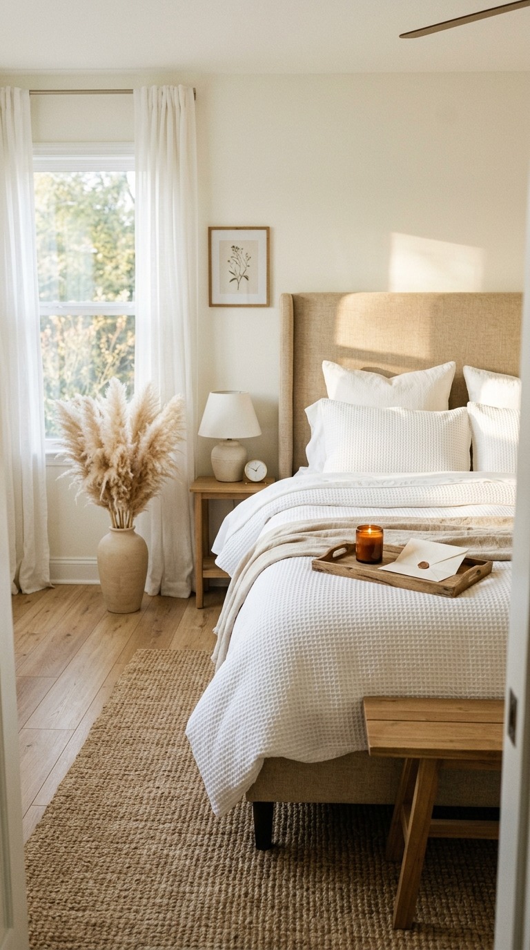
The beauty of creamy white is how it acts as a blank canvas that never feels cold. It welcomes every style — whether your taste runs toward rustic farmhouse, organic modern, or airy Scandinavian, creamy white works with all of it beautifully. The key is choosing the right undertone for your specific room. Warmer undertones lean toward yellow or peachy tones and suit south-facing rooms with lots of natural light. Rooms with less sunlight benefit from a creamy white with a very slight pink undertone, which keeps the space from reading gray and flat on cloudy days.
Forest Green Walls That Bring Nature Indoors Beautifully
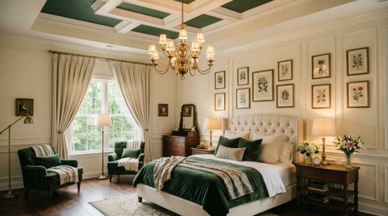
Forest green is the kind of bedroom color that makes you feel like you are sleeping inside a nature reserve — in the most luxurious, sheltered, beautifully designed way possible. It wraps a room in depth and richness that feels completely immersive. Waking up surrounded by deep green walls is genuinely different from waking up in any other color room — there is a grounding quality to it, something almost primal and settling, that makes the whole morning feel more deliberate and calm.
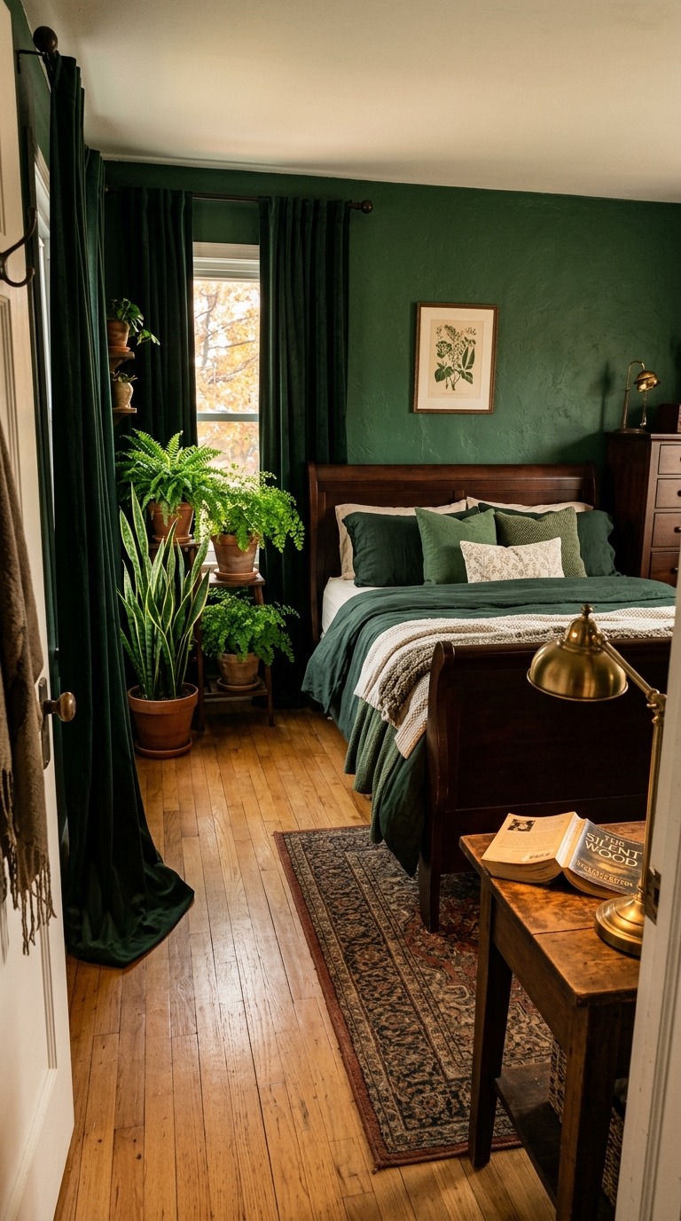
Leaning into natural elements is the most powerful way to make a forest green bedroom feel cohesive and intentional. Add real living plants — they disappear into the walls in the best possible way and create layers of texture you cannot manufacture with accessories. Choose furniture in dark walnut, mahogany, or espresso tones. Use warm brass or matte gold hardware to add glow without competing with the color. Keep bedding in cream, oatmeal, or very deep forest tones, and let the green walls be the undeniable star of the whole room.
Lavender Gray That Adds Dreamy Depth and Softness
Lavender gray occupies this rare, dreamy space where the softness of purple meets the restraint of gray — and the result is a bedroom color that feels genuinely unlike anything else. It is calming in a deeper, more layered way than straight gray, and more sophisticated than straight lavender. Rooms painted in lavender gray have an almost magical quality at different times of day — pearly and cool in bright daylight, and warmly romantic under evening lamplight.
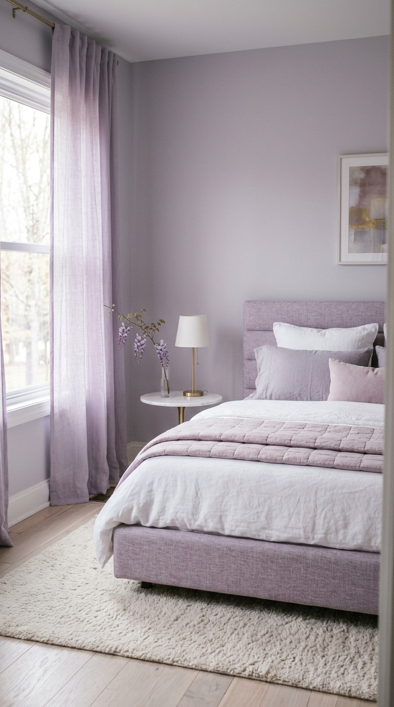
This color works beautifully in rooms with good natural light, which allows the lavender undertone to come forward during the day and recede gracefully in lower light. Pair it with warm whites rather than cool whites to keep the space from feeling icy. Soft gold, rose gold, and pewter tones all look extraordinary against lavender gray. Avoid overly saturated or vibrant accent colors — this is a quiet, refined palette that rewards subtlety and restraint more than any other bedroom color on this list.
Warm Mustard That Fills Your Room With Golden Energy
Warm mustard is not a color for the faint-hearted — and that is precisely what makes it so exciting. A mustard bedroom feels lived-in, confident, and entirely unique in a design landscape full of safe neutrals and muted tones. It pulls its warmth from somewhere deep and genuine — from harvest fields, spice markets, afternoon light — and it brings all of that energy right into your most personal space. When you get it right, a mustard bedroom feels like the warmest, most inviting room in the whole house.
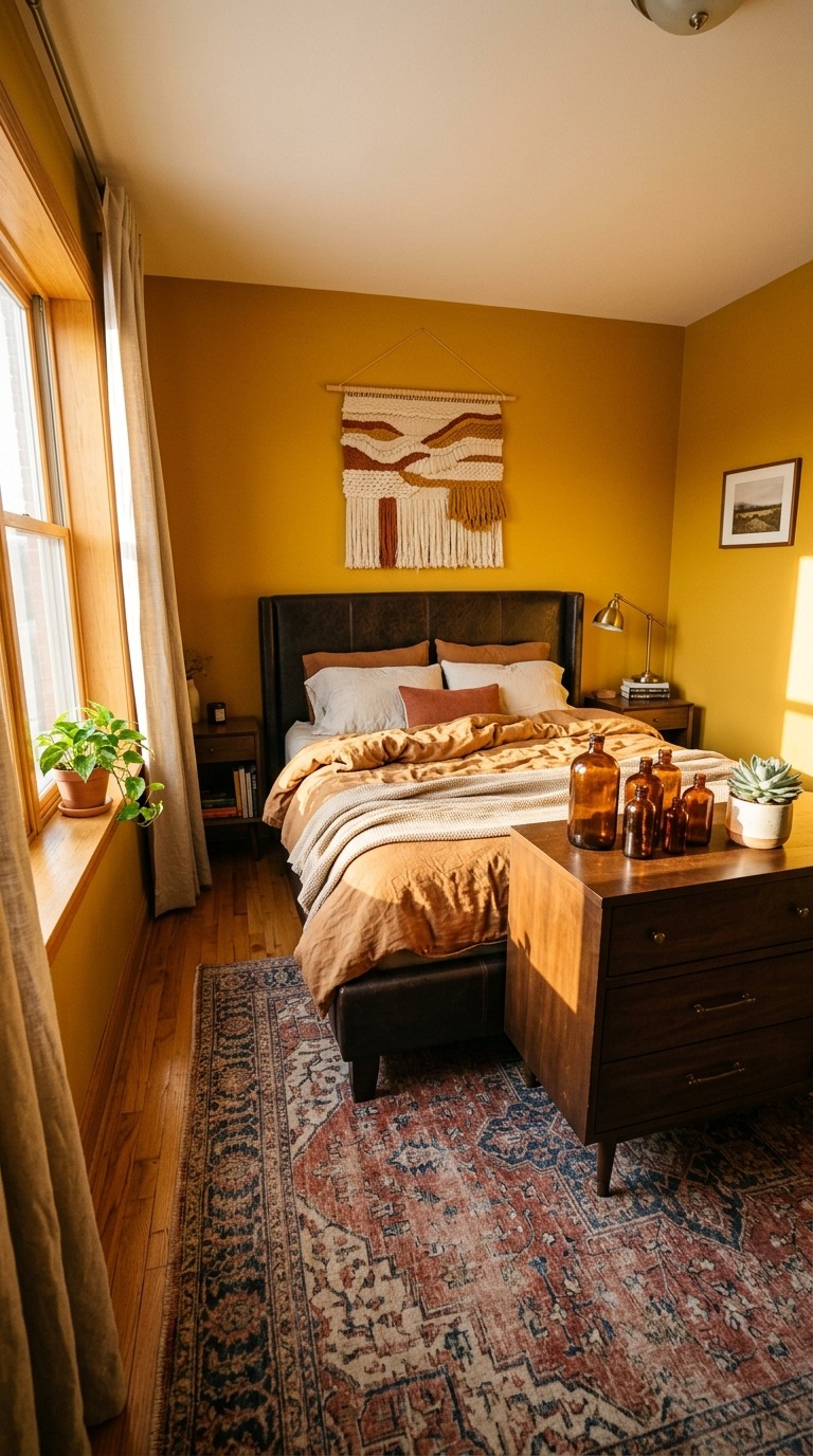
The critical thing to understand about mustard is that the right shade makes or breaks the whole room. You want a mustard that leans warm and golden rather than acidic or greenish — think old honey or aged turmeric rather than neon yellow. Balance it with deep, rich furniture tones: dark walnut, leather, aged bronze. Keep bedding neutral — ivory, linen, camel — and let the walls do all the dramatic heavy lifting. One or two deep jewel-toned accents, like a navy throw or a forest green pillow, give mustard exactly the grounding contrast it needs.
Navy Blue That Gives Your Bedroom Timeless Bold Character
Navy blue is a bedroom classic for such a good reason — it holds space beautifully. It is serious without being cold, dramatic without being overwhelming, and deeply restful in a way that makes sleep feel more intentional and complete. A navy bedroom signals that you know exactly what you want and that you have committed to it fully. There is a timeless quality to navy walls that places the room entirely outside of trend cycles and into something that feels permanently beautiful and right.
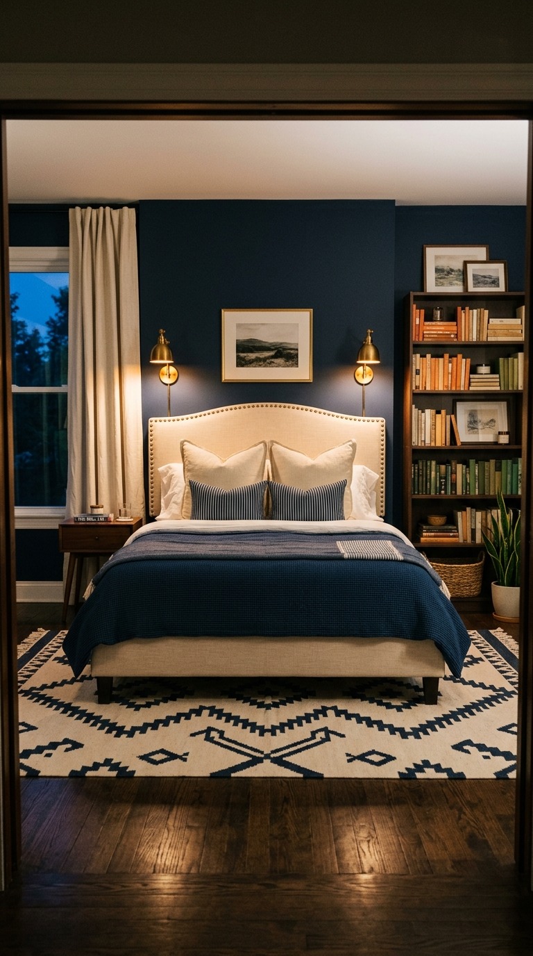
Warm metals are non-negotiable with navy — brass, gold, and antique bronze lift the color out of its potentially cold register and give the room genuine glow and hospitality. Cream, ivory, and warm white bedding creates a classic contrast that never feels tired when it is executed with good quality textiles and proper layering. If you want to modernize a navy bedroom, introduce natural wood tones and matte textures — linen, jute, raw wood — to soften the formality and make the space feel current and warm rather than traditional and stiff.
Mocha Brown That Wraps Your Bedroom in Pure Comfort
A mocha bedroom feels like sinking into the best chair in the house at the end of a long day — rich, deeply grounding, and entirely unapologetically comfortable. Mocha brown is having a genuine moment right now, and it deserves every bit of the attention because it does something that most bedroom colors simply cannot. It makes a room feel simultaneously luxurious and unpretentious, sophisticated and deeply cozy, all at once. It is the ultimate comfort color taken to its full, beautiful potential.
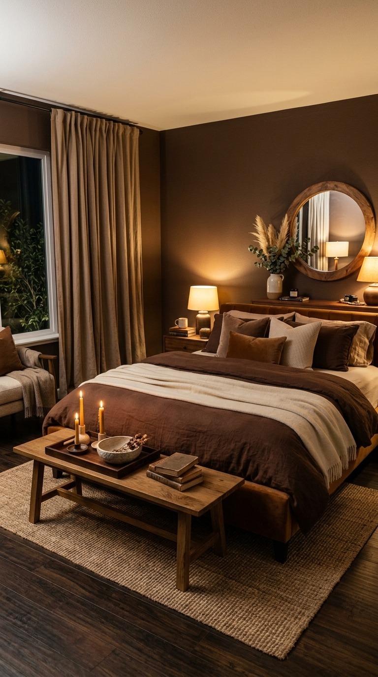
The layering strategy in a mocha room is everything. Build your palette from the walls outward in increasingly lighter tones of the same warm brown family — caramel, butterscotch, cream, and ivory — until the eye travels through the room naturally and rests on nothing jarring or out of place. Introduce texture through velvet, boucle, leather, and polished wood because all of these materials drink up the warm tones and reflect them back in slightly different ways. One large-scale piece of wall art in cream, rust, or warm gold gives the mocha walls a focal point they genuinely need.
Slate Blue Green That Turns Bedrooms Into Peaceful Retreats
Slate blue-green sits in one of the most interesting and nuanced territories in the entire color wheel. It is neither fully blue nor fully green — it has the calm of the ocean and the groundedness of the earth all in one. Rooms painted in slate blue-green have a distinctly spa-like quality without resorting to the clinical coldness that sometimes comes with purely aqua or teal palettes. It is restful in a complex, layered way that keeps the eye happy and the nervous system genuinely calm.
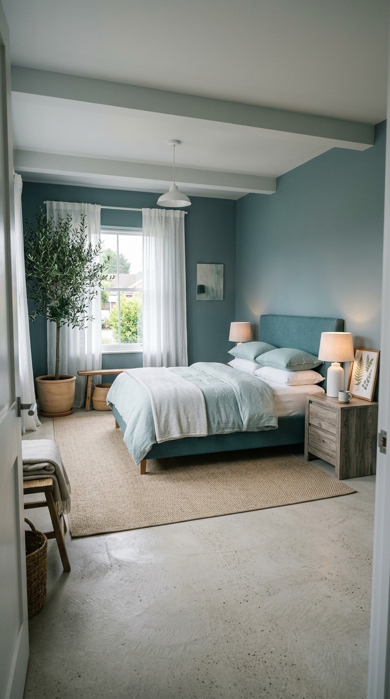
Grounding this cool palette with warm organic materials is the design move that elevates it from pretty to spectacular. Natural fiber rugs, linen curtains, rattan furniture, and terracotta accessories pull the warmth upward and stop the room from feeling too cool or too curated. White trim and ceiling keep the color from feeling heavy, while warm-toned wood floors provide the base note that holds everything together beautifully. This is a color that rewards restraint — let it breathe, keep accessories minimal, and watch how the room rewards you.
Soft Lilac That Makes Waking Up Feel Gently Beautiful
Soft lilac is the quiet romantic in the paint color world — the one that does not announce itself loudly but simply makes everything around it feel gentler and more beautiful. A bedroom in soft lilac is a genuinely calming space to fall asleep in and a gently uplifting space to wake up in, which is a rare and valuable combination. It carries the nostalgia of old gardens and heirloom roses, but when paired with modern, clean-lined furniture, it becomes something entirely contemporary and fresh.
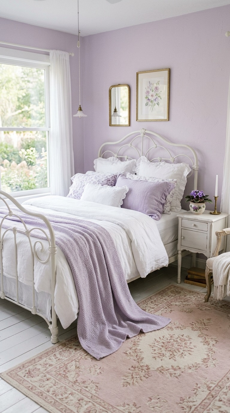
Keeping the overall palette very soft is the most important styling principle in a lilac bedroom. White, ivory, pale blush, and the softest sage green all live in perfect harmony with lilac walls. Avoid deep or saturated colors because they will fight the quiet loveliness of the color rather than support it. Opt for soft sheens and matte finishes in the paint itself — a flat or eggshell finish deepens the color and prevents the walls from reading plasticky or cheap. Feminine textures like silk, lace-edged linens, and soft velvet cushions feel entirely at home here without making the room feel overdone.
Off Black That Transforms Any Bedroom Into Dramatic Luxury
Off-black is the most committed, most confident, most fully realized choice on this entire list — and when it works, it works in a way that genuinely takes your breath away. An off-black bedroom is not trying to be anything other than exactly what it is: bold, intimate, theatrical, and deeply, completely restful. The off-black shade — which carries just the faintest whisper of warmth, whether brown, green, or navy — prevents the room from feeling flat or oppressive and gives the walls a living, breathing depth that pure black never quite achieves.
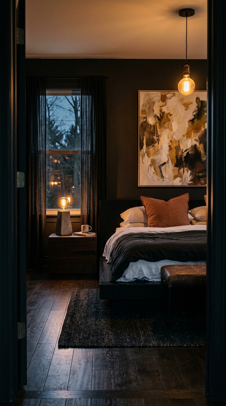
Lighting becomes your most important design tool in an off-black room. Every light source — lamp, sconce, pendant, candle — takes on enormous importance because it is the primary way warmth and personality enter the space. Warm-toned bulbs are essential; cool-white LED bulbs will make the room feel harsh and unwelcoming. Introduce reflective surfaces through mirrors, glass, and polished metal accessories to multiply the warmth. Keep bedding light and simple — crisp white or warm cream — because the drama of the walls provides everything the room needs, and the bed should feel like a haven within that drama rather than compete with it.
The most beautiful bedroom you have ever seen probably came down to one decision — a color someone was brave enough to choose. You have fifteen of those decisions sitting right here, waiting for you. Pick the one that made your heart move a little, grab a small tester pot first, and live with it on the wall for a week before you commit. Your bedroom should feel like the best place in your entire home — a space that restores you every single night and welcomes you back every single morning. That is not too much to ask from a coat of paint. Go make your walls work for you.