How Many Colors Should Be in a Room When Decorating? The Simple Rule Designers Swear By
Why Color Count Matters More Than You Think
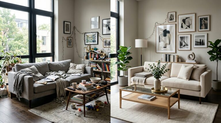
Walk into any beautifully designed room and something clicks instantly. It feels calm, balanced, intentional… almost effortless. Now walk into a space where too many colors are competing for attention, and suddenly it’s chaos—your eyes don’t know where to rest, and the room feels louder than it should.
That’s the real power of color. It doesn’t just decorate a space—it defines how that space feels.
And here’s where things get interesting. Most people focus on which colors to use, but the real secret that designers quietly rely on is something else entirely: how many colors you use in the first place.
So the question naturally comes up—how many colors actually work in a well-designed room?
The answer might surprise you in its simplicity. Across expert advice and interior design principles, there’s a clear sweet spot that keeps showing up again and again: 3 to 5 colors.
It’s not random. It’s not restrictive. It’s the balance point where creativity meets calm—where a room feels layered but never messy, expressive but never overwhelming.
Because at the end of the day, great interior design isn’t about using more color. It’s about using the right amount of color to create harmony, flow, and visual comfort.
2. The Short Answer: The 3–5 Color Rule
If you strip away all the styling techniques and design jargon, the rule is surprisingly simple:
- 3 colors = the ideal standard
- Up to 5 colors = the maximum recommended range
In fact, many designers refer to three colors as the “magic number” in interior design. It’s the point where a room starts to feel complete without becoming visually busy.
But why does this work so well?
Because staying within this range does three important things for your space:
- It keeps rooms cohesive — everything feels like it belongs together instead of competing for attention
- It prevents visual clutter — your eye can move comfortably without feeling overwhelmed
- It creates intentional design flow — each color has a purpose, not just a presence
In other words, this rule isn’t about limiting creativity—it’s about guiding it. When your color palette has structure, the entire room naturally starts to feel more polished, more balanced, and far more inviting.
3. The Most Trusted Formula: The 3-Color Rule
If there’s one system designers return to again and again, it’s the 3-color rule. It’s simple on the surface, but incredibly powerful when you see it in action. The idea is to build a room using three layers of color that each play a specific role—nothing random, nothing fighting for attention.
3.1 The Structure Behind the Magic
At the heart of this method is a clear breakdown:
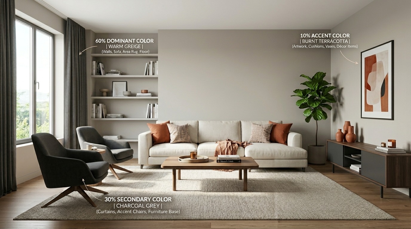
- Dominant color (60%)
- Secondary color (30%)
- Accent color (10%)
The dominant shade sets the foundation of the room. The secondary color supports it, adding contrast and depth. The accent color? That’s your personality moment—the small but impactful detail that brings everything to life.
Together, they create a visual rhythm that feels natural, almost instinctive.
3.2 How It Works in Real Rooms
This is where the theory becomes something you can actually picture.
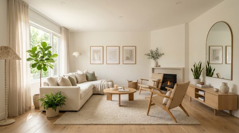
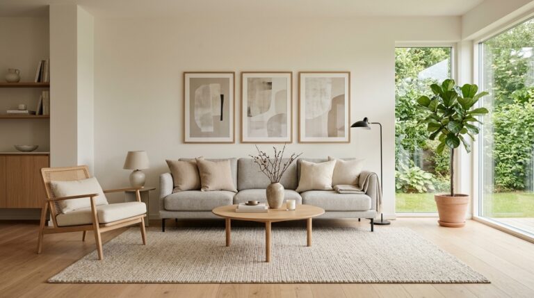
- Walls, sofas, and rugs = dominant color
- Curtains, bedding, accent chairs = secondary color
- Art, décor pieces, small highlights = accent color
Think of it like a visual hierarchy. Your dominant color sets the stage, your secondary color builds the mood, and your accent color adds the spark. When each layer has its place, the room instantly feels more grounded and complete.
3.3 Why Designers Love It
There’s a reason professionals rely on this formula so heavily:
- It creates instant harmony without overthinking
- It gives the room a clear visual structure from the start
- It makes decorating feel simpler, more intentional, and far less overwhelming
Instead of guessing what goes where, you’re following a system that naturally guides your decisions. And that’s exactly why it works so well—it removes chaos and replaces it with clarity.
4. Variations of the Rule Designers Use
While the 3-color rule is the foundation, designers often adapt it depending on the space, style, and mood they want to create. Think of it less as a rigid rule and more like a flexible design language.
4.1 The 3-3-3 Approach
Another way to think about color balance is to group everything into three clear categories:
- dominant
- secondary
- accent
It’s essentially the same structure as the 3-color rule, just expressed in a more simplified, intuitive way. Instead of focusing on percentages, you focus on how each color behaves in the room.
4.2 The 60-30-10 Rule
This is the more technical version of the same idea.
It reinforces the idea of balanced distribution across a space, making sure no single color takes over while still allowing enough contrast to keep things visually interesting.
It’s especially useful when you want a room that feels polished and professionally styled without appearing too busy.
4.3 The 4–5 Color Approach (“Golden Number”)
When designers want a little more depth and personality, they expand the palette slightly
This approach is often called the “golden number” because it sits right at the edge of creativity and control. You get variety, but not chaos. Personality, but not overload.
5. Why 3–5 Colors Is the Sweet Spot
There’s a reason designers don’t just pick colors randomly and hope for the best. When a room works visually, it’s usually because the palette sits right in that comfortable middle zone—not too minimal, not too busy.
A range of 4–5 colors can create real visual richness without tipping into chaos. It gives the room enough variation to feel layered, interesting, and lived-in, while still holding onto a sense of order.
But once you go beyond that, things start to shift. The space can quickly begin to feel scattered, like every corner is speaking a different visual language.
Keeping your palette limited does three important things:
- Cohesion — everything feels connected, like it belongs in the same story
- Visual breathing space — the eye has room to rest instead of constantly jumping around
- Easier styling decisions — fewer color choices means clearer, more confident decorating
In the end, restraint is what creates that effortless, designed look people often admire but can’t quite explain.
6. The Mistake Most People Make: Too Many Variations
Here’s where many well-meaning room makeovers start to fall apart.
It’s easy to think that using multiple shades of the same color will make a room feel coordinated. But in reality, overdoing variations can do the opposite—it can blur the design instead of sharpening it.
When too many similar tones compete, the eye struggles to define what’s important. Instead of harmony, you get visual noise disguised as coordination.
That’s why designers often recommend sticking to 3–4 variations of a color at most. It keeps the palette refined and intentional without overwhelming the space.
Because when tones are over-layered, something subtle but important gets lost: visual clarity. And once that’s gone, even the most beautiful colors stop feeling purposeful.
7. Expert Consensus: What Designers and Guides Agree On
When you look across interior design advice from different sources, one thing becomes clear pretty quickly—there’s a shared understanding of how color should behave in a room. The exact numbers may vary slightly, but the philosophy stays consistent.
7.1 The “3 Is Ideal” Perspective
Many interior experts and design guides point to three colors as the safest and most balanced choice. It’s the point where a room feels complete without becoming visually heavy.
With just three tones working together, everything has a defined role. Nothing competes, nothing feels random, and the space naturally leans toward harmony.
7.2 The “Up to 5 Works Best” Perspective
On the other hand, some designers are a little more flexible. They allow up to five colors when the goal is to introduce more depth, personality, or layering.
This approach is especially useful in spaces that lean creative or expressive, where a bit more visual variation helps the room feel alive rather than minimal.
Still, even in this more generous approach, the structure remains intentional—not excessive.
7.3 The Common Thread
Despite the slight differences in opinion, every expert circles back to the same core idea:
- Too many colors = chaos
- Structured limits = harmony
That’s the real agreement. Whether it’s three colors or five, the goal is always the same—creating a space that feels balanced, readable, and visually calm.
8. Practical Takeaway: How to Apply This in Your Own Room
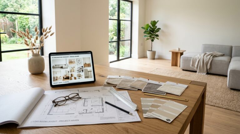
Theory is helpful, but this is where it becomes real. If you’re decorating your own space, the process can stay surprisingly simple.
Start with a clear foundation:
- Choose 1 dominant color to set the tone of the room
- Add 1 supporting color to build contrast and depth
- Finish with 1 accent pop to bring energy and focus
From there, you can expand carefully if your space needs more layering—but try to stay within a maximum of 5 total colors.
And throughout the process, pause and check one thing: does the room still feel calm and cohesive? If the answer is yes, you’re on the right track. If not, it might be time to simplify.
Because good design isn’t about filling space with more—it’s about making sure every choice has a reason to exist.
Conclusion
At the end of the day, creating a beautiful room isn’t about how many colors you can squeeze in. It’s about how well those colors work together.
The real secret is simple: balance beats quantity every time.
That’s why the rule keeps coming back:
- 3 colors is ideal
- 5 colors is the safe maximum
And beyond everything else, there’s one subtle truth designers always rely on—restraint is what makes a space feel expensive, intentional, and effortlessly put together.