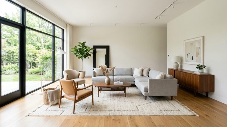

I Repainted My Living Room 3 Times Before Getting It Right — Here’s What I Learned
There’s a particular kind of frustration that sets in when you step back from a freshly painted wall — brush still in hand, paint fumes still in the air — and feel your stomach drop. Not excitement. Not pride. Just the sinking realization that something is very, very wrong.
That was me. Three times.
I spent more money than I’d like to admit, more weekends than I planned, and more energy than felt reasonable cycling through paint colors in my living room before I finally landed on something that felt right. What I didn’t know going in — and what no one really warns you about — is how dramatically colors change throughout the day. The warm greige I loved at the paint store looked green by noon and almost purple by lamplight. The crisp white I chose second made my room feel like a walk-in freezer.
Each of my first three paint attempts failed for different reasons: wrong undertones, wrong finish, wrong lighting assumptions, and one embarrassingly avoidable case of just picking a color because it looked good on Pinterest.
At Well Home Life, we believe your home should feel like yours — and getting the paint right is foundational to that. So if you’re standing at the start of your own repainting journey, this is the guide I wish I’d had. Here are the real lessons, the real mistakes, and what finally worked.
Why Choosing a Living Room Paint Color Is Harder Than It Looks
Most people assume paint is simple. You pick a color you love, slap it on the wall, and that’s it. If only. Choosing the right living room paint color involves a surprising number of variables — and ignoring any one of them is how you end up with three rounds of repainting.
Paint Swatches Look Completely Different on Walls
This is the first rule of choosing paint colors, and it’s one almost everyone learns the hard way. Those little cardboard chips at the hardware store are fine for getting a general direction, but they will mislead you every time when it comes to making a final decision.
Paint swatches are tiny, surrounded by other colors, and viewed under fluorescent store lighting. On your walls, the same color appears at a much larger scale, surrounded by your specific furniture, floors, and lighting. The psychological effect of scale alone changes how we perceive color dramatically. A soft dusty blue on a small chip can look like bold slate on a full wall.
This is why paint samples on walls — large ones, at least 12 by 12 inches — are non-negotiable before committing to a full paint job.
Natural Light Changes Everything
One of the most underestimated factors in choosing living room paint colors is natural light. A room flooded with south-facing afternoon sun will make warm tones glow beautifully. A north-facing room lit mostly by indirect, cooler light will make the same color look muddy or flat.
And it’s not just about direction — it’s about time of day. I learned this the hard way when a color I tested looked perfect at 10 a.m. and turned an unflattering shade of mauve by 6 p.m. Natural light in living rooms shifts in color temperature from morning to evening, and your paint color shifts right along with it.
Understanding how lighting affects paint color is one of the most practical things you can do before picking up a brush.
Undertones Matter More Than the Actual Color
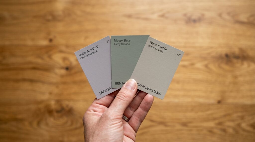
If there’s one concept that would have saved me two entire paint jobs, it’s this: paint undertones. Every paint color — even the most neutral-seeming greige or off-white — has an undertone. It might be pink, green, blue, yellow, or purple. And that undertone becomes far more visible once the paint is on your walls and interacting with your flooring, furniture, and light.
When I chose my first ‘safe neutral,’ I never checked its undertone. It had a distinctly cool blue-green base that clashed horribly with my warm oak floors. On the chip, it looked like a simple light gray. On my walls, it looked cold and slightly clinical. Warm vs cool undertones is one of the most important considerations in any paint project, and it’s easy to miss when you’re focused on the surface color alone.
Why Pinterest Living Rooms Can Be Misleading
We’ve all done it — fallen in love with a Pinterest living room and tried to replicate it. The problem is that those photos are almost always professionally styled, shot under perfect lighting, and edited post-production. The paint color you’re admiring may look entirely different in your actual room.
Beyond the photography, Pinterest spaces often have furniture, decor, flooring, and window configurations that are nothing like your own. Color exists in relationship to everything around it. A deep forest green that looks stunning against white oak floors and linen sofas might look oppressive in a room with brown carpet and dark furniture. Following living room color ideas from social media is a great starting point — but it’s just a starting point.
The First Paint Color I Tried (And Why I Hated It)
My first choice was what I thought was a no-risk move: a light, barely-there gray that the paint store associate described as a ‘classic neutral.’ It had hundreds of five-star reviews online. It was practically a guarantee of success — or so I thought.
The ‘Safe Neutral’ That Made the Room Feel Cold
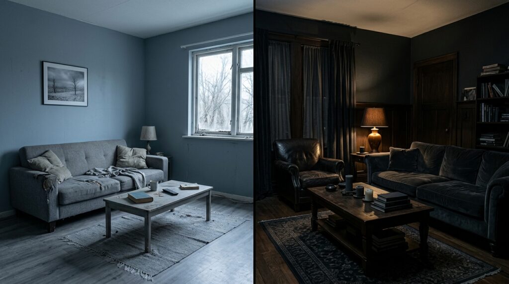
The moment the first coat dried, something felt off. By the second coat, I knew I’d made a mistake. The room, which had always felt a little small but cozy, now felt stripped of personality. Worse, it felt cold — and not just visually. The cool undertone of the gray seemed to lower the actual perceived temperature of the space.
What I hadn’t accounted for was that my living room gets mostly east-facing light, which is cooler and bluer in tone. Pairing that with a cool gray paint turned the room into something resembling a dental waiting room. It was technically a ‘neutral’ — but it was neutral in the worst possible way.
How Bright White Made My Living Room Feel Smaller
Before I repainted the gray, I went through a brief phase of thinking stark white might be the answer. I tested a few whites and quickly realized why so many designers caution against them in living spaces.
Bright whites are unforgiving. Every scuff, smudge, and shadow is visible. In a room that isn’t architecturally perfect — and most homes aren’t — stark white tends to highlight imperfections rather than minimize them. In my case, it also made the room feel smaller, not larger, because the harshness of the white emphasized the boundaries of the space.
The Mistake of Ignoring Warm vs Cool Undertones
Looking back, both my first attempts had the same root problem: I was choosing paint based on the surface color without understanding the undertone beneath it. I was picking grays and whites that looked clean and modern in isolation, without stopping to ask how they’d interact with the warm wood tones in my flooring and furniture.
Warm vs cool undertones isn’t just a design concept — it’s a practical checklist item. Before you ever buy a full can of paint, hold your large sample swatch against your floor, your sofa, your curtains. If there’s a clash, the undertone is usually the culprit.
My Second Attempt: Going Too Dark and Dramatic
Overcorrecting is a natural human response. After two rounds of colors that felt too light, too cold, and too safe, I swung in the opposite direction. I was going to go bold. I chose a deep, moody color — think late-evening forest, or the inside of a very chic restaurant.
Why Bold Paint Colors Look Different in Real Life
The color looked magnificent in photographs. On the chip, it looked rich and sophisticated. On my walls, at full scale, with my actual furniture and my actual lighting — it looked like I’d accidentally painted the room the wrong color.
Bold paint colors look different in real life for the same reason light colors do: scale, context, and light. But the effect is amplified. Deep colors absorb light rather than reflecting it, which changes the entire character of a space. The depth and shadow effects created by a very dark paint can make a room feel intimate and dramatic in ideal conditions — or small and oppressive if the lighting doesn’t support it.
The Problem With North-Facing Rooms
I also hadn’t accounted for room orientation. North-facing rooms receive indirect, cooler light throughout the day. The absence of direct sunlight means dark colors never get the warm glow that makes them look beautiful in design photography. Instead, they absorb the already-cool available light and make the space feel even darker.
If you have a north-facing living room, it’s not that you can never go dark — but you need to be especially deliberate about your choice and rely on warm artificial lighting to compensate.
How Dark Colors Changed the Mood of the Space
There was an undeniable shift in how the room felt with the dark paint. Not the sophisticated, cocooning effect I’d been hoping for — the color depth I’d chosen felt heavy rather than dramatic, and the living room color psychology effect was decidedly negative. Where the space had previously felt airy (if cold), it now felt enclosed. Even my dog seemed less enthusiastic about spending time in there, which felt like a sign.
What I Should Have Tested First
The lesson here was simple: I should have tested the color at scale, in my room, at different times of day, before committing. I’d looked at a paint chip. I’d looked at the Instagram photos tagged to the paint’s name. I hadn’t done the actual work of painting a large swatch section and living with it for 48 hours. That step, which feels like a small extra effort, would have saved me an entire paint job.
The Biggest Mistakes I Made Before Getting It Right
Across three paint attempts, I made a lot of mistakes. Some were specific to particular colors; others were systematic errors in my process. Here’s the full list — so you don’t have to repeat them.
Choosing Paint Before Furniture & Decor
This is one of the most common living room decorating mistakes, and I made it confidently, twice. I chose a paint color before I’d decided on my sofa, before I’d found a rug I loved, before I knew what direction I wanted the room to go.
Color doesn’t exist in a vacuum. Your walls are a backdrop — and a backdrop that looks great against one set of furnishings can look jarring against another. The conventional wisdom from most interior designers is to choose paint last, or at least after you’ve committed to your major furniture and flooring decisions. Paint is far cheaper and easier to change than a sofa.
Testing Tiny Swatches Instead of Large Samples
I’ve mentioned this, but it deserves its own section because it’s so important: paint samples on walls should be large. Not a four-inch square. Not a quick brush stroke. Large rectangular sections, ideally covering at least a foot square, painted directly on the wall you’re considering.
Better yet, use peel-and-stick paint samples, which allow you to move the sample to different walls and different lighting conditions without repainting.
Ignoring Paint Finish
Paint finish mistakes are another incredibly common issue, and one I definitely made on my first attempt. I chose a flat finish because I liked the matte, sophisticated look — without thinking about what that meant practically.
Flat finishes absorb light and hide imperfections beautifully, but they are notoriously difficult to clean. In a living room that sees regular use, that matters. The best finish for living room walls is typically an eggshell or satin: it has just enough sheen to be wipeable while still looking elegant and not overly shiny.
Not Checking the Color Morning vs Evening
This is the mistake that still stings a little. I tested my second-attempt color in the afternoon, loved it, and bought five gallons. I didn’t check it in the morning, and I didn’t check it under artificial lighting in the evening. By the time I’d painted the whole room and turned on the lamps that night, I realized the warm artificial lighting was doing something very strange to the undertones.
Checking colors at different times of day isn’t optional — it’s essential. Morning light, midday light, afternoon light, and evening lamplight are four different lighting environments, and your paint color will behave differently in each.
Following Trends Instead of My Home’s Style
A full wall of that dark, moody color was genuinely trending when I tried it. I’d seen it in every design publication and on every home account I followed. What I didn’t ask myself was whether it suited my home’s style, my room’s proportions, or my own everyday comfort.
Trendy colors that date quickly are a real risk. The decorating choices that age best are the ones made for the specific character of a home, not the ones made to match a magazine spread from a particular year.
What Finally Worked in My Living Room
After three attempts and a lot of lessons learned, my fourth paint color has been on my walls for over two years. I still love it. Here’s what changed.
Choosing a Warmer Neutral Instead
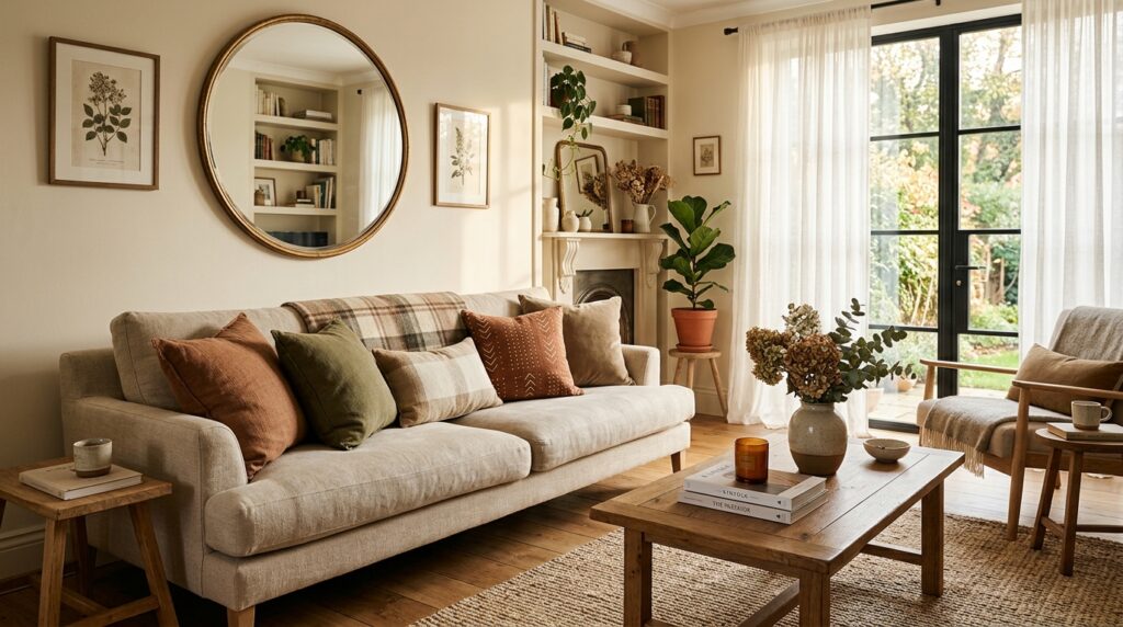
I finally did what I’d been avoiding: I chose a warm neutral paint color. Not a trendy color, not a bold statement, not a Pinterest moment — just a soft, warm, greige-adjacent tone with clear yellow-amber undertones that worked with my floors instead of against them.
Warm tones usually feel more inviting, and this turned out to be absolutely true in practice. The room immediately felt more livable, more comfortable, and more like a place where people actually wanted to sit and stay.
Layering Color With Textures Instead of Bold Walls
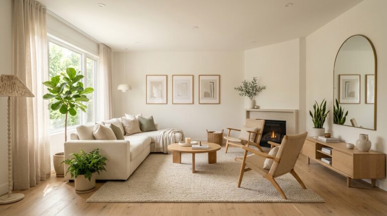
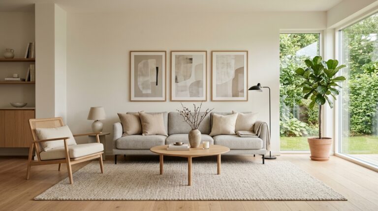
One of the shifts in my approach was accepting that the walls don’t have to do all the work. Instead of trying to make a statement with bold paint, I let the walls be a calm backdrop and brought personality in through textiles, cushions, throws, plants, and artwork.
This approach — layering color with textures — is what gives well-designed rooms their depth. The walls recede gently while the room’s objects come forward.
Using the 60-30-10 Color Rule
I’d heard of the 60-30-10 color rule before but hadn’t applied it deliberately. The principle is simple: 60% of the room’s color comes from the walls and large surfaces (the dominant tone), 30% from secondary elements like upholstery and curtains (a complementary shade), and 10% from accents like cushions, artwork, and decorative objects (a pop of contrast or personality).
Using this framework gave me a clear way to think about color theory for interiors without needing a design degree. My warm neutral walls became the 60%, my linen sofa and neutral rug became the 30%, and warm terracotta accents became the 10%. Everything finally held together.
Coordinating Paint With Flooring & Furniture
This was the structural change that made everything else work. Before choosing a color, I pulled samples of my flooring finish and held them against every paint chip I was considering. I laid the paint samples against my sofa fabric. I checked the paint against my wood furniture.
Coordinating paint with flooring and furniture is the single most important practical step in the whole process. Undertones that clash will fight each other no matter how good they look individually.
Why Soft Contrast Looks Better Than Stark Contrast
My earlier attempts had suffered from being either too matchy-matchy (everything a similar cool tone) or too contrasting (very dark walls, lighter furniture). What finally worked was soft contrast: a warm, mid-value wall color with slightly lighter trim and slightly darker anchor pieces.
Stark white trim against a very saturated wall color, for example, can look harsh and theatrical rather than elegant. Soft contrast — moving a few shades rather than jumping dramatically — creates depth and sophistication without tension.
How to Test Paint Colors the Right Way
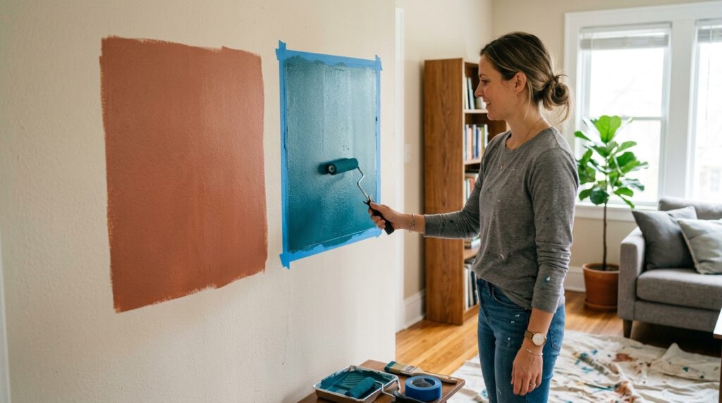
Testing paint properly is not a shortcut — it’s the process. Skip it and you’re rolling the dice. Here’s the full testing sequence I now follow before committing to any paint color.
Paint Large Sample Sections
At minimum, paint a 12 by 18 inch sample section directly on your wall. Larger is better. The color needs to be seen at scale to understand how it will actually behave. Two coats are ideal — thin single-coat samples look lighter than the finished result.
View Colors at Different Times of Day
Leave the sample on your wall for at least 48 hours and view it at multiple points: early morning, midday, late afternoon, and evening with your typical lighting on. Note how the color shifts. If it looks good at all four times, you’ve found a strong candidate.
Compare Paint Against Furniture & Flooring
Hold your paint sample physically against your floor, your main sofa, your curtains. Look for undertone harmony. If things feel slightly off, trust that instinct — it will only be more visible at full scale.
Test Both Natural & Artificial Lighting
Natural light and artificial lighting have very different color temperatures. Most home lighting is warm (yellow-toned), while daylight is cooler. A color that looks perfect in afternoon sun might look very different under your evening lamps. Always test with your actual light sources on.
Try Peel-and-Stick Paint Samples First
Peel-and-stick paint samples are one of the best modern tools for the testing process. They allow you to place large color swatches on any wall, move them around the room, compare them against different surfaces, and remove them cleanly — all without picking up a brush. Several paint brands now offer them, and the time and money saved makes them worth every penny.
Living Room Paint Colors Designers Say People Regret Most
I’m not the only one who’s made these mistakes. Designers consistently report certain paint color choices that clients end up regretting. Here are the most common.
Stark White
Stark white might be the most polarizing choice in residential painting. While it can look stunning in specific architectural contexts — high ceilings, bright natural light, modern minimal spaces — in most typical living rooms it tends to look harsh, cold, and unforgiving. It’s also practically difficult: every mark shows, every shadow reads, and without careful furniture curation it can feel clinical.
Cool Gray
Cool gray had its moment as the defining neutral of a whole decade of interior design. And it’s not a bad color — but it’s been responsible for an enormous number of paint regrets. The problem is usually the undertone: many popular cool grays have blue, purple, or green undertones that only become apparent once you’re surrounded by four walls of the stuff. Combined with north-facing light or cooler flooring tones, the result can feel sterile.
Overly Bright Yellow or Red
High-intensity colors like vivid yellow or saturated red look exciting in small doses — an accent cushion, a ceramic vase. At wall scale, in a room you inhabit daily, they become exhausting. Color psychology for interiors tells us that highly saturated colors, particularly warm hues like red and yellow, increase physiological arousal. What felt energetic and fun on day one can feel overwhelming and even stressful after a few weeks.
Trendy Colors That Date Quickly
This is the living room paint mistake I feel most personally about. Trendy colors that date quickly are everywhere in design media — the ‘color of the year’ announcements, the influencer living rooms, the before-and-after reels. These colors can genuinely be beautiful. But their life cycle in the design zeitgeist is short, and when the trend passes, your walls will feel behind the times in a way that fresh paint normally doesn’t.
Overly Saturated Accent Walls
The accent wall concept had a long run, and while it’s not dead, overly saturated accent walls have largely fallen out of favor among designers. One wall of very intense color in a room that’s otherwise neutral creates a lopsided visual tension that’s hard to resolve with furniture alone. Modern neutral living room aesthetics tend toward more subtle tonal variation — textured finishes, soft color gradation, or a slightly deeper tone in the same color family rather than a jarring contrast wall.
The Lessons I Wish I Knew Before Repainting My Living Room
After everything I went through, the lessons feel almost embarrassingly simple in hindsight. But simple isn’t the same as obvious — not when you’re standing in the paint aisle for the first time, overwhelmed by the wall of chips.
Paint Always Looks Darker on Full Walls
Every time. Without exception. The color on a chip looks lighter than the full wall will be, because you’re seeing it at a tiny scale surrounded by other colors. Go one shade lighter than you think you want and you’ll be closer to the mark. Interior paint lessons don’t come much more universal than this one.
Lighting Is More Important Than the Paint Brand
I spent time comparing paint brands, researching formulations, asking about pigment quality. All of that is valid — but it’s secondary to lighting. A premium paint in the wrong lighting will look worse than a budget paint in the right lighting. Invest in understanding your room’s light before you invest in premium paint.
Warm Tones Usually Feel More Inviting
This isn’t universal — some people genuinely prefer cooler, more minimal aesthetics and feel more comfortable in those spaces. But for most people, in most living rooms, cozy living room colors with warm undertones simply feel more like home. There’s a reason designers and architects return to warm whites, warm neutrals, and earthy tones across decades of different trends: they work in harmony with how humans perceive comfort.
Decorating Completes the Color Story
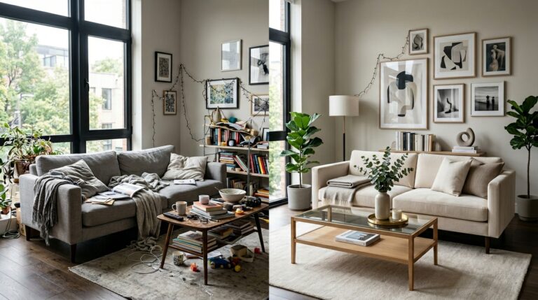
Paint is not the whole picture. Decorating completes the color story, and a so-so wall color can look much better when paired with thoughtful textiles, plants, and furniture. Conversely, even the most beautiful wall color can feel flat in an undecorated, unfurnished room. Evaluate your paint color with your room at least partially furnished for an accurate read.
Sometimes the Problem Isn’t the Paint
This is the lesson that hit me last, and hardest. After my third repaint, I hired a decorator for an hour-long consultation. Her first question was: ‘Have you thought about your lighting fixtures?’ I hadn’t. As it turned out, my overhead lighting was very cold-toned — the LEDs I’d installed were daylight-temperature rather than warm-white. They were washing out every warm paint color I tried.
Sometimes the living room color mistakes you think you’re making aren’t really about the paint at all. Lighting fixtures, window treatments, and furniture placement all affect how color reads in a space. Before you repaint again, take a walk around the room and ask whether the issue is really on the walls.
FAQs
How many times is it normal to repaint a room?
Most designers and paint professionals suggest repainting living rooms every five to seven years as part of general maintenance. Repainting for color changes is entirely normal and common — many homeowners repaint two or even three times before settling on a color they love. There’s no shame in the process; it’s simply part of figuring out what works for your specific space.
Can you repaint walls immediately?
You should wait for your existing paint to cure fully before repainting. Water-based latex paints feel dry to the touch in a few hours but benefit from 24 to 48 hours before recoating. If you’re making a significant color change — especially going from dark to light — you may also need a primer coat first to prevent bleed-through.
What paint colors make a living room feel bigger?
Paint colors that make rooms look smaller are typically very dark or very saturated. To create the perception of more space, opt for light, soft colors with warm or neutral undertones. Soft whites, warm creams, very light taupes, and pale warm grays all tend to open up a room visually. Using the same color on ceilings and walls (or going slightly lighter on the ceiling) can also help expand the perceived height of a space.
Should living rooms be warm or cool colors?
In most cases, warm colors work better in living rooms because they create a sense of comfort, ease, and invitation — which is generally what you want from a shared living space. Cool colors can work beautifully in living rooms that receive a lot of natural warm light, but in rooms with limited or cooler light, they can feel cold and unwelcoming. The best approach is to test both against your specific room’s conditions before deciding.
What is the best finish for living room walls?
The best finish for living room walls is either eggshell or satin. Both offer a low to mid-level sheen that is more durable and washable than flat or matte finishes, while still looking sophisticated rather than glossy. Flat finishes can look beautiful in living rooms but are harder to maintain, especially in homes with children or pets. High-gloss is generally reserved for trim and architectural details rather than full walls.
Conclusion
Three paint jobs. Hundreds of hours. More paint chips than I care to count. Looking back, I don’t entirely regret the process — I learned more about my home, my light, and my own taste than any before-and-after transformation story could have taught me.
But I also know that none of it had to be as hard as it was. The lessons were always available — in design blogs, in paint store consultations, in the advice of people who’d made these mistakes before me. I just hadn’t found them all in one place.
Choosing the right paint color is rarely as simple as picking the chip you like best. It’s a process of understanding how your room actually lives: how the light moves through it, what the floors and furniture are asking for, and what kind of mood you genuinely want to come home to. The right color isn’t just about trends — it was about understanding how my room actually lived.
So test before you commit. Go big on your samples. Check the color at midnight and at noon. And when in doubt, go a little warmer than you think you need. Your living room will thank you.
Published by Well Home Life | Your trusted guide to a home that works for you.