What Are Common Interior Design Mistakes?
You know that feeling when you walk into a room and something just doesn’t seem right? The furniture is expensive, the walls are freshly painted, and the décor is stylish, yet the space still feels awkward or unfinished. Surprisingly, that “off” feeling often has very little to do with budget and everything to do with a few common interior design mistakes.
The truth is that even beautifully decorated homes can suffer from poor planning, incorrect furniture placement, awkward proportions, or mismatched colors. These small missteps can make a room feel less comfortable, less functional, and less visually appealing than it could be.
The good news? Most design problems are surprisingly easy to fix once you know what to look for. Whether you’re decorating a new home or refreshing an existing space, avoiding a handful of common mistakes can instantly improve the way your rooms look and feel.
So, what are the most common interior design mistakes homeowners make? Let’s take a closer look—and more importantly, learn how to fix them.
The 13 Most Common Interior Design Mistakes (and How to Fix Them)
1. Skipping the Planning Phase
If there’s one mistake that causes the majority of decorating headaches, it’s jumping into a project without a plan. It’s tempting to buy a sofa you love, grab a trendy coffee table on sale, or choose a paint color that catches your eye. Unfortunately, impulse decisions often create bigger problems later.
Why It’s a Problem
Without a clear plan, homeowners frequently end up with furniture that doesn’t fit the room properly, colors that clash, or pieces that simply don’t work together. What started as a collection of individually attractive items can quickly turn into a space that feels disconnected and unbalanced.
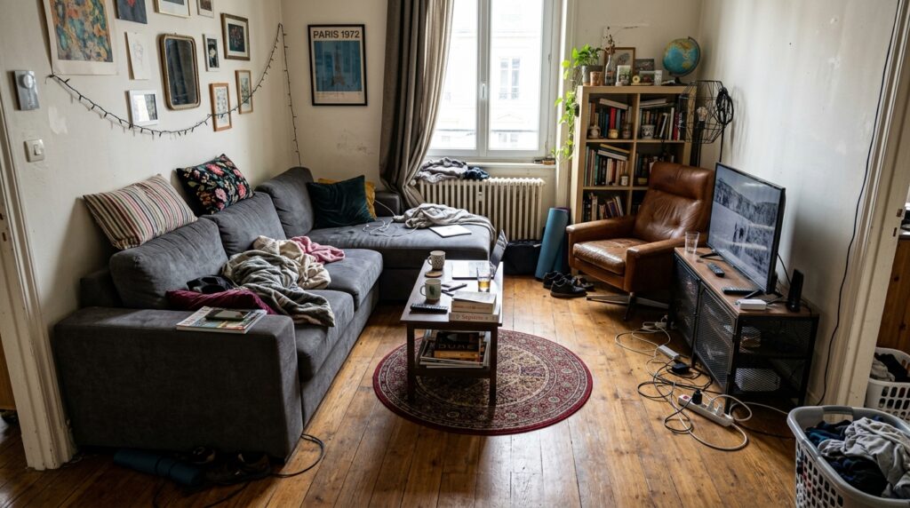
A lack of planning also leads to costly mistakes. Purchasing furniture before measuring the room may result in pieces that overwhelm the space or leave awkward gaps. Even worse, replacing items later can significantly increase your decorating budget.
Common issues caused by skipping the planning phase include:
- Impulse purchases that don’t fit the overall design
- Furniture that is too large or too small for the room
- A lack of visual cohesion between colors, materials, and styles
- Wasted money on items that eventually need replacing
How to Fix It
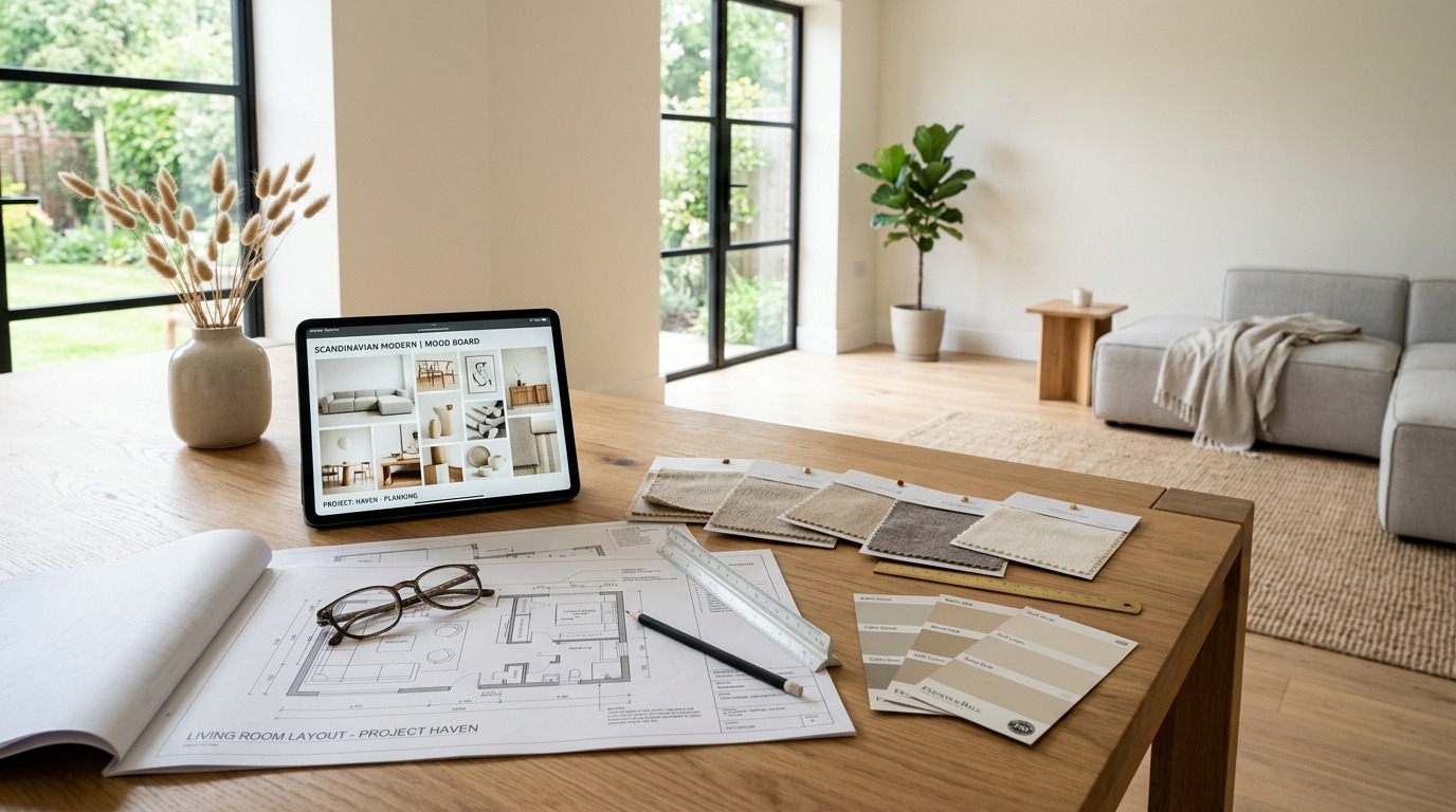
Before buying anything, take time to develop a complete vision for the room.
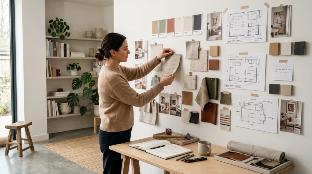
Start by measuring the space carefully, including walls, windows, doorways, and existing furniture. Accurate measurements help prevent costly sizing mistakes and make furniture shopping much easier.
Next, create a simple floor plan. Even a basic sketch can help you visualize furniture placement and traffic flow before making any purchases.
Finally, build a mood board that includes your preferred colors, furniture styles, materials, and décor pieces. Seeing everything together helps ensure that every item contributes to a cohesive design rather than competing for attention.
A little planning upfront can save money, reduce frustration, and create a room that feels intentionally designed from the start.
2. Painting Before Choosing Furniture and Fabrics
Many homeowners assume paint should be the first decorating decision. After all, it covers the largest surface in the room. However, choosing paint colors before selecting furniture, rugs, and fabrics is one of the most common design mistakes.
While paint comes in thousands of shades, furniture and textiles offer far fewer options. Selecting wall color first can make it surprisingly difficult to find furnishings that coordinate perfectly later on.
Why It’s a Problem
When paint is chosen too early, homeowners often find themselves trying to force furniture and accessories to match an existing color scheme. This limits decorating flexibility and can lead to compromises that affect the overall look of the room.
A paint color that seemed perfect on its own may clash with the sofa, rug, curtains, or accent chairs you eventually fall in love with. As a result, the space may feel less cohesive than intended.
Some common challenges include:
- Difficulty matching fabrics and furnishings to wall colors
- Limited choices when shopping for large furniture pieces
- Additional time and expense if repainting becomes necessary
- A less coordinated final design
How to Fix It
Instead of starting with paint, begin with the room’s largest and most important elements.
Choose major furnishings first, such as the sofa, bed, area rug, dining table, or upholstered chairs. These items typically have a bigger impact on the room’s overall style and are more difficult to replace.
Once your key pieces are selected, use their colors, textures, and patterns as inspiration for the wall color. This approach gives you far more flexibility and helps create a polished, professionally designed look.
Think of paint as the finishing touch rather than the starting point. By selecting furnishings first and paint second, you’ll have a much easier time creating a room where every element works together beautifully.
3. Choosing the Wrong Rug Size
A rug might seem like a finishing touch, but it actually plays a major role in how a room looks and feels. Unfortunately, choosing a rug that’s too small is one of the most common interior design mistakes homeowners make. While a smaller rug may seem like a budget-friendly option, it often creates the opposite effect of what people want.
Why It’s a Problem
An undersized rug can make even a well-decorated room feel awkward and incomplete. Instead of bringing furniture together, it visually separates the pieces, making the space look smaller and less coordinated.
Many designers refer to tiny rugs as “postage stamp rugs” because they sit in the middle of the room without connecting to anything around them. As a result, furniture appears to float independently rather than functioning as part of a cohesive arrangement.
Common problems caused by a rug that’s too small include:
- The room feels smaller than it actually is
- Furniture appears disconnected and scattered
- Seating areas lack visual unity
- The overall design feels unfinished
How to Fix It
When selecting a rug, think of it as the foundation of your furniture arrangement rather than an accessory.
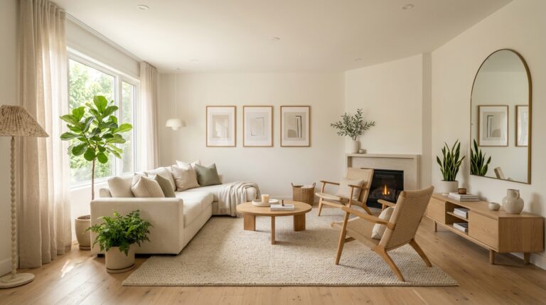
In most living rooms, all major furniture pieces should connect to the rug in some way. At the very least, the front legs of sofas and chairs should sit on the rug. In larger spaces, placing all furniture legs on the rug often creates the most polished look.
Choosing a larger rug may feel like a bigger investment initially, but it can dramatically improve the appearance of the entire room. A properly sized rug anchors furniture, defines the space, and makes the room feel more intentional and inviting.
When in doubt, size up rather than down. A rug that’s slightly too large almost always looks better than one that’s too small.
4. Pushing Furniture Against Every Wall
Many people assume that placing furniture against walls makes a room feel larger. While that may sound logical, it often produces the opposite result. Pulling every sofa, chair, and table to the edges of the room can leave a large, awkward void in the center and make the layout feel less welcoming.
Why It’s a Problem
When furniture hugs the walls, the room can feel disconnected and lacking in purpose. Instead of creating comfortable gathering areas, the layout spreads everything apart, making conversations feel less natural and reducing the sense of intimacy.
This is especially noticeable in larger living rooms, where furniture pushed against walls can make the space feel cold and underutilized.
Common issues include:
- A large empty area in the middle of the room
- Seating arrangements that feel disconnected
- Less inviting spaces for conversation and relaxation
- Poor visual balance throughout the room
How to Fix It
Whenever possible, pull furniture away from the walls and arrange it around a central focal point.
Even moving a sofa forward by a few inches can make a significant difference. Group seating pieces together to create conversation-friendly layouts where people can comfortably interact without shouting across the room.
Large rugs can help define these seating zones and visually anchor the furniture arrangement. In open-concept spaces, floating furniture can also help separate different functional areas without the need for walls.
Instead of decorating the perimeter of the room, focus on creating purposeful zones that encourage comfort, connection, and everyday living.
5. Hanging Artwork Too High
Artwork has the power to transform a room, but only when it’s placed correctly. One of the most widespread decorating mistakes is hanging artwork too high on the wall. In many homes, art ends up positioned near the ceiling, leaving a noticeable gap between the artwork and the furniture below.
Why It’s a Problem
When artwork is hung too high, it feels disconnected from the rest of the room. Rather than contributing to the overall design, it appears isolated and out of place.
This mistake can also throw off the visual balance of the space. The eye naturally has to travel upward, making the room feel less cohesive and creating an awkward relationship between the walls and furnishings.
Some common effects include:
- An unbalanced room layout
- Artwork that feels detached from surrounding furniture
- Empty wall space that looks accidental rather than intentional
- Reduced visual impact from the artwork itself
How to Fix It
A simple guideline used by many designers is to hang artwork at eye level whenever possible. Rather than positioning the top of the frame as the reference point, focus on the center of the artwork.
In most homes, the center of a piece should sit approximately at average eye level, creating a more natural viewing experience.
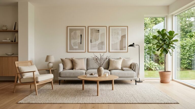
When hanging art above furniture such as a sofa, bed, or console table, think of the artwork and furniture as a single visual unit. The art should feel connected to the piece below rather than floating independently on the wall.
By lowering artwork slightly and paying attention to its relationship with nearby furnishings, you can instantly make a room feel more balanced, polished, and professionally designed.
3. Choosing the Wrong Rug Size
A rug might seem like a finishing touch, but it actually plays a major role in how a room looks and feels. Unfortunately, choosing a rug that’s too small is one of the most common interior design mistakes homeowners make. While a smaller rug may seem like a budget-friendly option, it often creates the opposite effect of what people want.
Why It’s a Problem
An undersized rug can make even a well-decorated room feel awkward and incomplete. Instead of bringing furniture together, it visually separates the pieces, making the space look smaller and less coordinated.
Many designers refer to tiny rugs as “postage stamp rugs” because they sit in the middle of the room without connecting to anything around them. As a result, furniture appears to float independently rather than functioning as part of a cohesive arrangement.
Common problems caused by a rug that’s too small include:
- The room feels smaller than it actually is
- Furniture appears disconnected and scattered
- Seating areas lack visual unity
- The overall design feels unfinished
How to Fix It
When selecting a rug, think of it as the foundation of your furniture arrangement rather than an accessory.
In most living rooms, all major furniture pieces should connect to the rug in some way. At the very least, the front legs of sofas and chairs should sit on the rug. In larger spaces, placing all furniture legs on the rug often creates the most polished look.
Choosing a larger rug may feel like a bigger investment initially, but it can dramatically improve the appearance of the entire room. A properly sized rug anchors furniture, defines the space, and makes the room feel more intentional and inviting.
When in doubt, size up rather than down. A rug that’s slightly too large almost always looks better than one that’s too small.
4. Pushing Furniture Against Every Wall
Many people assume that placing furniture against walls makes a room feel larger. While that may sound logical, it often produces the opposite result. Pulling every sofa, chair, and table to the edges of the room can leave a large, awkward void in the center and make the layout feel less welcoming.
Why It’s a Problem
When furniture hugs the walls, the room can feel disconnected and lacking in purpose. Instead of creating comfortable gathering areas, the layout spreads everything apart, making conversations feel less natural and reducing the sense of intimacy.
This is especially noticeable in larger living rooms, where furniture pushed against walls can make the space feel cold and underutilized.
Common issues include:
- A large empty area in the middle of the room
- Seating arrangements that feel disconnected
- Less inviting spaces for conversation and relaxation
- Poor visual balance throughout the room
How to Fix It
Whenever possible, pull furniture away from the walls and arrange it around a central focal point.
Even moving a sofa forward by a few inches can make a significant difference. Group seating pieces together to create conversation-friendly layouts where people can comfortably interact without shouting across the room.
Large rugs can help define these seating zones and visually anchor the furniture arrangement. In open-concept spaces, floating furniture can also help separate different functional areas without the need for walls.
Instead of decorating the perimeter of the room, focus on creating purposeful zones that encourage comfort, connection, and everyday living.
5. Hanging Artwork Too High
Artwork has the power to transform a room, but only when it’s placed correctly. One of the most widespread decorating mistakes is hanging artwork too high on the wall. In many homes, art ends up positioned near the ceiling, leaving a noticeable gap between the artwork and the furniture below.
Why It’s a Problem
When artwork is hung too high, it feels disconnected from the rest of the room. Rather than contributing to the overall design, it appears isolated and out of place.
This mistake can also throw off the visual balance of the space. The eye naturally has to travel upward, making the room feel less cohesive and creating an awkward relationship between the walls and furnishings.
Some common effects include:
- An unbalanced room layout
- Artwork that feels detached from surrounding furniture
- Empty wall space that looks accidental rather than intentional
- Reduced visual impact from the artwork itself
How to Fix It
A simple guideline used by many designers is to hang artwork at eye level whenever possible. Rather than positioning the top of the frame as the reference point, focus on the center of the artwork.
In most homes, the center of a piece should sit approximately at average eye level, creating a more natural viewing experience.
When hanging art above furniture such as a sofa, bed, or console table, think of the artwork and furniture as a single visual unit. The art should feel connected to the piece below rather than floating independently on the wall.
By lowering artwork slightly and paying attention to its relationship with nearby furnishings, you can instantly make a room feel more balanced, polished, and professionally designed.
10. Decorating with Too Many Small Accessories
Small décor pieces can add charm and personality to a room, but when they’re overused, the effect quickly turns from stylish to chaotic. Many homeowners fall into the trap of filling every surface with little objects, thinking it will make the space feel more “decorated.” Instead, it often does the opposite.
Why It’s a Problem
Too many small accessories create visual noise. Instead of guiding the eye, they compete for attention, making it hard to focus on any single element in the room. Even a well-designed space can start to feel cluttered when surfaces are overloaded.
Common issues include:
- Visual clutter that feels overwhelming
- Lack of breathing space on shelves and tables
- A busy, disorganized appearance
- Reduced impact of individual décor pieces
How to Fix It
The key is intentional curation rather than accumulation.
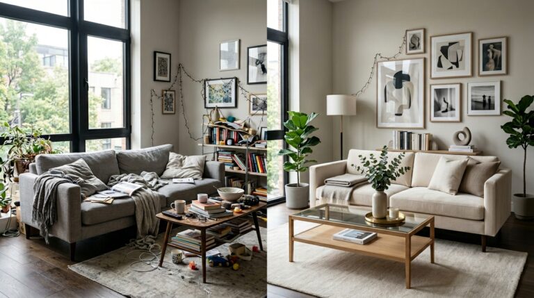
Choose fewer, more meaningful pieces that actually contribute to the room’s style. Instead of scattering items across every surface, group them together in small, balanced arrangements. Repetition—such as using similar shapes, colors, or materials—also helps create a sense of harmony.
Negative space is just as important as decoration. Leaving some areas intentionally empty allows the eye to rest and makes the displayed items feel more purposeful and impactful.
11. Having No Color Strategy
Color is one of the most powerful tools in interior design, but without a clear strategy, it can easily become overwhelming. Rooms that lack a defined color plan often end up feeling disjointed, with shades that don’t relate to one another.
Why It’s a Problem
When colors are chosen randomly or added piece by piece over time, the result is often visual confusion. Instead of a cohesive environment, the room feels like a collection of unrelated elements.
This can lead to:
- A lack of visual harmony
- Competing colors that distract the eye
- Spaces that feel inconsistent or unfinished
- Difficulty adding new décor later
How to Fix It
A simple way to create balance is to follow the 60-30-10 rule. This means using:
- 60% dominant color (walls, large furniture)
- 30% secondary color (upholstery, rugs, curtains)
- 10% accent color (pillows, artwork, décor)
Sticking to a limited, cohesive palette helps everything feel more intentional. You can still introduce variety through texture and pattern, but the underlying color structure should remain consistent.
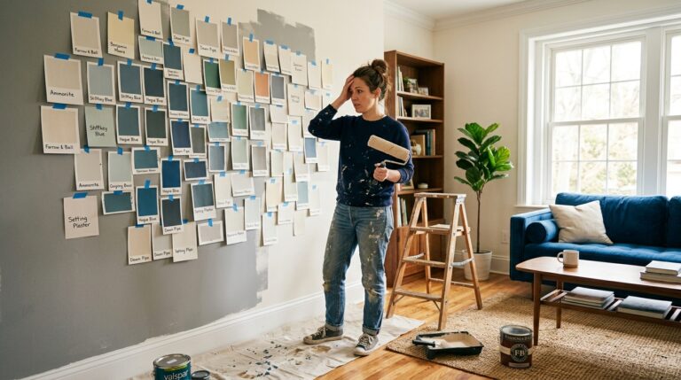
12. Skipping Paint Swatch Testing
Paint can look completely different on a wall than it does in a store or on a small sample card. Lighting, room size, and surrounding colors all influence how a shade appears in real life. Skipping the testing phase is one of the most expensive mistakes homeowners make.
Why It’s a Problem
Without proper testing, paint colors often end up looking too dark, too light, too cool, or too warm once applied. What seemed like the perfect shade in theory may clash with furniture or feel completely different under natural and artificial light.
Common consequences include:
- Unexpected color results after painting
- Poor coordination with furniture and décor
- The need for repainting, adding extra cost and effort
- Dissatisfaction with the final look of the room
How to Fix It
Always test paint in the actual space before committing. Large sample swatches work far better than tiny chips, as they give a more realistic sense of coverage and tone.
Move the samples around the room and observe them at different times of day. Natural daylight, evening lighting, and artificial bulbs can all change how a color appears.
Taking this extra step ensures that your final paint choice enhances the room rather than creating an expensive design regret.
13. Following Trends Without a Plan
Trends can be exciting. One scroll through social media, and suddenly a new style feels like a must-have. But designing a home based purely on what’s popular right now often leads to regret later on. What looks fresh today can feel outdated surprisingly fast.
Why It’s a Problem
When design decisions are driven by trends rather than intention, the overall look of a home becomes inconsistent. Each room may reflect a different “moment” in design culture instead of a unified personal style.
Over time, this creates a space that feels disjointed and lacks long-term appeal.
Common issues include:
- A home that feels quickly outdated
- Mixed styles that don’t work together
- Frequent need to replace décor and furniture
- A lack of personal identity in the space
How to Fix It
Instead of chasing every trend, focus on building a foundation that reflects your personal taste and lifestyle.
Choose timeless, versatile pieces for larger investments like sofas, beds, and dining tables. Trends can still play a role, but they work best in smaller, easier-to-update accents like cushions, artwork, or décor objects.
Before buying anything trendy, ask a simple question: will I still love this in a few years?
Prioritizing long-term design over short-term hype creates a home that feels more authentic, stable, and visually consistent.
Why These Interior Design Mistakes Happen
Most decorating mistakes don’t happen randomly—they usually come from a few common habits and mindsets.
- Lack of Planning: Jumping into purchases without a clear vision or layout
- Fear of Making Bold Choices: Playing it too safe leads to uninspired spaces
- Following Trends Too Closely: Prioritizing popularity over personal style
- Focusing on Individual Items Instead of the Whole Room: Decorating piece by piece instead of designing the full picture
When these patterns are repeated, even expensive interiors can feel unbalanced or incomplete.
Quick Interior Design Checklist Before You Decorate
Before you start buying or rearranging anything, run through this simple checklist:
- Have I measured the room?
- Is my rug large enough?
- Does the room have a focal point?
- Am I using layered lighting?
- Have I tested paint colors?
- Does everything fit my overall design plan?
A few minutes of checking can prevent months of regret.
Final Thoughts
Good interior design isn’t about having the most expensive furniture or copying the latest styles. It’s about avoiding small but costly mistakes that quietly affect how a space feels.
When you focus on planning, proportion, lighting, and cohesion, everything starts to fall into place naturally. Rooms feel more balanced, more comfortable, and far more intentional.
And often, the biggest transformation doesn’t come from adding more—it comes from stepping back and fixing what’s already there.