14 Cozy Bedroom Aesthetic Ideas That Will Make You Never Want to Leave Your Bed
You know that feeling when you walk into a hotel room, drop your bags, and immediately exhale? The kind of exhale where your whole body finally lets go of everything it was holding? I spent years chasing that feeling in my own home, repainting walls, swapping out bedding, rearranging furniture at midnight like a woman possessed. And then one slow Saturday morning, sipping coffee in my newly finished bedroom, I finally got there. That exhale? I found it at home.
That is exactly why I wrote this article for you. Inside these 14 cozy bedroom aesthetic ideas, I am sharing every color choice, every texture, every layering trick I personally tested in my own rooms over the past decade. Whether you rent a tiny apartment or own a sprawling master suite, these ideas will help you build a bedroom that feels like the best hug you have ever gotten. Let us turn your bedroom into the sanctuary you have been dreaming about.
Soft Sage Green
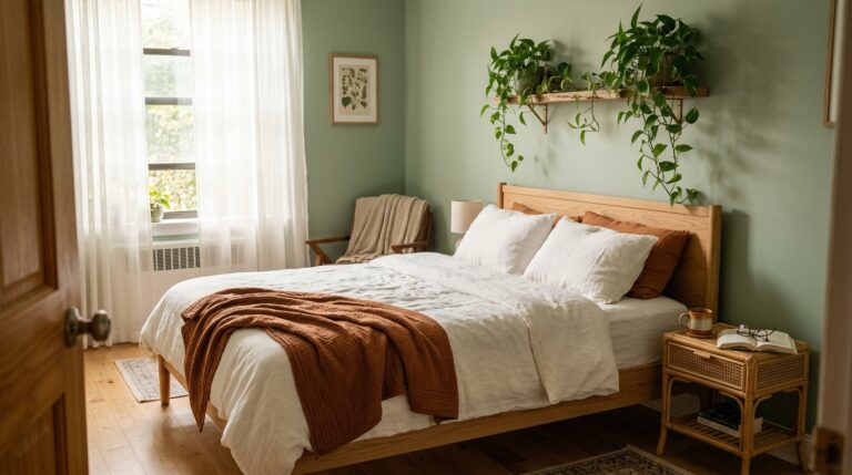
There is something almost medicinal about waking up inside a room painted sage green. The color sits somewhere between silver and green, cool enough to feel restful but warm enough to feel alive. On a Sunday morning when pale gold light filters through linen curtains, sage walls seem to glow from the inside. The whole room breathes. Shadows in the corners turn deep and mossy. Your cream duvet looks richer, your oak furniture looks more intentional, and somehow the whole space feels like it grew naturally rather than being decorated by a person with a Pinterest board and a cart full of Amazon home goods.
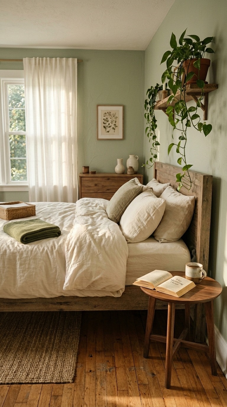
For paint, I always send people straight to Sherwin-Williams Privilege Green SW 6193. The undertones lean slightly grey without ever going cold, which is exactly what you want in a north-facing room. Pair it with warm white bedding — I love a heavyweight cotton percale — and pull in natural wood tones through your nightstand and bed frame. A rust-colored lumbar pillow adds the most unexpected warmth. Honestly, this is the first color I painted in my own bedroom three years ago, and I have never once considered changing it. It is that good.
Deep Terracotta and Clay
Terracotta bedrooms feel ancient and warm in the best possible way, like sleeping inside a Moroccan riad or a sun-soaked Italian farmhouse. The color carries earth and fire at the same time, never harsh, always deeply human. When your lamps click on at night and that warm orange glow bounces off clay walls, the room transforms completely. Everything inside it — your bedding, your skin, your wooden furniture — looks more beautiful. Deep terracotta asks you to slow down. It almost commands it. No one rushes through a morning in a room this color, and that is the whole point.
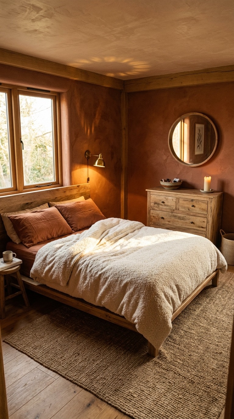
Benjamin Moore’s Terra Cotta Tile 2090-30 is the shade I recommend without hesitation. It has enough brown in it to stay grounded and avoid the dreaded orange-bathroom trap. Layer textures aggressively here — boucle, linen, and woven jute all belong in a terracotta room. Warm brass hardware on your nightstand and dresser pulls everything together with a quiet luxury that feels genuinely earned rather than purchased. I used this color in my guest room and visitors consistently ask if they can move in. One of them actually tried. Bold color is not scary — it is transformative.
Warm Cream and Butter Yellow
Butter yellow and cream belong together the way coffee and quiet mornings belong together — inseparably and beautifully. A bedroom in this palette feels lit from within even on the greyest winter days. There is nothing cold about waking up inside warm creamy walls. The light that gathers in a room like this feels honeyed and slow, the kind of light that makes you feel like the whole world is soft-edged and forgiving. Vintage rattan chairs look stunning. Linen quilts look like heirlooms. Even the most ordinary furniture starts to look like something you found on a European flea market trip.
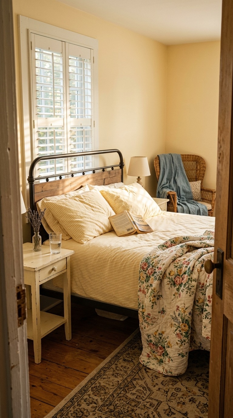
Farrow & Ball’s Hay No. 37 is the butter yellow I reach for every single time someone asks me for a warm, livable bedroom color. It never reads as childish or loud — it reads as intentional and deeply cozy. Pair it with true cream trim using Benjamin Moore’s White Dove OC-17, and the whole room feels cohesive and tailored. Soft floral bedding in muted pinks and ivory pulls the palette together without competing. I painted a small secondary bedroom in my house this combination two winters ago, and it is now the room everyone fights over during the holidays.
Moody Navy Blue
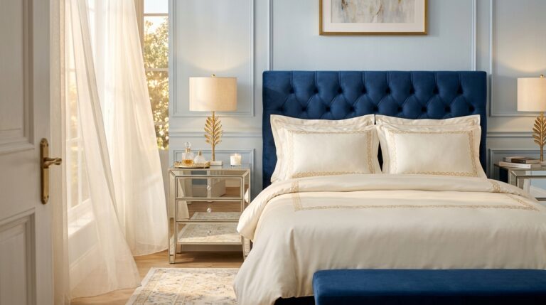
Navy is one of those colors that feels like it belongs exclusively in formal studies and preppy living rooms, and I am here to completely change your mind. A navy bedroom is the single moodiest, most romantic choice you can make for a space meant for rest. The deep blue wraps around you. It swallows the walls and makes the room feel like a cocoon. White crisp bedding pops against it like stars against a night sky. Brass hardware glows warmly. And that moment just before sleep, when everything is dim and the lamp throws amber light around the room? Absolutely cinematic.
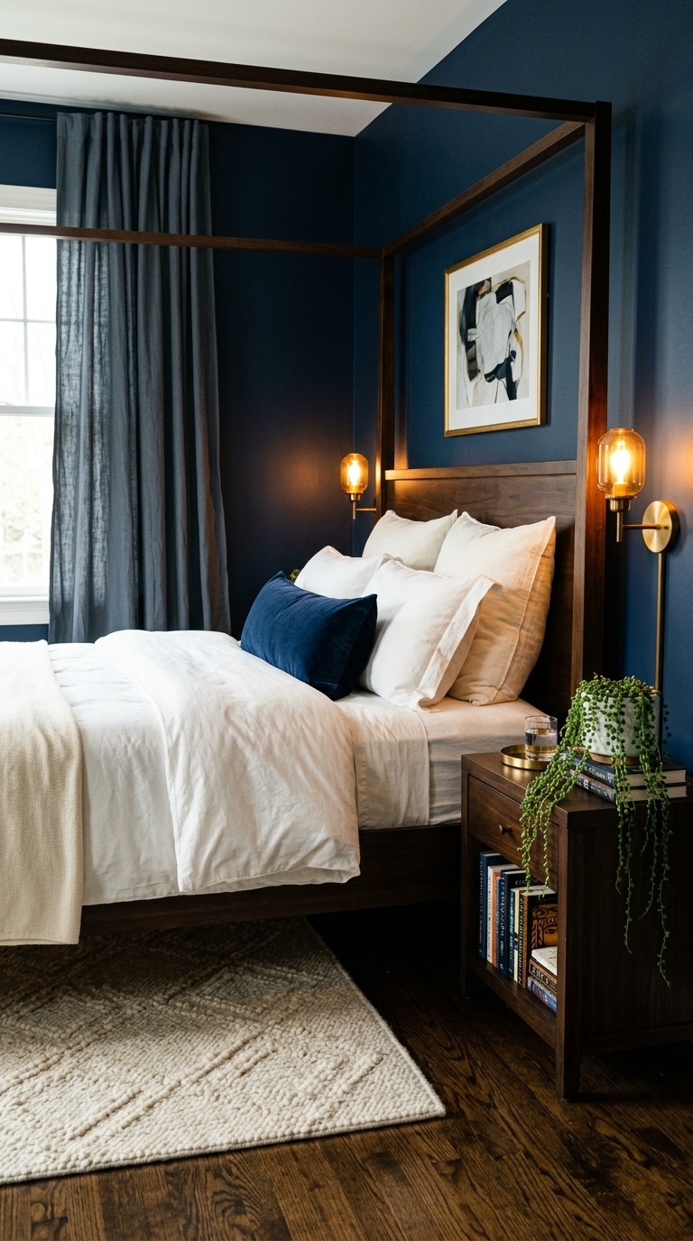
Sherwin-Williams Naval SW 6244 is the navy I trust most for bedrooms because it pulls slightly warm rather than cold, which keeps the room from feeling like the inside of a corporate boardroom. Pair it with bright white bedding — a hotel duvet cover in cotton sateen works beautifully — and warm metallic accents in brass or antique gold throughout. Avoid grey accessories here, they will kill the warmth instantly. I painted my reading nook in this color years ago, loved it so fiercely that I eventually took it to an entire spare bedroom, and I have never once looked back.
Dusty Blush Pink
Dusty blush is not the millennial pink of Instagram circa 2017, and I want to be very clear about that distinction. The right dusty blush bedroom reads as vintage, romantic, and incredibly grown-up. Think old roses rather than birthday cake frosting. It is the color of faded French linen and antique silk and rooms that have been loved for decades. When morning light touches blush walls, the room turns rosy and golden at the same time. Your white bedding glows softly pink. Your wood furniture warms up. The whole space feels like a love letter written slowly in good light.
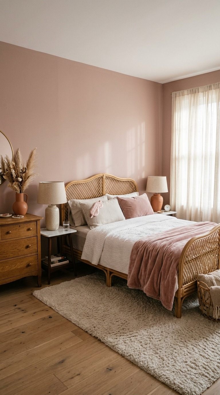
Benjamin Moore’s Mellow Rose 2169-50 captures that perfectly faded dusty tone without veering saccharine. The key to making blush work in a grown-up bedroom is pairing it with raw natural materials — think a cane or rattan bed frame, linen pillowcases in oat or ivory, and a sisal or jute rug underfoot. Avoid anything too shiny or modern-looking here; blush needs softness and age around it to hit right. I painted a rental bedroom in this color using removable paint — yes, that is a real product — and my landlord actually complimented it when I moved out.
Warm Greige and Stone
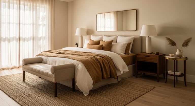
Greige — that gorgeous grey-beige blend — might be the single most underestimated color in bedroom design. People dismiss it as boring, and I disagree completely. A warm greige bedroom is like the perfect neutral outfit that somehow makes everything else you own look better. It asks nothing of you. It competes with nothing. And because it asks nothing, it gives you everything — total calm, total rest, total visual quiet. Furniture pops against it effortlessly. Bedding looks luxurious without trying. The room feels expensive in that old-money way that has nothing to do with what you actually spent.
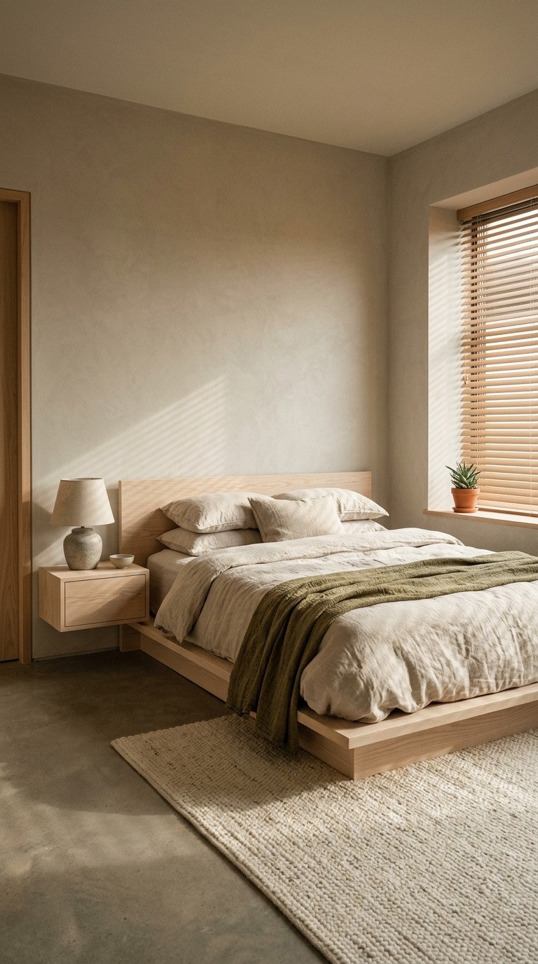
Farrow & Ball’s Elephant’s Breath No. 229 is the quintessential warm greige and it earns its reputation completely. It reads lavender in some lights, biscuit in others, and stone in low evening lamp glow — it is endlessly interesting. Pair it with oatmeal linen bedding, a pale ash or white-washed wood bed frame, and a chunky cream knit throw folded at the foot. Avoid cool white accessories — they will drag the warmth straight out of this color. I used Elephant’s Breath in my own master bedroom and people walk in, stop talking, and visibly decompress. That reaction never gets old.
Forest Green and Dark Wood
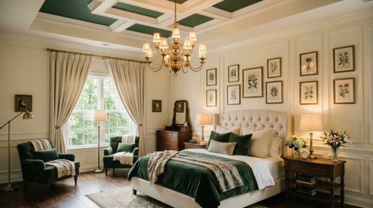
Forest green is the bedroom color for people who take their rest seriously, and I mean that as the highest possible compliment. It is earthy and intellectual and deeply calming all at the same time. Dark wood furniture looks magnificent against it — the kind of pairing that feels like it belongs in a countryside estate or a beautifully curated mountain cabin. Leather accessories, wool throws, ceramic lamps — everything natural and tactile thrives inside a forest green room. Sleeping here feels intentional. Waking up here feels grounding. It is the bedroom equivalent of a long walk through trees in October.
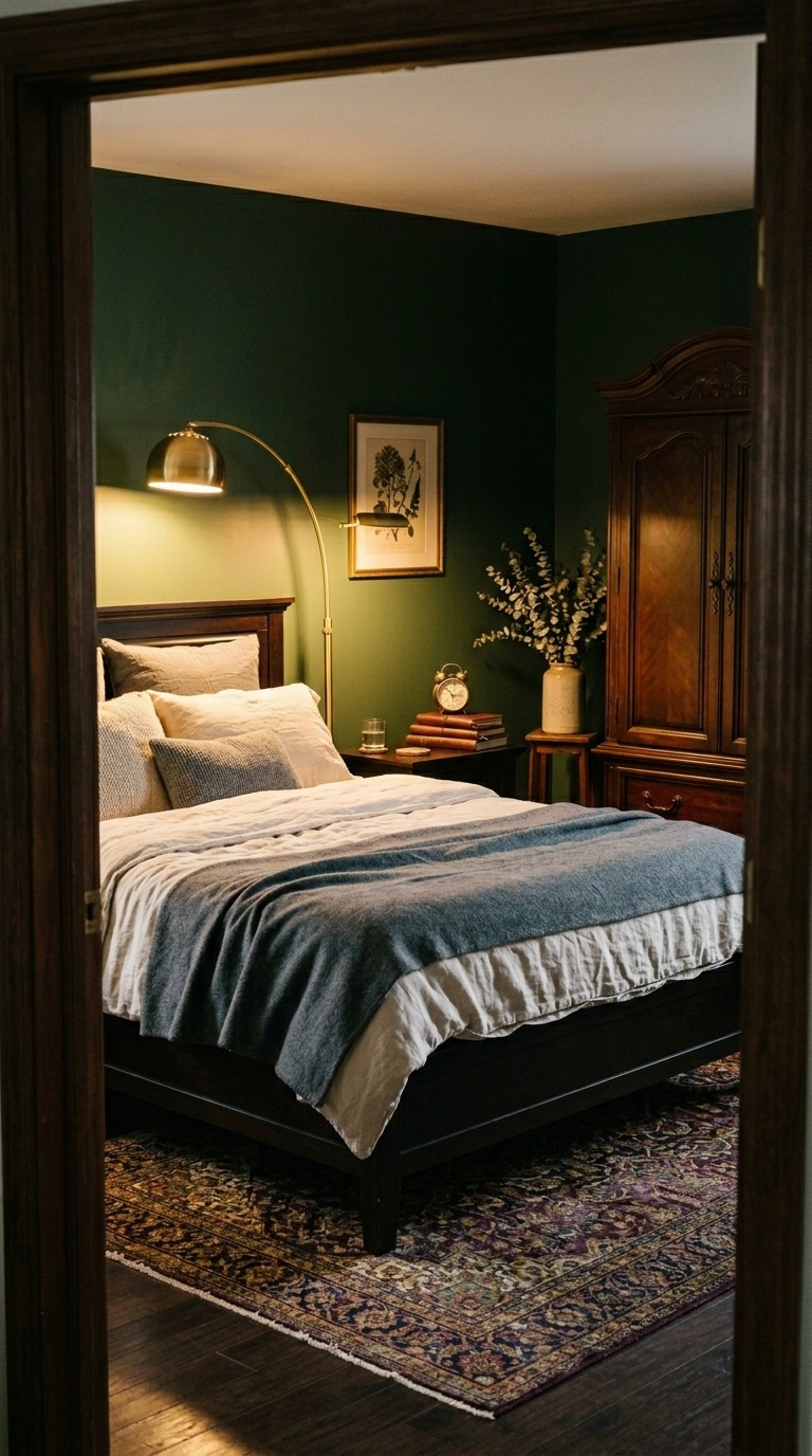
Sherwin-Williams Hunt Club SW 6468 gives you a forest green with just enough brown warmth to keep it from going cold or clinical. This is critical — too blue-green and you lose the earthy coziness entirely. Pair dark espresso or walnut wood furniture with slate grey and ivory bedding layers for maximum depth. A worn vintage rug in jewel tones ties the whole room together without screaming for attention. I styled a client’s bedroom in this combination last fall, and she texted me three days later saying she had been sleeping better than she had in years. Forest green does something to the nervous system. Something wonderful.
Charcoal and Warm White
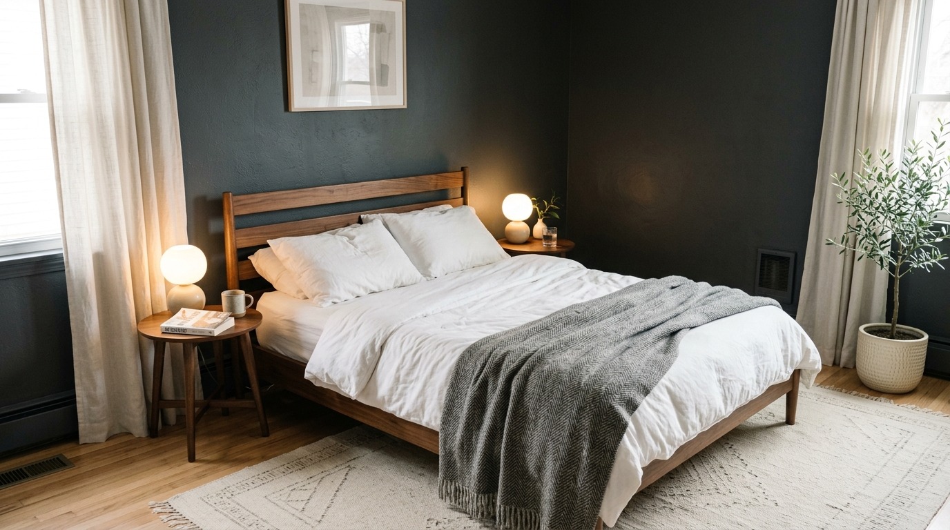
Charcoal and warm white is the design pairing that proves opposites do not just attract — they elevate each other completely. Charcoal walls are dramatic but grounded, moody but never cold when you pair them with the right warm whites and natural wood tones. The contrast is what makes this bedroom feel so visually satisfying. Crisp white bedding against charcoal walls looks like a photograph. Warm walnut furniture glows. And because charcoal absorbs light rather than reflecting it, the room feels private and protected — like the walls are holding you rather than closing in on you.
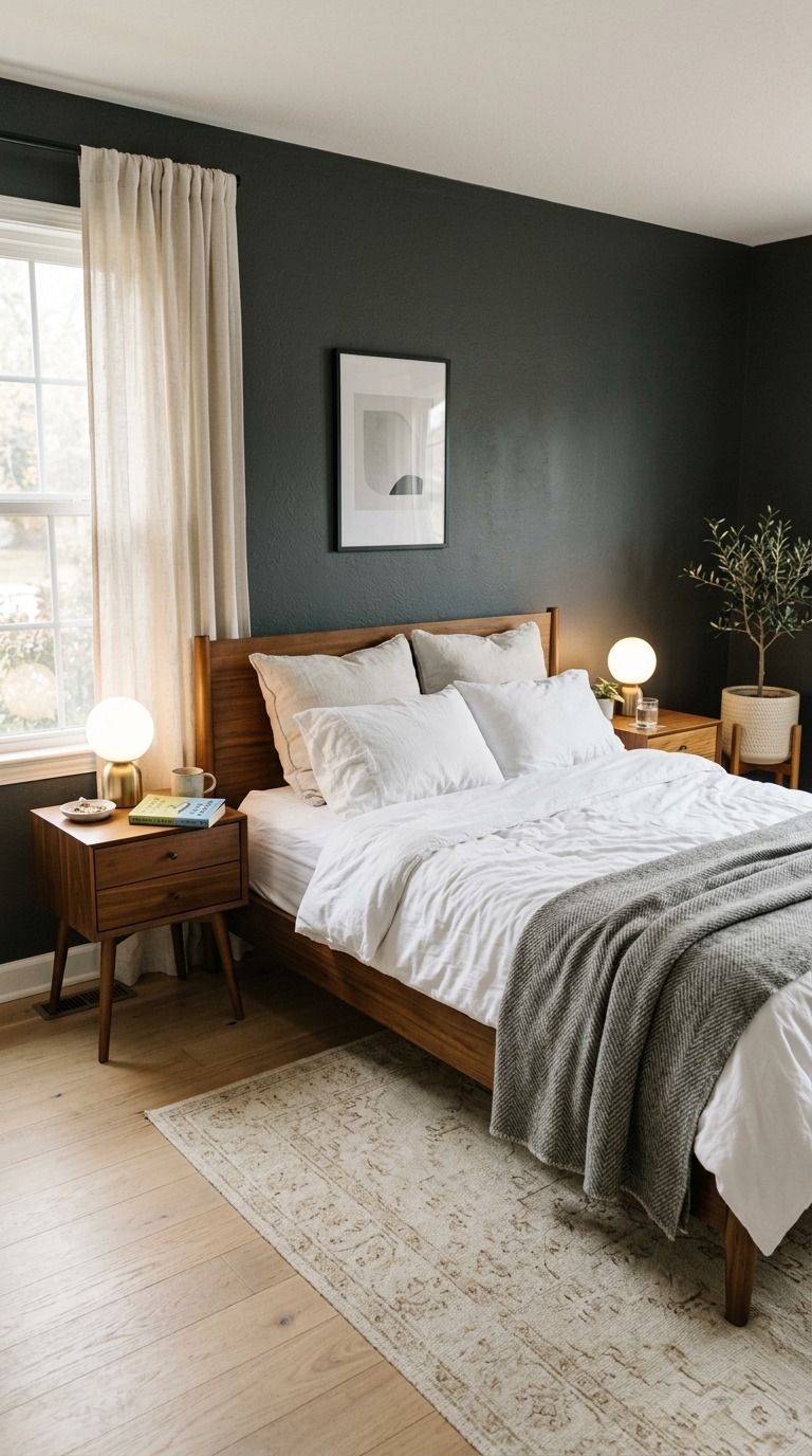
Benjamin Moore’s Wrought Iron 2124-10 is my personal charcoal benchmark. It has just enough brown warmth to prevent that steely cold feeling that some dark greys carry. Pair it with warm white bedding in cotton sateen — not bright white, which reads too stark — and pull in walnut or medium oak through your furniture to keep the warmth alive. A single large plant in a cream pot softens the drama beautifully. I have styled several bedrooms in this pairing and it photographs beautifully, but more importantly, it feels extraordinary to actually live inside. That distinction matters more than most people realize.
Lavender and Soft Grey
Lavender might seem like a bold bedroom choice but I promise you — the right lavender reads as one of the most calming wall colors in existence. The trick is choosing a muted, grey-leaning lavender rather than a bright purple. When you get this right, the room feels like early morning light made permanent. There is something about lavender that genuinely quiets the mind, and I do not say that as a decorating cliché. I say it as someone who has painted three different rooms in lavender variations over the past eight years and slept noticeably better in all three of them. Soft and gentle wins every time here.
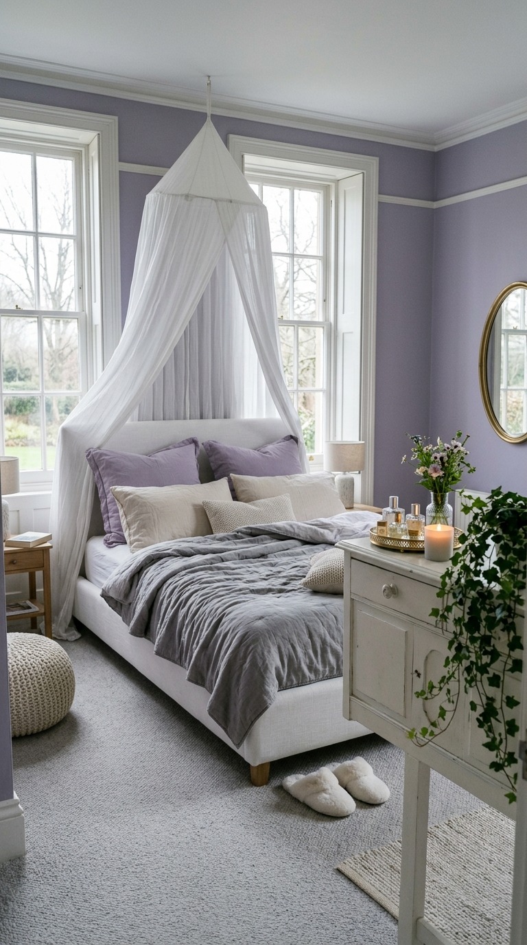
Sherwin-Williams Dreamy SW 6820 leans slightly grey which is exactly what makes it sophisticated rather than sweet. Pair it with soft grey bedding, white painted furniture with slightly visible brushstrokes, and ivory and cream textile layers throughout. Avoid anything too warm or too bright — lavender needs cool tones around it to stay serene. A white gauzy canopy over the bed adds that final dreamy layer without requiring any renovation or commitment. I put one up in my daughter’s room last spring and she walked in, looked at the ceiling, and said, “Mama, this looks like sleeping in a cloud.” That was a win.
Warm Terracotta and Ivory
Light terracotta paired with ivory is the combination I reach for when someone tells me they want their bedroom to feel like a vacation permanently. It carries a sun-drenched Mediterranean warmth without trying too hard. Limewash terracotta walls — where the paint is applied in layers to show subtle depth and variation — look absolutely gorgeous and feel worlds away from a flat painted surface. The texture makes the color breathe. Morning light hits it and the room turns golden. By evening, under warm lamp glow, it deepens to something almost amber and impossibly beautiful. This is the bedroom aesthetic that makes you genuinely grateful to come home.
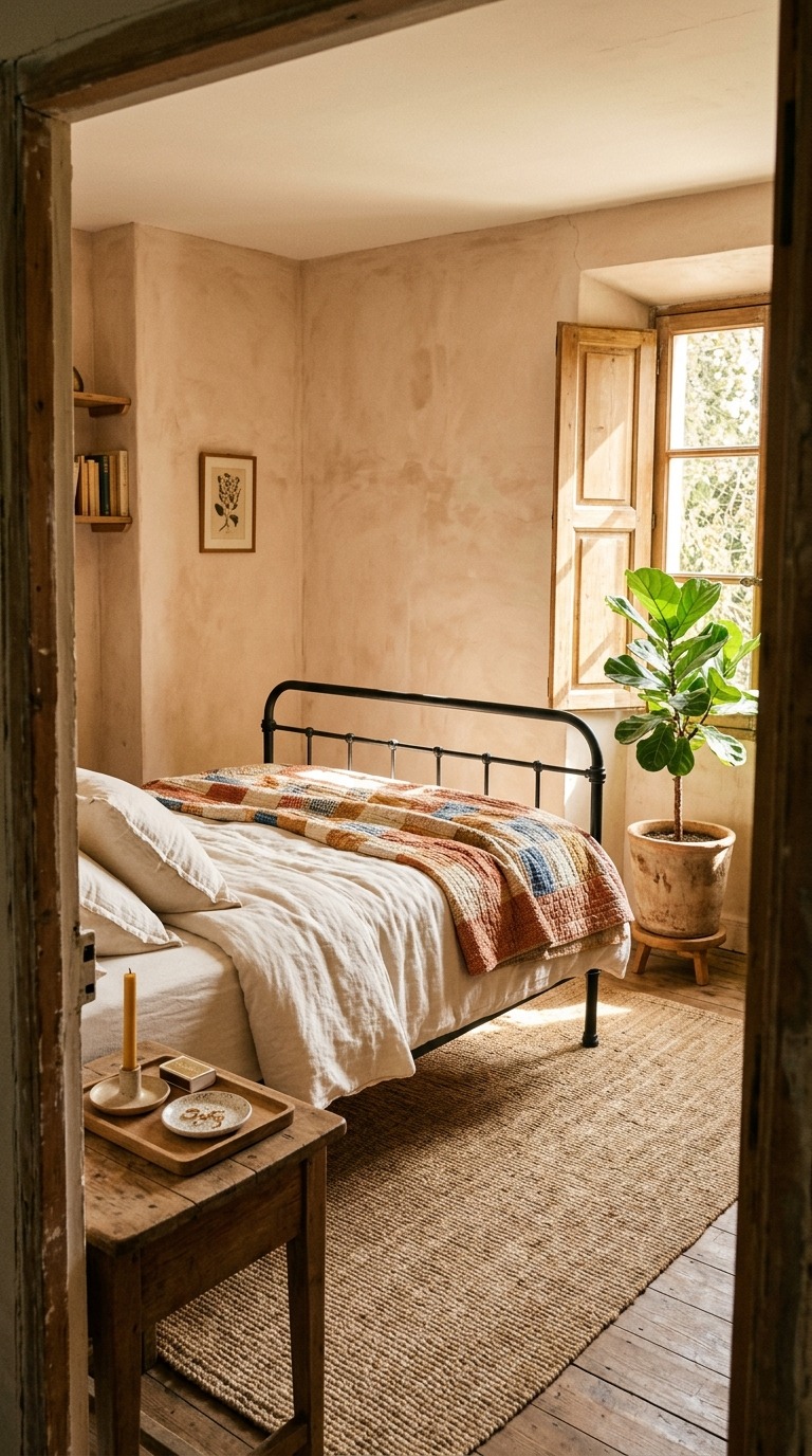
I love Portola Paints Limewash in Terracotta for this look — the application creates that old-world depth that no standard flat paint can replicate. Pair it with ivory and cream bedding in natural cotton or linen, choose iron or aged black metal bed frames to ground it, and bring in living green through a large leafy plant in a raw clay or ceramic pot. Keep accessories few and meaningful rather than many and cluttered. This palette rewards restraint. I spent one full weekend limewashing my bedroom walls myself, following tutorials obsessively, and the result was so beautiful that I cried a little. Not ashamed.
Cool Blue-Grey
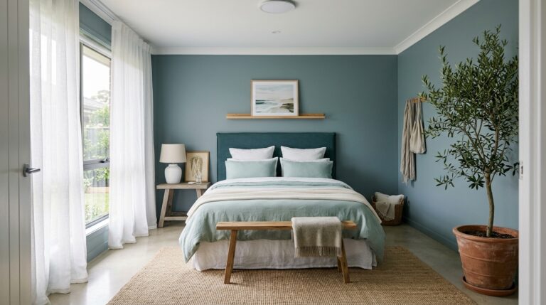
Cool blue-grey bedrooms feel like living inside a calm exhale, the kind that happens after everything urgent has finally passed. This is the color palette of early morning ocean views and quiet rainy Sundays and nothing-to-do afternoons. It does not demand your attention — it releases it. Paired with white and natural linen textures, cool blue-grey walls create a bedroom that feels genuinely effortless in the best possible way. You could have zero decorating skill and a bedroom in this palette would still make guests stop and compliment you. It is one of those combinations that simply cannot fail if you lean into the lightness of it all.
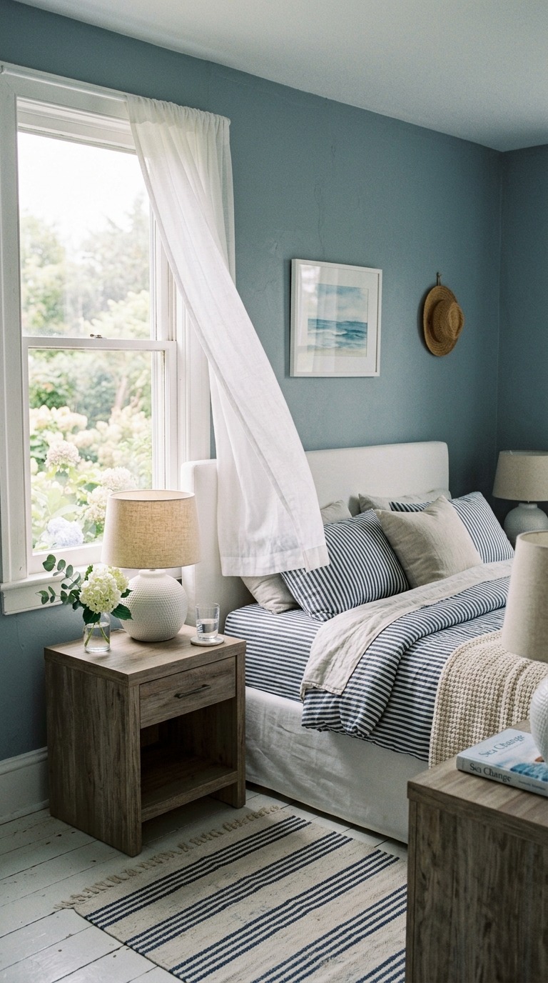
Benjamin Moore’s Quiet Moments 1563 is the blue-grey I return to again and again because its undertones shift beautifully with the light — going silvery cool in morning brightness and settling into a deeper, calmer slate by evening. Pair it with white slipcovered furniture, natural rattan or driftwood-finish wood tones, and linen and cotton textures in ivory and soft navy. Nothing shiny belongs here — keep everything matte and natural-feeling. I styled a coastal cottage bedroom in this color combination for a friend last summer and she calls it the best room in her house. It is the best room in her house.
Deep Burgundy and Cream
Deep burgundy is the color of old libraries and candlelit dinners and bedrooms that people fall helplessly in love inside of. It is bold, yes, but paired with cream and warm brass it never feels aggressive — it feels lush and intimate and completely transporting. Burgundy walls absorb warm light and reflect it back as something even richer. White bedding against deep wine walls creates a contrast so visually satisfying it almost looks curated by a professional stylist. And the bonus nobody talks about enough — burgundy rooms photograph extraordinarily well, which means every morning you wake up feeling like you live somewhere genuinely beautiful.
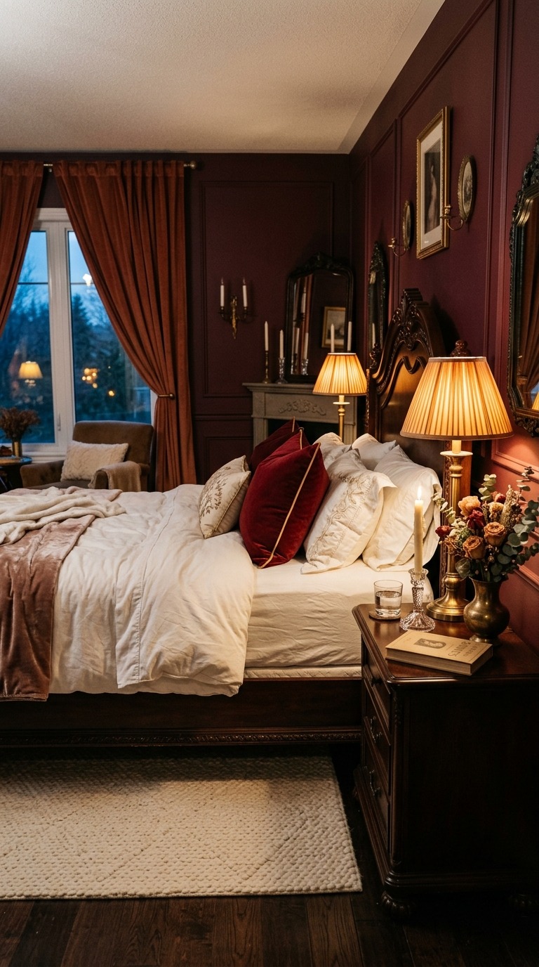
Farrow & Ball’s Preference Red No. 297 hits that precise balance between wine and burgundy that makes a bedroom look deliberately sophisticated rather than accidentally theatrical. Pair it with bright white or ivory cotton bedding — this is not the time for off-white, you want actual contrast — and bring in antique brass through your lamps and hardware for warmth. Cream or ivory wool rugs on dark hardwood floors complete the look impeccably. I used this color in a tiny bedroom that felt impossible to design, and the dark walls made the small space feel intentional and cozy rather than cramped. Dark colors in small rooms are not something to fear. They are something to embrace.
Warm Rust and Natural Linen
Rust is one of those deeply satisfying colors that feels simultaneously ancient and completely current. It belongs to deserts and autumn forests and handmade ceramics and all the best things the natural world has ever produced. In a bedroom, rust walls wrapped around linen bedding and raw wood furniture create a space that feels so organically beautiful it barely seems designed at all. You just walk in, exhale, and feel like the room grew around you. There is a particular restfulness in that feeling — the sense that the space is on your side rather than performing for you. Rust gives you that every single day.
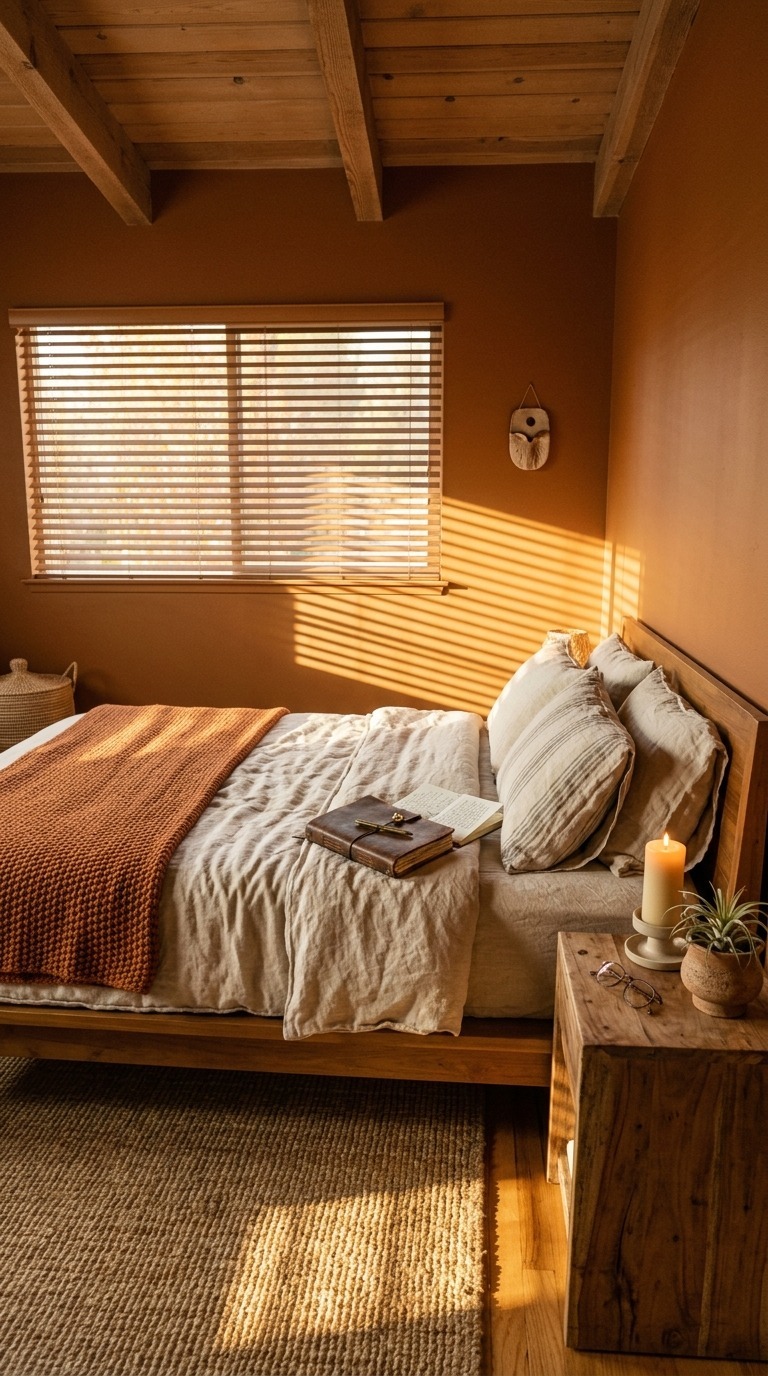
Sherwin-Williams Cavern Clay SW 7701 became enormously popular for good reason — it is a terracotta-meets-rust that works beautifully in both bright and low-light rooms, shifting from bright copper in daylight to a deep warm clay by lamplight. Natural linen bedding in undyed or oatmeal tones is the essential pairing here — nothing synthetic, nothing bright. Bring in raw wood through your nightstands and bed frame, and keep accessories earthy and organic — clay pots, leather accessories, dried botanicals. I used this color in a cabin-style bedroom renovation and every single person who slept there said it was the best sleep of their recent memory. The color does real work.
Midnight Black and Gold
Midnight black walls in a bedroom sound terrifying until you see it done right and then you understand immediately why people describe it as their best decorating decision ever. Black walls do not make a room feel smaller. They make it feel boundless — like the walls simply disappear into the evening and all that remains is warmth and light and you. Paired with crisp white bedding and warm gold accents, a midnight black bedroom looks like somewhere extraordinary people sleep. It is theatrical and deeply cozy simultaneously, which is a combination most colors cannot pull off. Black pulls it off with complete ease and a certain breathtaking confidence.
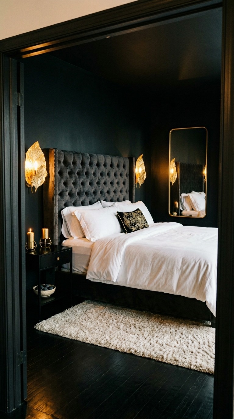
Benjamin Moore’s Black Beauty 2128-10 is a true matte black with the faintest warm brown undertone that keeps it from reading cold or stark. Pair it with the crispest white cotton bedding you can find — the contrast is everything in this palette — and choose warm gold or antique brass for every metal accent in the room, from lamps to cabinet pulls to mirror frames. An ivory or cream plush rug grounds the darkness underfoot beautifully. I painted a moody home office in this color first as a trial run before committing to a bedroom, and within two months I had rolled it into a guest room. The reaction from guests is consistently and delightfully dramatic.
You made it through all fourteen and I genuinely hope something here sparked that feeling — you know the one. That little electric pull toward a specific color, a particular texture combination, a mood that suddenly feels exactly right for your room. That feeling is your instinct talking and it is almost never wrong. Pick the one that made you pause the longest. That pause means something real.
Here is my honest advice after years of doing this: start with one wall if the full commitment feels too bold. Paint it on a Saturday afternoon with a coffee in hand and live with it for a week. Light changes color throughout the day, and you deserve to know the full story before you roll it across all four walls. But mostly — just begin. A cozy bedroom is not a luxury reserved for people with design budgets or perfect spaces. It is something you build one good decision at a time, and every single idea in this article is yours to take home today.